Clash City Rockers | N/A
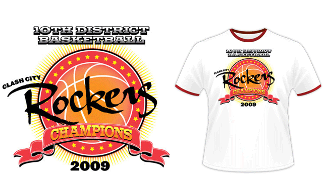
I made this basketball shirt design comp in order to demonstrate my skills to a custom sports apparel company. The team name is an homage to punk rock legends The Clash. It also commemorates a district tournament win for the fictional high school sports team.
Basketball shirt design story
First, I chose a red and yellow color scheme reminiscent of my high school alma mater, the Muhlenberg South Suns. Also, the main titles are set in black, which contrasts the white shirt. I made the most of a four color screen print to demonstrate my versatility. I blended many of the colors together in percentages, thus creating gradient effects.
My suggested basketball shirt design lays out on a white shirt along with bright red ringers for a vintage sports feel. I framed the requisite basketball shape with a bold red circle filled with bright yellow stars. Additional black and white strokes give weight to the frame. A burst of sun rays in the background completes the shape.
The word “CHAMPIONS” shines in a yellow to orange gradient, which pops off the shirt with a black shadow. It then adorns a stitched red ribbon in the foreground. I chose to set it in the bold serif Memphis font to give it a traditional athletic feel.
“10TH DISTRICT BASKETBALL” at the top features a white to black gradient with a heavy black shadow. “2009” and “CLASH CITY” display in a heavyweight sans serif font, which is similar to Britannic Bold.
Finally, the word “Rockers” splashes across the front of the design in a thick, painterly script. This gives the apparel design an edge.
Your sports team needs to hire a professional graphic designer
When your school needs a slam dunk basketball shirt design, contact me to get started. Together, we would make a great team!

Stellar Kin | Bowling Green, KY
I toured with the band Stellar Kin for six years. In addition to writing and performing, I created all of our band merch design. It is a special feeling to know that there are hundreds of these floating around out there with my former band’s name emblazoned on them.
Band merch design story
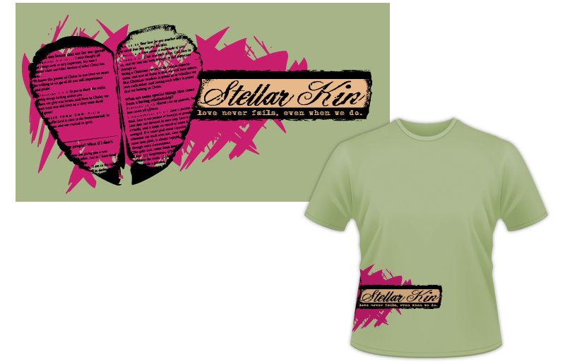
This shirt design is one of my favorites. I sought out to use an alternative placement from the beginning. Why not wrap the art around the side? The story of how the artwork came together for this jade green shirt is a unique one.
When I lived in Bowling Green, Kentucky, I came home from work one day to find that a neighbor’s home had burned down. Some of the debris had blown into my yard. I picked up a burnt piece of a page from the Bible. It instantly inspired me to create a unique band merch design. Not only did it contain scriptures about how we are called by God to love one another, it was distinctly shaped like one half of a heart. I scanned both sides of the page and simplified it to a simple high contrast solid black.
After I mirrored the two sides of the page to form the focal heart image, the phrase “Love never fails, even when we do.” came to mind. It sums up the main idea of the scriptures, as well as a personal mantra for myself. I set this text in a distressed typewriter font across a grungy faux papyrus scroll.
I distressed the band name “Stellar Kin” as well, featuring it in a pirate style script. Finally, I colored in the background of the art with some hot pink paint swaths to add extra chaos, while still tying the art together.
Your band needs a graphic artist for your apparel art.
I love working with independent musicians when they need merchandise designs. Bonus points for an unusual concept or a random twist on a conventional idea. Contact me today to get started!
-

-
Dogwood Lakes Newspaper Ad – Independence Day
-

-
Dogwood Lakes Memorial Day Event – Newspaper print ad
-

-
Dogwood Lakes Camping Resort – Newspaper Ad for Summer events
-

-
Newspaper Print Ad For Camping Resort Yard Sale Event
-

-
Spring events newspaper ad for campground
I created this newspaper ad design series while working for Dogwood Lakes Camping Resort in Dunmor, KY. The long beloved Western Kentucky campground held annual motorcycle rallies and concerts during my time working as their in-house Graphic Designer. Dogwood Lakes also held smaller community events, such as yard sales. Holiday parties and haunted houses also became popular.
The campground had grown in recent years, so I designed these ads to promote their upcoming events. The Greenville Leader News and the Central City Times Argus local papers featured the ads.
Newspaper ad design for clients in Kentucky

Dogwood Lakes as it appeared in the early 2000s.
My coworker Ricardo Lowenstein conceived the adorable Top Dog character. He provided a total of four posed illustrations for me to use in the newspaper ad design series. I then dressed the pooch up in Photoshop to fit the themes of these events.
Top Dog portrayed many diverse characters for a variety of special occasions. TD dressed as a vampire, Uncle Sam, a jolly pirate, and a mariachi singer. He rode in a go-kart for Memorial Day, hawked a velvet Elvis painting for the yard sale event, flew a kite, and munched on a yummy chocolate bar.
Other designers might have felt limited by the black and white newspaper format. However, I chose to look at it as a challenge. Without colors, I still used the elements I had on hand to create vibrant and fun newspaper ad design pieces.
The ads were so successful in getting the word out in Muhlenberg and Logan Counties that they attracted huge turnouts for the events. I always have fun reimagining characters in different scenarios in order to breathe new life into them.
Need a seasoned print advertising graphic designer? You need me.
What can a professional newspaper ad design do for your business? Old school is still cool! Contact me today to get started.

Dogwood Lakes Camping Resort / Dunmor, KY
Dogwood Lake(s) was a popular campground which featured two man made lakes. I grew up in Western Kentucky, just a few miles away from the park’s location in rural Dunmor, in bordering Logan County. I have many fond memories of swimming there as a kid, as well as watching their fireworks displays on the Fourth of July. During this period, Dogwood Lakes also operated an amusement park on site. The camping site held many special events throughout the year. I laid out and updated their annual print brochure design when I worked there on site in the early to late 2000s.
Print Brochure Design story for Western Kentucky Campground
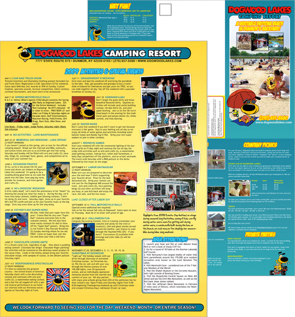
This twelve panel fold out features on site photos Dogwood provided me. These demonstrate the fun activities potential visitors could expect.
I also used several images of their mascot Top Dog. Talented illustrator Ricardo Lowenstein created TD. I dressed the lovable furball up in a variety of festive costumes to suit each of the events’ descriptions. Top Dog starred as a racecar driver, Uncle Sam, a pirate, as well as other fun characters. I also took this approach for Dogwood’s newspaper event ads.
I colored the print brochure design background simply in vibrant gradients of blue and yellow. These hearken to sunshine and clear blue waters, the perfect backdrop for outdoor fun. I set the main titles in the bold, lighthearted Badaboom font. Thus, the whole piece retains a fun, comic book style feel throughout. Recipients unfolded these big, beautiful brochures, and instantly knew they were in for a good time when they visited the park.

The Brothers Pizza | Owensboro, KY
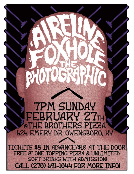
The Brothers Pizza was a great place to see live music and enjoy mouth watering Chicago style pizza. This rock concert poster design was inspired by my friend Andy (Frontman of Facedown Records metalcore band A Plea for Purging)’s newly shaven head.
Rock concert poster design story
First, I started off with a photograph I took at a previous show of Andy’s newly bald head. Then, I removed the background and roughened the edges of his outline using Adobe Photoshop. I added some noise filters and also increased the saturation for an illustration effect. I used the paintbrush tool to spell out the band names in order to simulate shaving cream.
Between the information blocks, I placed black silhouettes of vintage straight razors as dividers. I set all of the text in a specialty handwriting style font.
Finally, I added a series of purple silhouettes which depict modern disposable razors between Andy’s head and the black background. I arranged them in four columns at angles, which serve to draw your eye to the center of the composition.
A thick white frame boxes in the rest of the elements, but the purple disposable razors poke out in front of it. This technique helps to add depth to the overall piece. The pink, purple, and black combination creates a high contrast pop art feel.
I have probably made hundreds of poster designs over the years. This is one of my favorites. Although the head shaving theme had nothing to do with the show, it still caught people’s attention. The bands, the club, and many of the fans in attendance told me they loved it. It also help drum up more print design business for me.
Hire me to design your next show poster art
Are you a concert venue or an event promoter? Are you part of an independent band? I will design a poster that is as unique as you are. Let’s turn some heads together. Contact me today to get started!

Nathan Morris | Owensboro, Ky
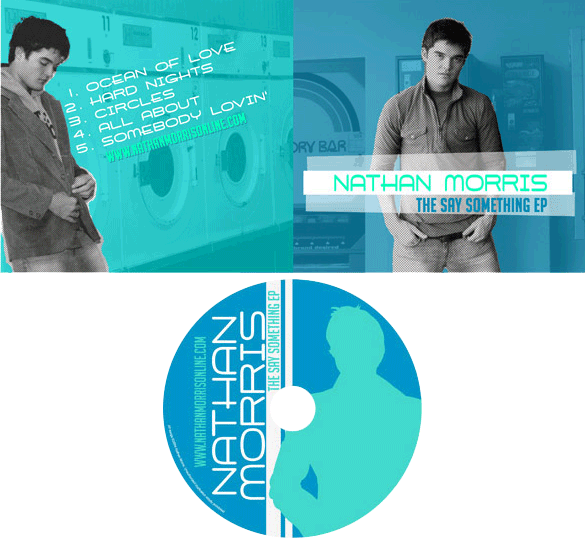
Singer songwriter Nathan Morris is an old friend who hails from Owensboro, KY. I designed this CD slip layout, which he used for his 2004 debut EP. Since “Natmo” dug the previous stickers and pop album art design I’d made for him, he hit me up again to create this CD art.
Pop album art design story
First, Nathan supplied me with the posed photography from a session he had taken at a local laundromat. His only directions to me were to keep it simple. He instructed me to use a color scheme that was both minimal and cool. I combined a mint green shade with a dark sky blue in order to achieve the effect.
First, I converted the front and back photos to black and white. Using Adobe Photoshop, I then cut out Nathan from the backgrounds. I did it in a sloppy, imprecise manner to give it a homemade, DIY feel. By keeping Nathan in black and white, while colorizing the background behind him, I made his image a focal point that really popped. This is ideal to introduce a solo artist via pop album art design.
Throughout the design, I used a combination of two fonts. The main title font has a feel that can only be described as retro futuristic. I supplemented it with one of my favorite fonts, the tall and bold face Big Noodle Titling. At the suggestion of my then-roommate Adam, I tilted the song title list on the back at the same angle that Nathan is leaning against the wall at. I also tilted the main title text on the front of the CD slip, displaying it on top of white strips which faux electrical tape. Finally, I simplified another photo of Nathan to make a silhouette on the CD face itself. I repeated the white strips as a 90 degree border, and also turned the text itself on it’s side.
Contact me to design your pop CD layout
Are you an independent musician who is in need of the perfect pop album art design? Why not contact me today? You already have a record that perfectly represents your sound. I’ll make you look your best, too.
