admin

Auto Repair Shop Website Design - Showcase

Auto Shop Showcase | Bowling Green, KY

Back in 2006, Gary Gunn hired me for various tasks in his automotive industry coaching business. I made sales calls, ordered inventory, and even interviewed job applicants. As time went on, Gary realized that he was not taking advantage of my skills as a print and web graphic designer. He then phased me out of my general office duties, and put me to work overhauling his company website and designing printed materials to mail out to his clients. Years later, he returned to the auto service industry after selling that company and waiting out his non-compete clause. When he started his new company Auto Shop Showcase, Gary hired me to set up his auto repair website design.

Auto Repair Website Design For Automotive Business Coach

When Gary reached out to me in 2023, he had a clear vision for his new site. He only needed a few pages, centered around two offers to reel in his potential customers, auto repair shop owners.

We dug deep and resurrected a previous campaign brand from his old business, Showcase. I created the logo years ago as a takeoff on the now defunct Showbiz Pizza, which I loved as a kid. I surrounded it with vintage entertainment tropes such as bright red stage curtains and vintage microphones in our marketing materials. These all returned in the layout of this new site.

Along with content heralding Gary’s qualifications as a business coach, this auto repair website design highlights links to each of those two offers. I created secure forms to add new customers to Gary’s sales funnel. Every form adds a tag to their contact information in Mailchimp, so Gary can add them to the right email journey. Gary’s business plan uses mainly Facebook ad campaigns to drive potential customers to these forms. I have helped with devising and managing these campaigns, as well as creating the artwork for each one.

Finally, I edit and post each of his long form videos for Youtube, and Reels for social media. A section on the front page automatically displays the feed of his most recent six Youtube uploads.

Contact Me For Your Auto Repair Website Design

Are you an automotive shop owner needing a facelift for your online presence? Could you be a business mentor or coach looking for someone to build a new site or regularly update it? Maybe you’re both, and you need a new auto repair website design. Contact me today to turn the key.

Real Estate Investor Website Design for Rob Rowsell

Rob Rowsell | Las Vegas, NV

Since 2020, I have managed web content and edited videos for Rob Rowsell. Rob is a San Diego native with a remarkable life story, detailed in his best selling book Addicted to Life. Previously, Rob owned multiple auto repair shops. He reinvested the wealth he earned there into multifamily real estate properties. Those investments grew his wealth greatly. Today, he coaches aspiring investors on how they can do the same. For the first few years I worked with Rob, I set up and managed a membership section on his site. As his clientele grew, the site demanded a redesign. This is the story of that investor website design.

Real Estate Investor Website Design Story

As the years ticked by, I consulted with Rob and his personal assistant on how to add more paying members. We all agreed his existing site needed a complete facelift. His publishing company initially created a cookie cutter template (poorly) designed to sell his book. His business model was gradually moving away from just selling his books and scheduling speaking engagements. Instead, he set new goals of attracting leads to try out one of his monthly Zoom meetings. Once they tested what Rob’s Inner Circle meetings offered, they might join his paid online coaching group.

Rob constantly travels all over the country, both buying and selling multifamily rental properties. He is also an inspirational and highly sought after public speaker. As such, he has to trust that we, his remotely based team, can carry out the vision he lays out for us in our weekly strategy sessions. Sometimes, we have to make judgment calls when he is unavailable to meet with us. It helps that I have paid close attention to his aesthetic tastes. I take detailed notes on every task that he needs done, so it is very rare that Rob requests that I make changes to his graphic design or video clips.

Building The Investor Website Design Layout With My Rental Property Manager Client

I replaced the bland, uninspiring site layout with a bold combination of blue, yellow, white, and black. These background colors organize the homepage into blocks that help emphasize Rob’s services, as well as testimonials from group members. I also included a section that highlights the newest free blog posted to the site’s library.

I sprinkled a combination of studio and casual photos of Rob throughout the site. These are bolstered by royalty free images related to real estate investment properties in both the blog entries and pages explaining Rob’s coaching and speaking services.

Simplifying the Website Content

When we planned Rob’s new investor website design, I advised him to simplify the existing content. Some of its  pages slowed down the site with large, washed out images that were not optimized. The site also suffered from overall content bloat. There were way too many pages in the menu. Many of those pages were either redundant or out of date. The only dynamic element that ever changed on the site was the slideshow on the front page heralding Rob’s awards and achievements. Therefore, I combined several pages, condensing the menu to just four important links. During my audit, I made sure not to delete any bonus content pages linked from the book via QR Codes.

As the new site came together, our team agreed that the focus of the site needed to shift. While Rob’s many awards and his life story remained, the main goal of the site was to entice investors to join his Inner Circle Community. Therefore, we made sure the new homepage boldly highlighted that membership group. Rob also spearheads mission trips in order to build homes in Mexico. Links to that information is also important featured content.

Property Investor Website Design: Behind The Scenes Features

Along with streamlining the website’s layout and content, I made many improvements behind the scenes. The secure online forms automatically add new contacts to Rob’s CRM (HighLevel). They are organized into tags as well. I also solved an issue where the forms were allowing a large amount of spam messages. Now, using Google ReCAPTCHA 3.0, only legitimate messages make it to Rob’s inbox.

In addition to the website redesign and ongoing updates, I worked with Rob Rowsell’s team to integrate direct message marketing workflows. When potential customers see his Youtube Shorts or Meta Reels, he wraps up with a call to action. The videos ask viewers to request a free PDF or other info via direct message. Customers send him a keyword via DM asking for the content. In exchange, they provide their email addresses. That then starts an automation. I set these processes up in HighLevel to add the users to his contacts under specific tags, just like the website forms. When users are added, they join a funnel of leads Rob’s PA maintains. She automates follow up campaigns to nurture those prospects.

Real Estate Blog Entries

Today, I still update and troubleshoot Rob’s investor website design. Each month, I edit his monthly Zoom call recordings into short clips. Then, I schedule them to post on his Youtube channel and his Facebook page over the following weeks. I also get even more mileage from these videos by writing weekly real estate blog entries that flesh them out in writing. Along with eye catching thumbnails, I write a blog post centered around a keyword for each video. This process of regular updates strengthens the site’s SEO (Search Engine Optimization). The site then attracts more views from Google searches.

See the investor website design in action here!

Do You Need Your Own Investor Website Design?

Do you invest in real estate, stocks, or small businesses? Perhaps, like Rob, you teach others wealth building investment strategies. In that case, you need a secure membership based investor website design. I have built and maintained sites like this since 2006. I have kept my focus on the ever evolving advancements needed to future proof them. Contact me today.
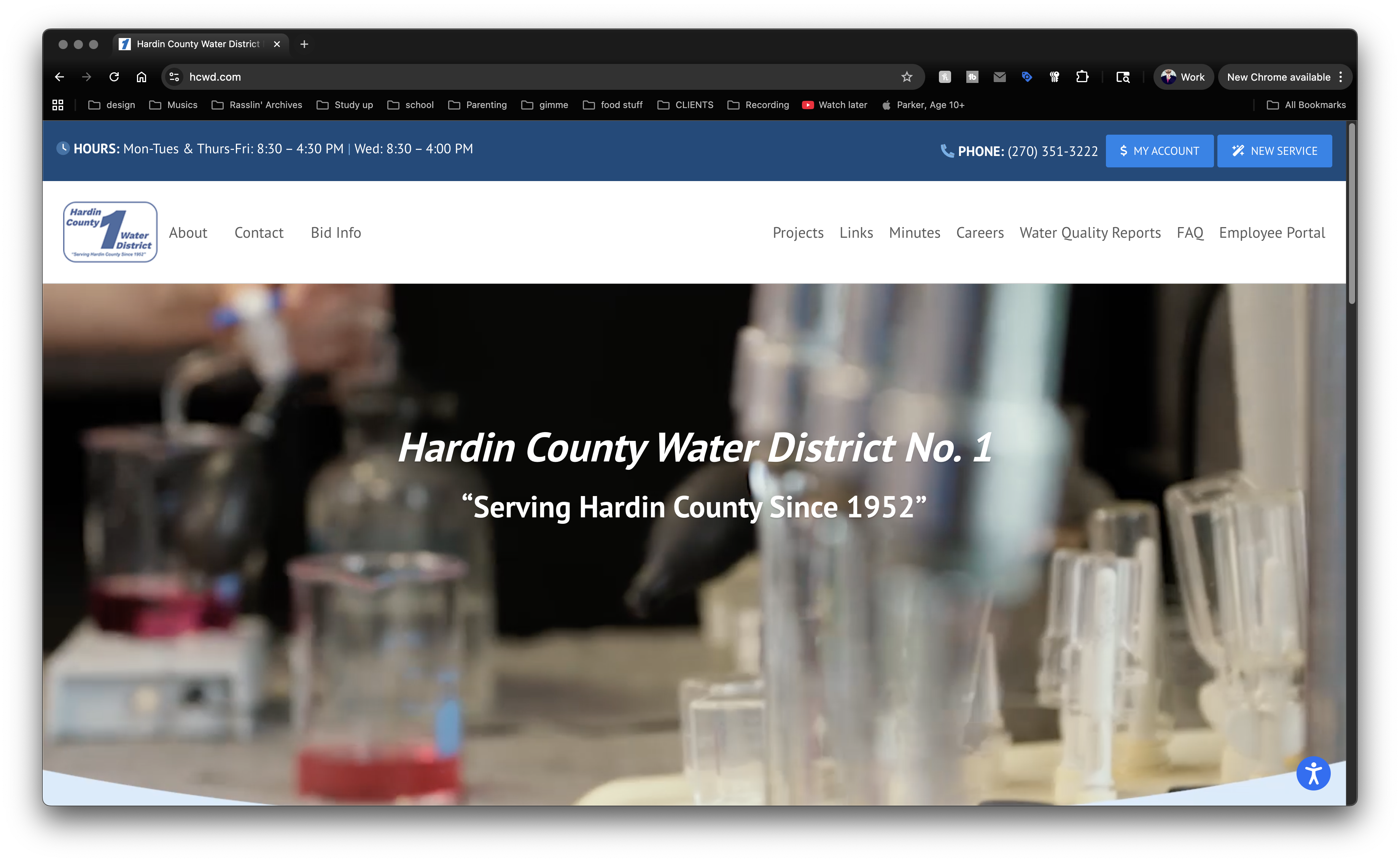
Skate Punk Concert Poster Design

Skunch | Lexington, KY

My band Sempervivi had to take long hiatus from playing out, due to me breaking two fingers in 2023. Since we could not perform live, I was not designing any flyers for shows. I got back in the game big time with this punk concert poster design, for our gig at the Euclid Avenue institution, The Fishtank.

Punk Concert Poster Design for Lexington, Kentucky Bands

I went into this project with intention of making it portfolio worthy. Also, I decided to try something new. This is the first print design I drew completely using the Procreate app on my iPad. I knew from the jump that I wanted to depict a skeleton performing a skateboard trick. What could be more punk rock than that?

After selecting the perfect skate trick photo to model from, I experimented with a few different pens and brushes. I outlined the skateboarder’s body, then studied images of skulls and bones to complete the skeleton figure. After sketching out the board and the skatepark, the black outlines were complete.

I then hand drew the text, listing out the show information. Rather than just copy and paste the band logos, I freehanded them in order to continue the “DIY” feel of the punk concert poster design.

Color And Finishing Touches

Once I was finished with drawing the black outlines, I imported them into Photoshop to complete the flyer. I employed a few more brushes and effects to color it in. The show date is warped into an arch at the top, colored in with a green to yellow to green gradient effect. I repeated that gradient on the skate deck, then added “stickers” referencing each of the bands to it. A “grunge” eraser brush gave the appearance of scuffs on the deck, as well as rips and fading on the stickers themselves.

After coloring in all of the foreground elements, I used a sponge brush and a few gradient and overlay effects for the cloudy sunset. I also blended the brush in faintly with the faded concrete of the skatepark, creating a watercolor feel. The outlines of the skatepark stayed lighter than the foreground elements, adding further depth.

Once I had colored in all of the elements, I felt like something was missing. I added some black splatters to the top and bottom of the punk concert poster design, which added weight and helped the show information stand out.

Do You Need a Punk Concert Poster Design? Contact Me!

If you can’t do it yourself, don’t worry. I’m your guy. Promote your big show with a punk concert poster design by the premier graphic designer in Kentucky. Holler at me.

Auto Shop Showcase Postcard Mailer Design

Auto Shop Showcase / Bowling Green, KY

My longtime client Gary Gunn started up a new business in 2023, returning to mentoring auto repair shop owners. Gary collaborated with me on his new website, as well as his online and print advertising campaigns. This postcard mailer design has been a huge success for Gary’s startup business. In fact, it has attracted several valuable automotive business owners to join his monthly mentoring meetings.

Postcard Mailer Design Story – Changing Business Model

Gary Gunn started his career in the automotive industry in 1979. When we first crossed paths in 2006, he hired me to work in office doing clerical duties, sales calls, and human resources tasks. Soon, he saw my talent for graphic design and allowed me to manage his website and lay out CDs and printed curriculum for his coaching clients. When I moved to Lexington from Bowling Green, KY years later, he kept me on hand as a freelancer. Gary eventually sold his coaching company and helped others start their own mentoring and coaching businesses. In 2023, he finished his tenure working with them and started a new business, Auto Shop Showcase.

Back side of the business coach postcard mailer design

The back side of the auto shop coach postcard mailer design.

Initially, Gary’s business model centered around interviewing shop owners and other automotive industry professionals. I got his podcast and Youtube channel up and running, as well as his website.

Soon, his business model changed, as business models often do. While his business’ end game was always recruiting auto repair shop owners to his monthly coaching calls, the weekly interviews were unsustainable. I soon shifted to editing daily social media Reels, in addition to the long form Youtube “Auto Shop Tips” videos. I created and managed his Facebook Ads, while laying out this postcard mailer design.

Getting Started

We all get bulk presorted mail in our mailboxes. A lot of what we receive is “junk mail” that we chuck in the recycle bin right away. Business owners especially are bombarded with unsolicited offers. However, the right offer, coupled with an eye catching layout, can break through. Gary and I collaborated to create just that. Which elements came together in order to create a campaign that continues to deliver results?

When Gary first came to me for this postcard mailer design, I already knew what he was looking for. Since I had designed print projects for him for so many years, I knew his tastes by heart. Our collaboration method has not changed much since I left Bowling Green and started working from home. Gary begins the process with a mockup in Microsoft Word. He includes a few suggested images, headlines, and copy in order to get his point across. I start by correcting any grammar and spelling errors and selecting the most effective text. Then, I make my own tweaks to it before moving on to Adobe Photoshop for the actual design.

Graphics And Layout For Direct Mail Card Design – Front Side

Regarding this piece, I already had the perfect stock image in mind. The older gentleman featured is a blue collar worker who looks like he could be right at home managing an auto repair shop. He is clearly frustrated. By what? In this instance, it is a lack of written SOP’s (Standard Operating Procedures). Without a clear operations manual, none of his mechanics, service advisors, or management know how to do their tasks properly. You can see why he is so frustrated!

Gary’s business Auto Shop Showcase has the solution. When a shop owner scans the QR code on the card with their phone, it takes them to an online form. When they provide their email address, they receive a free starter kit teaching them how to write SOPs, step by step. Gary also follows up with them in order to make sure they understand. This also opens the door for him to offer them a spot in his monthly mentoring meetings.

Returning to the elements that make the card effective, I added a motion blur to the shop owner, since he is shaking his fist. I employed a bright purple to pink background behind him, with an image of a repair shop faded into it. In order to make the headline pop, I used the wacky title font made famous by the video game Fortnite, heavily stroked in black. The phrase “Frustrated by SOPs?” is highlighted in golden yellow. Futura Black spells out the rest of the card’s content.

Back Of Card Art – Completing The Message

The back of the card repeats the faint automotive shop image, this time over a bright teal blue background. Gary’s smiling face is beaming to the left of his bio. The shop owner from the front of the card returns, this time with a smile of satisfaction on his disembodied head. A final nudge urges the reader to “End Your Frustration Now”. Clearly, it has been an effective campaign thus far. After all, many automotive repair shop owners have signed up for the starter kit using the link.

Do You Need Your Own Postcard Mailer Design?

Despite the many rumors of its demise, direct mail advertising is alive and well! Gary has had massive success in the auto repair industry with this campaign. It all starts with an eye catching layout. That all starts with an experienced graphic designer. Investing in my skills will pay your business back in spades, so contact me today.

Pop Art Poster for Rock Concert - Courtney From Work - Columbus, OH

Courtney From Work | Columbus, OH

Our upcoming gig with Wicked Peace and Courtney From Work was approaching. These bands are known for their energetic live shows and are loads of fun to hang out with. That’s why I chose to lay out a pop art poster design in order to promote it. The bright colors, halftone patterns, and exaggerated facial expressions common in vintage comic strip and pulp stories were perfect to match this bill’s vibe.

Pop Art Poster Design story

While perusing royalty free stock art online, I chose a few images that I could lay out in order to tell a story. The focal character in the top panel is on her phone, starting a rumor. In the next panel, another lady whispers the gossip into her friend’s ear. Finally, in the last panel, the man is frustrated at reading the news on his computer. These Jezabels have ruined his reputation!

In reality, the story came second to the details about the show. I patterned the venue and date displayed at the top after a comic strip name and author byline. The top panel heralds the headline act in a mix of bright blue and black, popping out from the speech balloon. “21+ Adults Only!”, the banner at the bottom of the panel declares. Underneath the main illustrations, I added the other band names in a classic comic strip font. Then, I accented the band names with two more eye catching pop art poster characters splashed over the stark black background. Finally, the poster declares the door charge “Only Five Bucks!”. You just can’t beat that for a night of entertainment!

Hire me to design your event poster artwork!

Are you promoting an upcoming concert or event? Looking to promote it with a splash of tongue in cheek kitsch? Then you should contact me today!

I’m a big time band merch nerd. Especially stickers. If I don’t have the money budgeted to buy a shirt or hoodie from a band at their show, I will at least purchase some stickers. They end up either on my truck, toolbox, or the filing cabinet in my office. I always make sure my band Sempervivi’s merchandise table is fully stocked with items ranging from inexpensive to higher priced items. In 2022, we were running low on previous sticker design concepts, so I took advantage of a Sticker Mule sale and stocked up. I worked up four different sticker design ideas and had all of them printed in order to offer some variety to our fans.

Sticker Design Story

Using the "Skate" sticker design on my favorite coffee cup.

The “Skate” sticker design on my favorite coffee cup.

First, I thumbed through some old line art books and picked out a nice roaring tiger. I colored in the tiger’s fur with a golden yellow hue. Then, I combined this expertly detailed illustration with our name uppercase in a vintage font. Our hometown “LEX KY” nestles between two simple lightning bolt icons in yellow, completing the first sticker design.

Since many would call our band’s genre “skate punk”, I incorporated a broken skateboard image into an old school signage layout. The bold image of the broken deck jumps out in front of the marquee font spelling our band name. Then, I added our hometown and Roman numerals for the year 2015 to the sticker design, commemorating the year when our band began.

I played with a few different different color schemes. The band members couldn’t choose between the two palettes I pared it down to, so we had both printed. I love the alternative “Joker” combination of mostly purple and lime green. The melon red and Carolina blue scheme is lighter, cleaner, and more fun.

Finally, I had been toying around with a rugged “stamp” style logo for the band. I jumbled the sizes of the letters and tilted them, creating a chaotic style to match our fast, loud punk sound. The final touches came together as I filled in the characters in neon pink and turquoise. Then, I outlined the letters in black and added a solid black shadow to the art to make it pop.

Stick with me, your trusty merch artist.

Every musician needs merch. If you are a live performer, your fans want to buy merch to support you. An inexpensive way to get started?  Contact me today to bring your sticker design to life.

Pedestrians Kentucky Blues Concert Poster

Pedestryans | Lexington, KY

Here’s a retro concert poster that I designed for a 2022 show at Lynagh’s Irish Pub in Lexington. My friend Destry is a classy lady who sings and plays bass guitar in the blues based alternative rock band Pedestryans. Her selfie game is on point, and she often rocks a variety of vintage styles. Featuring a classic 1950s style pin up girl would fit perfectly.

Retro Concert Poster Story

When I chose the vintage style pin up girl photo from my extensive stock image collection, I knew that I wanted to bathe it in an aqua blue tint. I overlaid the whole image with a wavy “static” pattern, so as to imitate vintage TV interference. Also, I envisioned wrapping the band names around the black vinyl record that she is holding. The bright pink and orange hues of the names help them stand out over the wax circle.

For the date at the top, I manually jumbled the letters in order to give it a retro, playful feel. I also jumbled the letters at the bottom of the page that spell out the venue name. The bright yellow date is encased in a typical 50’s “futuristic” style black curved shape. I then added a subtle gradient that fades the aqua blue to purple at the bottom in order to highlight “At Lynagh’s”. Other event information floats to the left and right of the pin up girl in black. Every retro concert poster needs a wave warp effect. I added this element in order to give it some movement and also to increase the kitsch factor.

I’m the poster designer you’ve been looking for!

Are you holding an event that would benefit from a retro concert poster design? I love incorporating vintage 1950s elements into promotional ads! Contact me today to get started.

Dream Lovers Podcast Website Design

Patch and Sara Drury | Lexington, KY

When I first moved to Lexington in 2009, I befriend Sara Drury and her husband Patch. Since that time, I’ve been privileged to work with them on a myriad of projects. The Drurys initially worked day jobs, but today, they both work for themselves from home. Sara built a successful life coaching business for women, while Patch collaborated on video projects and explored podcasting on metaphysical topics. Starting in 2021, the spouses came together to start a new podcast about dream analysis. In Dream Lovers, these certified experts share their knowledge of the subconscious mind, and interpret listeners’ dreams. As such, they needed a podcast website design. Naturally, they contacted me for a quick turnaround site. You could say I was now a podcast blog designer.

Podcast Website Design Story

Patch and Sara needed a basic, two page web design. The top bar features a media player, which automatically plays their newest episode. When a new show drops each week, I write a search engine optimized blog post to recap it. I select a fitting featured stock image, and center each post around a keyword, in order to help Google and other search engines find the site.

The Home page features a brief description of the podcast itself, as well as a call to action for listeners to submit their own dreams. A feed of blog posts summarizing each episode scrolls below the description. An expanded About page gives the reader more information about the show, as well as a larger player with a feed of all past episodes. Below that, the secure form to submit dreams and sign up for their mailing list displays.

Contact Me If You Need a Podcast Website Design

Patch and Sara’s podcast has a been a huge success from the jump. Dreams are a subject everyone can relate to. Everyone has had dreams that puzzled them, and Dream Lovers analyzes them in a thoughtful and entertaining way. If you have an idea for a show that listeners will love, you also need a podcast website design to complement it.  Hire me today to be your podcast blog designer.

LGBTQ Fairness Benefit Poster Design

Fairness WV | Huntington, WV

West Virginia based band Jay Parade offered my band Sempervivi a spot on this benefit show they were holding for Fairness WV. The guys liked my poster design for another show we did together, so they asked if I would donate my time for this cause. I happily agreed to provide this LGBTQ fairness poster design.

LGBTQ Fairness Poster Design Story

Josh from Jay Parade gave me all of the information about the equality event, such as the bands performing and the starting time. I contacted the venue, as well as Fairness WV, to obtain their logos. Since the organization had confidence in my skills, they did not insist on any specific design elements for the layout. Although I knew I wanted to include a rainbow in some way, I didn’t want to stoop to cliches or pandering. When working on a project such as this, it is easy to make it too cute. I needed to create an eye catching, bright poster that clearly announced what the event was, as well as its goal.

Using negative space for some of the typography was another goal. White “paint” splatters create that negative space in front of the rainbow color gradient background. I reversed out both the logos at the top, as well as the date and other information at the bottom. Then I added a rad rocker jumping with his guitar as the focal image. I reduced the image down to black and white, so it would stand out in front of the rainbow background. Once I added a motion blur filter, the guitarist was complete. Each of the band names features a perspective warp to give it some motion as it wraps around the guitarist.

When I put all of those elements together, I thought it was good, but not quite complete yet. In order to complete the LGBTQ Fairness Poster Design, I shrunk everything down and centered it. Then, I created an homage to the Appalachian mountains shared by West Virginia and my home state of Kentucky. I added some black and white mountain photos to make the new background. Now, the rainbow scheme really pops!

Contact Me For Your Benefit Fundraiser Art

Will your fairness campaign hold a fundraiser soon? You need a professional graphic designer to help draw attention to your benefit event.  Contact me today.

St. Patrick's Day Poster Design for Lexington, KY Irish Bar

Lynagh’s Irish Pub | Lexington, KY

I experienced some of my favorite memories of performing original music live on stage at Lynagh’s. Lexington’s finest Irish Pub was always good to me and my bandmates in Sempervivi. Since they are an Irish themed bar and grill, St Patricks Day was a hugely successful time of year for them. The Slams are a local favorite Celtic Punk style band. Therefore, booking them to play with us at the pub on this occasion was a no brainer. Of course, I took on the task of drawing up the St Patricks Day poster design, so let’s dive in, shall we?

St Patricks Day Poster Design Story

I knew right away that the central image would need to feature a buxom Irish lass. Therefore, the perfect illustrated stock image portrays a luscious redhead in green leprechaun garb holding aloft a mug of foamy beer. After adding her to the composition, I wrapped the event name around the circular frame behind her. “March 19th” displays in a scrolling banner using an old English style font, while each of the band names is “stenciled” on the wooden fence our lucky lady sits on.

Additional event information also displays in a lime and dark green box at the bottom. In order to add a little flair to the dark green background, I inserted some fizzy bubbles, mimicking those founding in the beer mug. Finally, I added a solid orange shamrock shape in each corner to contrast the green and tie everything together.

 Contact Me For Your Irish Pub Party Artwork

Are you planning a big concert event or party at your venue for St Patricks Day? Don’t press your luck! Hire a professional graphic artist with over 20 years of experience to design your poster. Contact me today!