band merch

Sempervivi

Lexington, KY

I’m a big time band merch nerd. Especially stickers. If I don’t have the money budgeted to buy a shirt or hoodie from a band at their show, I will at least purchase some stickers. They end up either on my truck, toolbox, or the filing cabinet in my office. I always make sure my band Sempervivi’s merchandise table is fully stocked with items ranging from inexpensive to higher priced items. In 2022, we were running low on previous sticker design concepts, so I took advantage of a Sticker Mule sale and stocked up. I worked up four different designs and had all of them printed in order to offer some variety to our fans.

Sticker Design Story

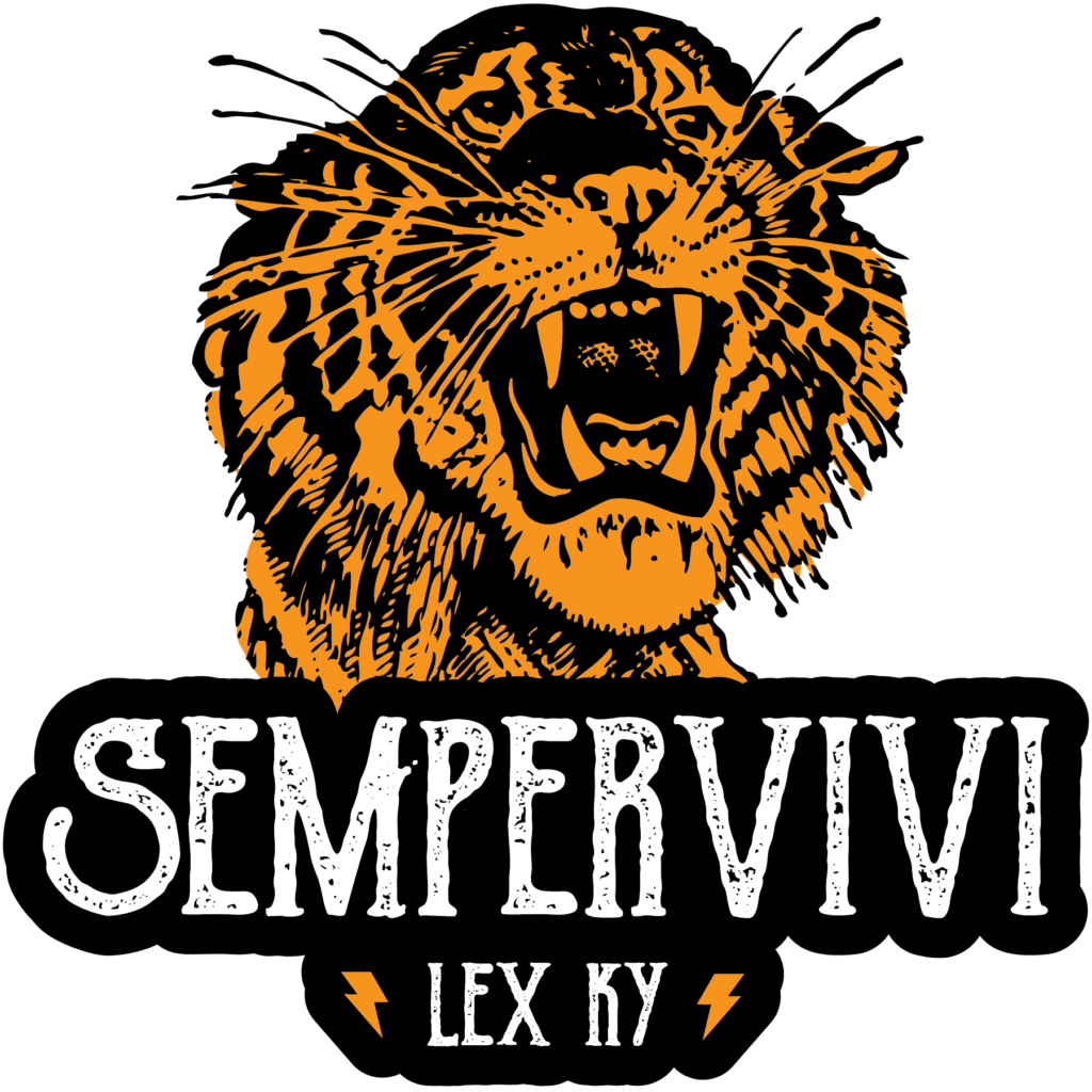
First, I thumbed through some old line art books and picked out a nice roaring tiger. I colored in the tiger’s fur with a golden yellow hue. Then, I combined this expertly detailed illustration with our name uppercase in a vintage font. Our hometown “LEX KY” nestles between two simple lightning bolt icons in yellow, completing the first sticker design.

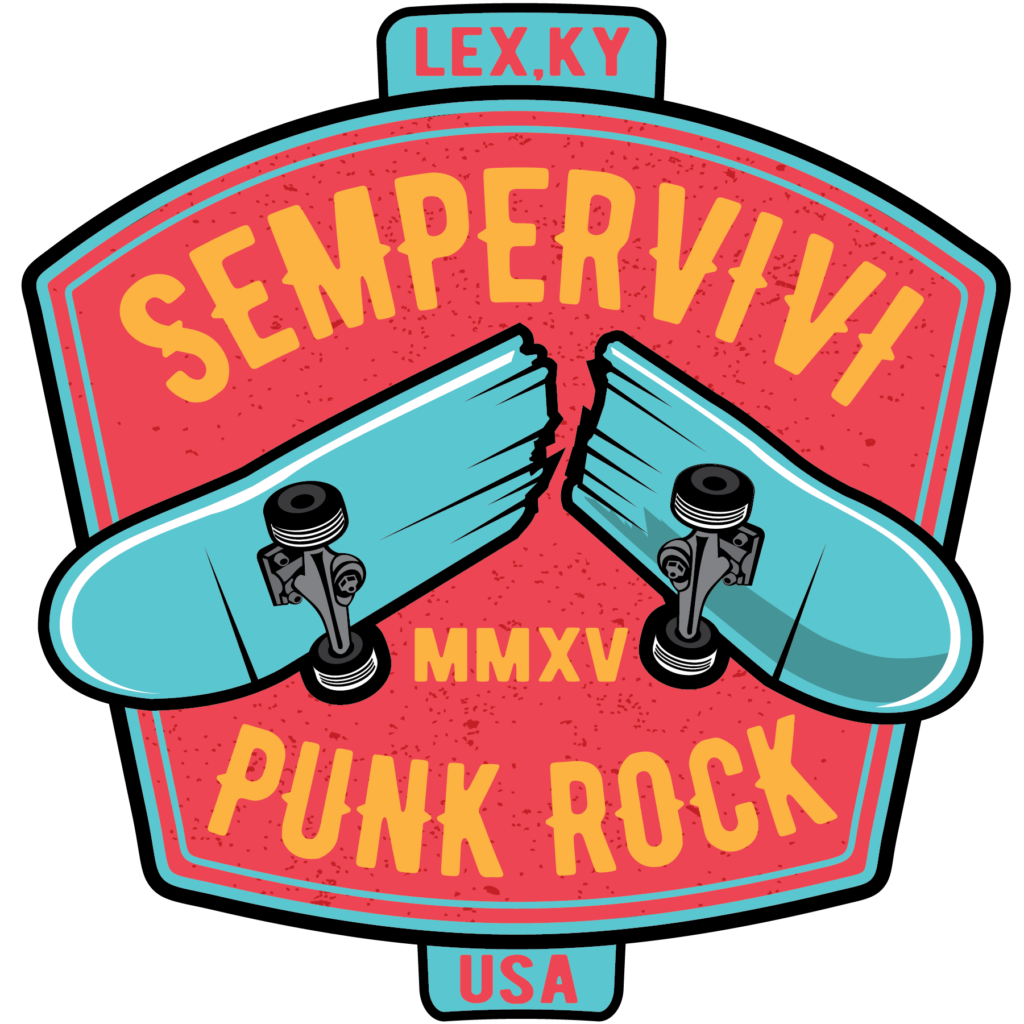
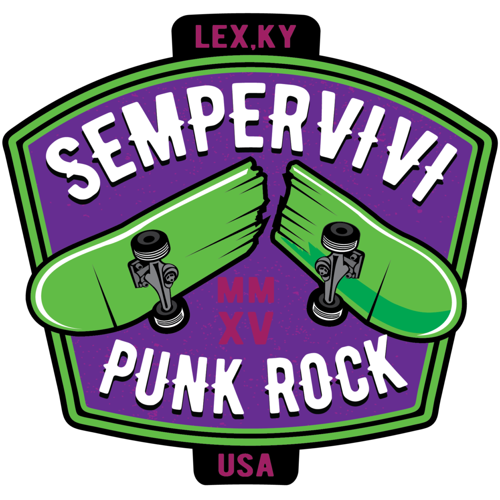
Since many would call our band’s genre “skate punk”, I incorporated a rad broken skateboard image into an old school signage layout. The bold image of the broken deck jumps out in front of the marquee font spelling our band name. I added our hometown and Roman numerals for the year 2015, the year when our band began. I played with a few different different color schemes. The band members couldn’t choose between the two palettes I pared it down to, so we had both printed. I love the alternative “Joker” combination of mostly purple and lime green. The melon red and Carolina blue scheme is lighter, cleaner, and more fun.

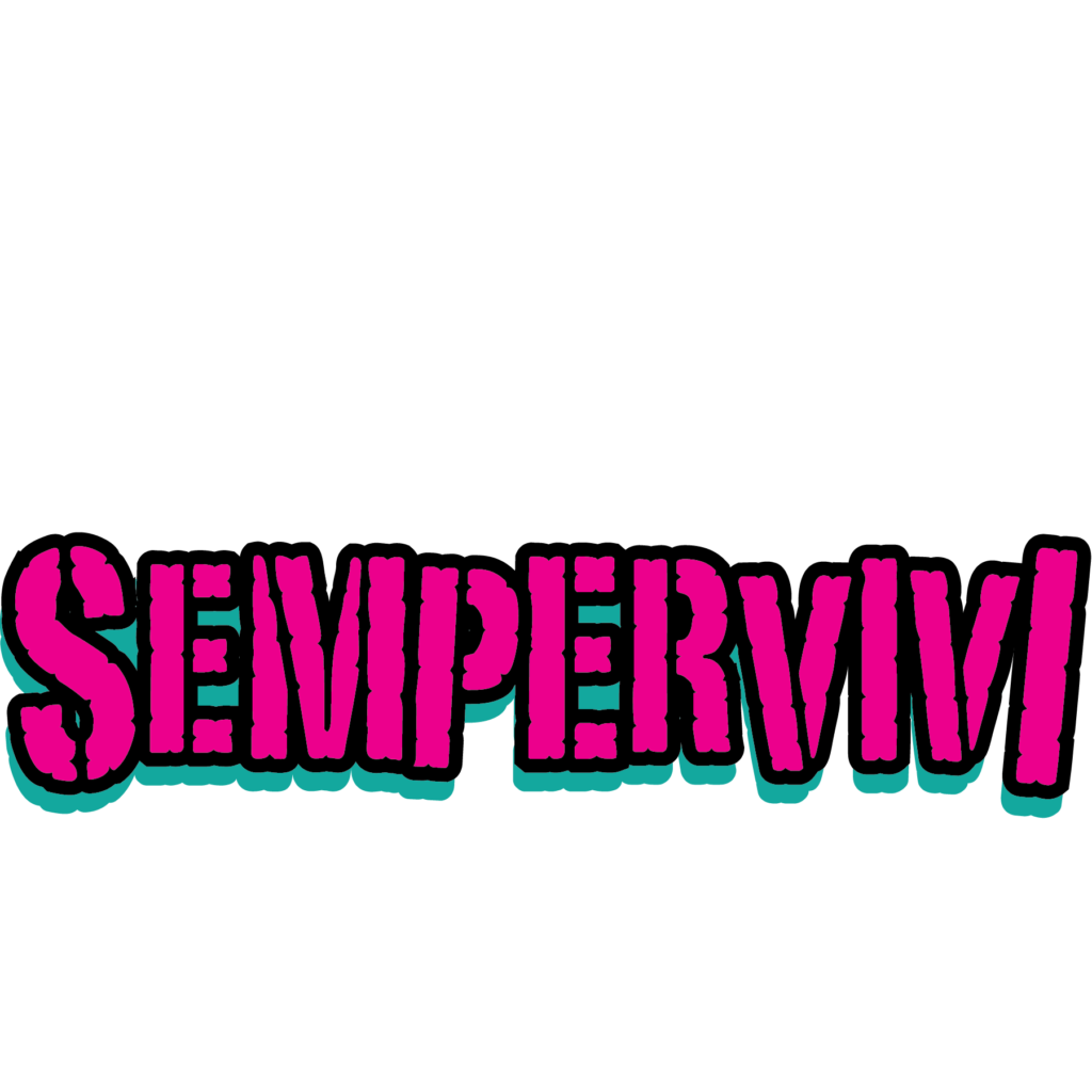
Finally, I had been toying around with a rugged “stamp” style logo for the band. I jumbled the sizes of the letters and tilted them, creating a chaotic style to match our fast, loud punk sound. The final touches came together as I filled in the characters in neon pink and turquoise. Then, I outlined the letters in black and added a solid black shadow to the art to make it pop.

Contact Me For Your Band’s Sticker Design

Every musician needs merch. If you are a live performer, your fans want to buy merch to support you. An inexpensive way to get started?  Contact me today to bring your sticker design to life.
Sempervivi Hoodie Graphic Design - Front and BackSempervivi

Lexington, KY

Since 2015, I’ve designed several shirts for my pop punk project Sempervivi. As the band has grown, so have our merchandise offerings. We decided to take the next logical step by putting out some hoodies. I have done hoodie graphic design before, but this was special, since it was for my own music project.

Hoodie Graphic Design Story

Printing hoodies can be expensive. I wasn’t sure if there would be a big enough demand for Sempervivi hoodies, so setting up a preorder on our website for a limited run made sense. Maybe my friend who prints our shirts (Jeremiah at Flesh and Blood Printshop) might have a few extra blanks lying around. I asked him, and it turned out he had a lucky number of 13 surplus hoodies, both pullovers and full zip ups. There was also a mix of black, dark green, and heather grey garments, in a wide variety of sizes, so it helped create a sense of scarcity.

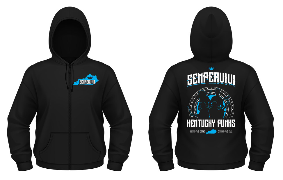
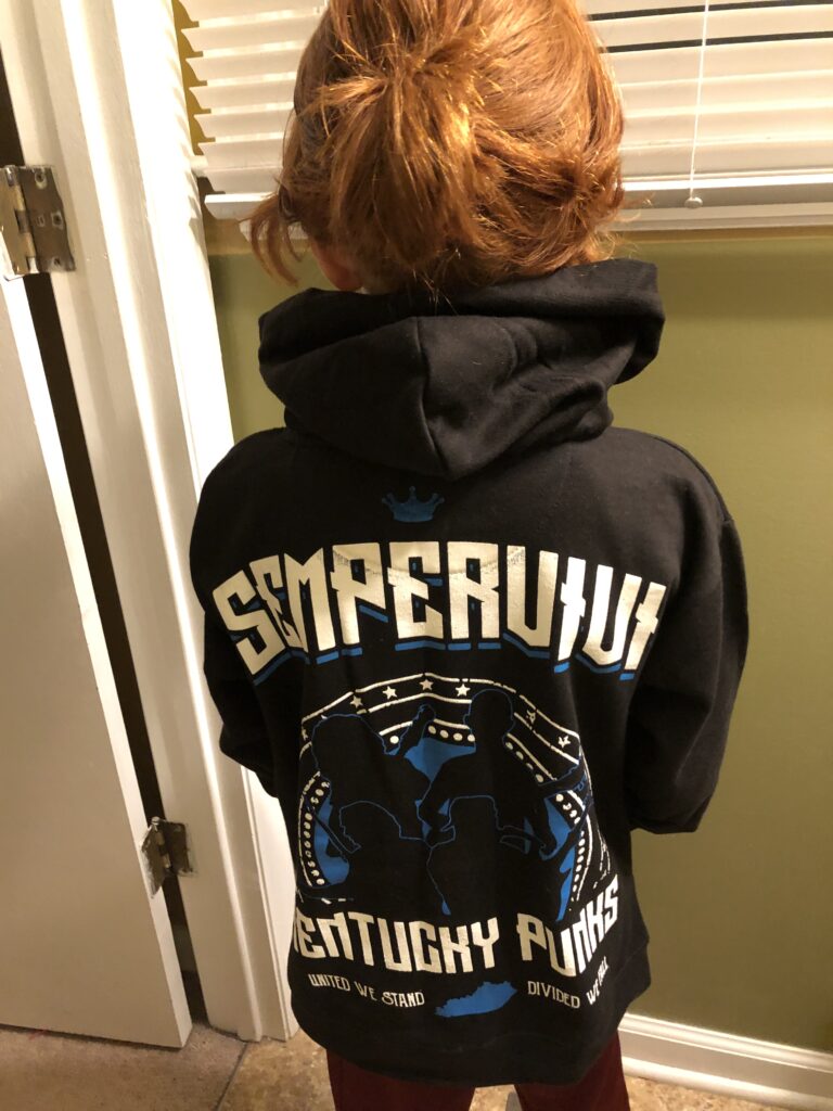
Once I got our plan in place, I started working on a design, which is backward from my usual order of doing things. Our bassist suggested that I create the design around silhouettes of us rocking out. I’ve done this theme several times over the years, both for artists and businesses. I used Adobe Illustrator to outline a few screen captures of live video footage, as well as some professional photos our friend Carmen had taken.

After I arranged the silhouettes, I framed them in a grungy circle of stars, adding the phrase “Kentucky Punks” underneath. To punctuate that phrase, I added our state’s motto “United We Stand, Divided We Fall”. Then, I arched the band name at the top using a tall retro title font. I adjusted the “M” for legibility, and added a small crown at the top to finish the back art.

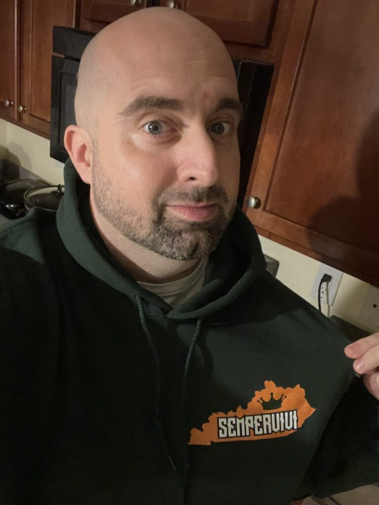
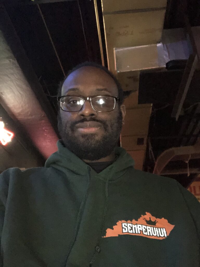
Finally, I added the front design to the left chest. The silhouette of Kentucky contains the new logo font without the arch, along with the crown.

Hoodie Graphic Design Color Variants

Since we were printing on three different colored garments, I asked our printer to use three different ink color combinations. In addition to this being our first hoodie design, it was our first apparel to feature more than one ink color. For the black hoodies, we used a combination of cyan blue and white. The forest green garments featured orange and white. Lastly, the heather grey hoodie graphic design was printed using black and pink ink.

When I finally nailed down the design and the color schemes, we set up the online preorder for our fans. Once we had sold enough hoodies in advance to break even, I sent the files to press. Suffice to say that everyone loved them!

Contact Me For Your Hoodie Graphic Design

Inspired to offer hoodies for your fans? Contact me today to create a hoodie graphic design for your own band or business.

Local Violence band sticker designLocal Violence

Lexington, KY

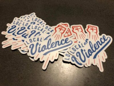
I created this band sticker design for a new group based here in Lexington. Local Violence is a pop punk band that includes some friends from my local music scene. I have been designing band merch since 1999, so they reached out to me in order to help promote their band.

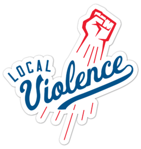
The finished product is ready for the masses! Here is a printed and die cut band sticker design.

The finished product is ready for the masses! Here is a printed and die cut band sticker design.

Band sticker design story

The band already used a fist icon in their initial branding. They wanted to somehow incorporate it in a parody of the Los Angeles Dodgers‘ iconic logo. I both cleaned up and recolored their existing fist art in red using Adobe Illustrator. Then, I added motion lines in red, so that it would mimic the Dodgers’ “flying baseball” image.

After that, I found a similar script font to replace the word Dodgers with “Violence” in blue. A few adjustments to the text made the font more authentic. Finally, the word “Local” tops off the design in a blue sans serif Varsity font. I spaced out the letters and also warped them with an arch effect.

At last, the baseball parody sticker art was complete.

Local Violence loved the finished band sticker design. They took advantage of a special promotion with Stickermule to both print and die cut their stickers. This created a white stroke effect around the design. The precise outline of the shape really stands out amongst other standard square and circle shaped stickers.

Hire me to create your band sticker design

Is your new band just getting your feet wet with merch? Perhaps you have been in the game for awhile and you all just need a fresh new design. Contact me today to hire me for your new band sticker design!