 Clash City Rockers
N/A
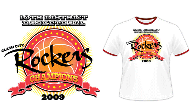
I made this basketball shirt design comp in order to demonstrate my skills to a custom sports apparel company. The team name is an homage to punk rock legends The Clash. It also commemorates a district tournament win for the fictional high school sports team.
Basketball shirt design story
First, I chose a red and yellow color scheme reminiscent of my high school alma mater, the Muhlenberg South Suns. Also, the main titles are set in black, which contrasts the white shirt. I made the most of a four color screen print to demonstrate my versatility. I blended many of the colors together in percentages, thus creating gradient effects.
My suggested basketball shirt design lays out on a white shirt along with bright red ringers for a vintage sports feel. I framed the requisite basketball shape with a bold red circle filled with bright yellow stars. Additional black and white strokes give weight to the frame. A burst of sun rays in the background completes the shape.
The word “CHAMPIONS” shines in a yellow to orange gradient, which pops off the shirt with a black shadow. It then adorns a stitched red ribbon in the foreground. I chose to set it in the bold serif Memphis font to give it a traditional athletic feel. “10TH DISTRICT BASKETBALL” at the top features a white to black gradient with a heavy black shadow. “2009” and “CLASH CITY” display in a heavyweight sans serif font, which is similar to Britannic Bold.
Finally, the word “Rockers” splashes across the front of the design in a thick, painterly script. This gives the apparel design an edge.
Do you need a basketball shirt design?
When your school needs a slam dunk basketball shirt design, contact me to get started. Together, we would make a great team!