 Lynagh’s Irish Pub
Lexington, KY
I experienced some of my favorite memories of performing original music live on stage at Lynagh’s. Lexington’s finest Irish Pub has always been good to me and my bandmates in Sempervivi. Since they are an Irish themed bar and grill, St Patricks Day is a hugely successful time of year for this bar. The Slams are a local favorite Celtic Punk style band. Therefore booking them to play with us at the pub on this occasion was a no brainer. Of course, I took on the task of drawing up the St Patricks Day poster design, so let’s dive in, shall we?
St Patricks Day Poster Design Story
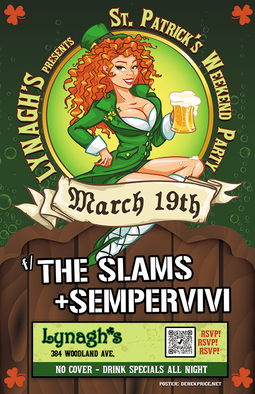
I knew right away that the central image would need to feature a buxom Irish lass. Therefore, the perfect illustrated stock image portrays a luscious redhead in green leprechaun garb holding aloft a mug of foamy beer. After adding her to the composition, I wrapped the event name around the circular frame behind her. “March 19th” displays in a scrolling banner using an old English style font, while each of the band names is “stenciled” on the wooden fence our lucky lady sits on.
Additional event information also displays in a lime and dark green box at the bottom. In order to add a little flair to the dark green background, I inserted some fizzy bubbles, mimicking those founding in the beer mug. Finally, I added a solid orange shamrock shape in each corner to contrast the green and tie everything together.
Contact Me For Your St Patricks Day Poster Design
Are you planning a concert event or party at your venue for St Patricks Day? Don’t press your luck! Hire a professional graphic artist with over 20 years of experience to design your poster. Contact me today!
 Fischbach USA
Elizabethtown, KY
I created this packaging design for my former employer, Fischbach USA. Fishbach is an international company that is the world’s leading producer of sealant cartridges. These cartridges typically contain caulk and other sealants for household and industrial use.
I worked in house at one of the US offices, which is located here in Kentucky. Most of the work I performed during my time there involved updating text on other companies’ arts. Companies such as DAP and GE come to mind. In this case, my employers assigned me a project to flex my creative muscles.
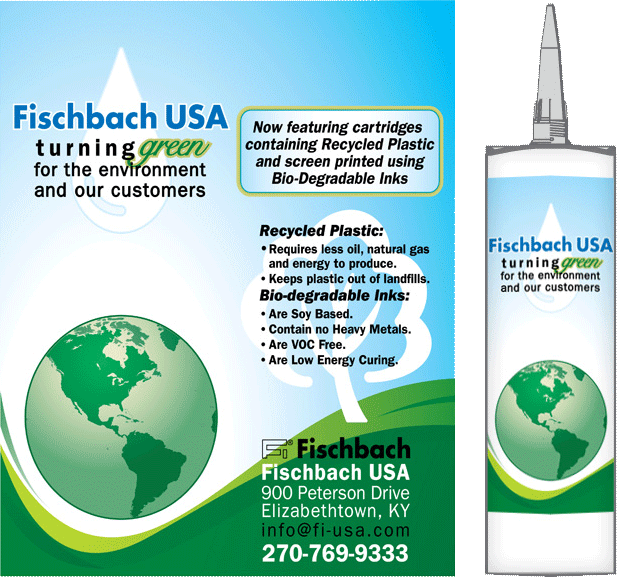
I designed this screen printed promotional item in order to tout the company’s environmentally friendly practices. Fishbach only requested that I use a certain set of colors and devise a nature theme. They also provided me with the copy for the tube. The rest of the details were up to me.
Environmentally friendly packaging design
This special run cartridge featured a conservation theme. As such, Fischbach partially manufactured it with recycled plastic and then tinted it a faint shade of green. The tube stated that the inks on the design were both soy based and biodegradable. Since the copy centered around conserving Earth’s natural resources, I went with a “clean Earth” theme. The green grass meets blue skies. A refreshing dewdrop and a globe surround the rolling hills. You can almost smell the fresh air!
Our screen printing process limited me to using five solid ink colors. Therefore, I made the most of that limitation. I have always prided myself on making the most of the least resources in my clients’ print projects.
Contact me today for your own packaging design
Do you need a packaging design that stands out above your competitors? Trust a graphic designer with the skill and experience you need. Contact me today!
 Lynagh’s Irish Pub
 Fischbach USA