 Troy Napier
Georgetown, KY
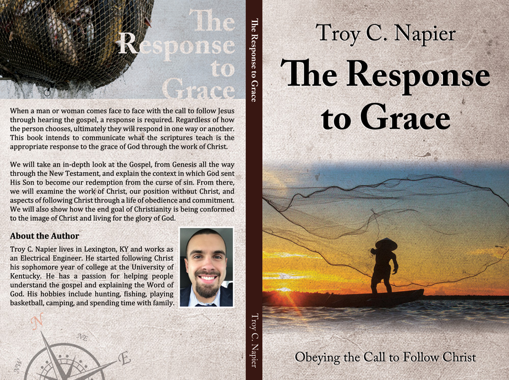
Troy C. Napier is an author from neighboring Georgetown, Kentucky. He contacted me to design the book jacket art for his first commentary The Response to Grace. Troy chose me because of my success working with other Christian authors. My reputation as a Christian book cover design artist was growing.

Troy, happily displaying the finished product.
Book Jacket Art For Kentucky Author
Since Troy did not have a specific vision in for this project, I worked with him to come up with the right book jacket art concept. First, he provided me with samples of some book layouts that he liked, in order to outline their positive aspects. I then pitched a few concepts based on different passages of scriptures in the Bible.
For example, I proposed centering the art around a close up photo of an ear (Matthew 11:15). Also, I thought of a runner lacing up his shoes and crouching at the starting line (Hebrews 12:1). Finally, we agreed on the concept of a fisherman. This idea was based on Jesus calling his first disciples in Matthew 4.
I first incorporated a royalty free stock image of a fisherman casting his net out on the water for the focal point of the book jacket art. I softened the edges of the photo and blended it into the grunge texture background. Afterward, I set the cover text in a classic serif font, mixing weights of that same font for variety.
The back cover features a picture of a net. Hundreds of fish fill the net to the brim. The book’s title text is reversed out of it. A compass image adorns the bottom of the book below the author’s photo and bio. The book is available as a paperback, as well as in Kindle format on Amazon.
Contact me today for your Christian book cover design
Are you an author seeking a graphic designer for your next book? I specialize in making faith based themes come to life. Contact me today.
 Marked Youth Camp
Illinois
I made this youth camp logo design for a United Methodist Church sponsored camp based in Illinois. It was an update of their existing logo, which made use of block lettering and a grunge “splatter” element. The Youth Pastor called me to reimagine it with a more modern look and feel.
Youth Camp Logo Design Story
First, I chose the weighty Rockwell Bold font, which was very popular at this time. A font that strong is impossible to ignore, especially with a high contrast design such as this. Then, I filled the letter “A” in red. This represents how Christians are set apart (“marked”) for the Lord’s service. Many of my favorite logo designs leave out the bridge in the capital letter A. I felt that this also helps this design stand out in addition to the color variant.
The client encouraged me to use some swirling vine elements, but to make sure they were “not too feminine”. This gives the design some flair, but is not too over the top. I added a thick black stroke outline around the elements to give it plenty of weight and contrast. Tilting the logo upward also helps to catch the eye. Gradient and embossing effects on the letter A, as well as the black background, help give it a high end feel.
The last elements I included were some subtle grunge cracks around the edges of the text, plus a splatter in the background to give it an edge. Finally, I drafted several variations of the concept for different purposes, such as those in which the grunge elements were not appropriate. This kind of versatility is important to clients who may need to appeal to different audiences for funding, for instance.
Let me create your group or church’s youth camp logo design
Does your church or youth camp need a fresh look? Rebranding could be the key to attract new parishioners or campers. I have extensive experience with religious content, as well as decades in the field of high end logo design. Contact me today to get started.
 Troy Napier
 Marked Youth Camp