Drifters Bar and Grill | Ironton, OH
My band Sempervivi booked a show at Drifters, a new venue in nearby Ironton, Ohio. I soon realized the booking was on November 1st, the day after Halloween. As usual, a brilliant idea came to mind. Why not make it a post Halloween event, as well as the usual punk show? I set plans in motion for a vintage style Halloween party poster advertising a chance for local music lovers to get one last wear out of this year’s costume and a chance to unload their unwanted candy.
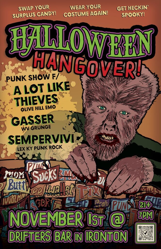
Halloween Party Poster By Lexington, Kentucky Graphic Designer
I started this holiday themed design by sketching out a few different concepts involving Universal Monsters. I drew scenarios involving Dracula, Bride of Frankenstein, The Mummy, and several other horror inspired creatures. In the end, The Wolfman won the day. I found a few good images of the classic movie monster, as portrayed by Lon Chaney, Junior and got to work.
I drew a simplified image of him in Procreate, as well as several empty candy wrappers. Rather than real life sweets, I created parodies of them. For instance, I renamed “Twix” to “Tix”, and Nestlé “Crunch” to “Punch”. This is my kind of humor, for better or worse.
I colored in the Wolfman, complete with melted chocolate around both his mouth and his fingers. Then, I added color to the candy wrappers and began assembling the rest of the layout.
Graphic Design: Poster Layout And Typography
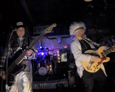
Sempervivi rocking out at the Halloween Party
After adding the dull orange background behind Wolfman and the candy, I then focused on the show info. I chose two scratchy grunge fonts to alternate between.
The neutral shaded taglines encourage the attendees to wear their costumes once again for the party. They can bring their surplus candy to trade, and “get heckin’ spooky!”
Below the taglines, I laid out a big, bold title. I used a decorative antique style font to spell Halloween in a spooky green and purple color combination. The word curves, giving it a “demented circus” feel. I spelled “Hangover” in blood red, staggering the letters along the bottom curve.
I then spelled out the band names in black with eerie green shadows behind them. A transparent yellow splatter underneath helps them pop off the page.
Halloween Party Poster Finishing Touches
Finally, I rounded out the poster with info in the footer. The venue, date and other information echo the green and purple color combination in the main title. I added a dark shadow above the table of candy wrappers in order to help emphasize the text.
The show was a blast! We made some new fans, and also connected with our fellow musicians in the other bands. I would like to think that the poster achieved its goal and drew in some people who might not normally check out independent, original music.
Do You Need A Custom Halloween Party Poster?
No spooky shindig is complete without a custom designed Halloween Party Poster. Contact me today.