website

Auto Repair Shop Website Design - Showcase

Auto Shop Showcase | Bowling Green, KY

Back in 2006, Gary Gunn hired me for various tasks in his automotive industry coaching business. I made sales calls, ordered inventory, and even interviewed job applicants. As time went on, Gary realized that he was not taking advantage of my skills as a print and web graphic designer. He then phased me out of my general office duties, and put me to work overhauling his company website and designing printed materials to mail out to his clients. Years later, he returned to the auto service industry after selling that company and waiting out his non-compete clause. When he started his new company Auto Shop Showcase, Gary hired me to set up his auto repair website design.

Auto Repair Website Design For Automotive Business Coach

When Gary reached out to me in 2023, he had a clear vision for his new site. He only needed a few pages, centered around two offers to reel in his potential customers, auto repair shop owners.

We dug deep and resurrected a previous campaign brand from his old business, Showcase. I created the logo years ago as a takeoff on the now defunct Showbiz Pizza, which I loved as a kid. I surrounded it with vintage entertainment tropes such as bright red stage curtains and vintage microphones in our marketing materials. These all returned in the layout of this new site.

Along with content heralding Gary’s qualifications as a business coach, this auto repair website design highlights links to each of those two offers. I created secure forms to add new customers to Gary’s sales funnel. Every form adds a tag to their contact information in Mailchimp, so Gary can add them to the right email journey. Gary’s business plan uses mainly Facebook ad campaigns to drive potential customers to these forms. I have helped with devising and managing these campaigns, as well as creating the artwork for each one.

Finally, I edit and post each of his long form videos for Youtube, and Reels for social media. A section on the front page automatically displays the feed of his most recent six Youtube uploads.

Contact Me For Your Auto Repair Website Design

Are you an automotive shop owner needing a facelift for your online presence? Could you be a business mentor or coach looking for someone to build a new site or regularly update it? Maybe you’re both, and you need a new auto repair website design. Contact me today to turn the key.

Real Estate Investor Website Design for Rob Rowsell

Rob Rowsell | Las Vegas, NV

Since 2020, I have managed web content and edited videos for Rob Rowsell. Rob is a San Diego native with a remarkable life story, detailed in his best selling book Addicted to Life. Previously, Rob owned multiple auto repair shops. He reinvested the wealth he earned there into multifamily real estate properties. Those investments grew his wealth greatly. Today, he coaches aspiring investors on how they can do the same. For the first few years I worked with Rob, I set up and managed a membership section on his site. As his clientele grew, the site demanded a redesign. This is the story of that investor website design.

Real Estate Investor Website Design Story

As the years ticked by, I consulted with Rob and his personal assistant on how to add more paying members. We all agreed his existing site needed a complete facelift. His publishing company initially created a cookie cutter template (poorly) designed to sell his book. His business model was gradually moving away from just selling his books and scheduling speaking engagements. Instead, he set new goals of attracting leads to try out one of his monthly Zoom meetings. Once they tested what Rob’s Inner Circle meetings offered, they might join his paid online coaching group.

Rob constantly travels all over the country, both buying and selling multifamily rental properties. He is also an inspirational and highly sought after public speaker. As such, he has to trust that we, his remotely based team, can carry out the vision he lays out for us in our weekly strategy sessions. Sometimes, we have to make judgment calls when he is unavailable to meet with us. It helps that I have paid close attention to his aesthetic tastes. I take detailed notes on every task that he needs done, so it is very rare that Rob requests that I make changes to his graphic design or video clips.

Building The Investor Website Design Layout With My Rental Property Manager Client

I replaced the bland, uninspiring site layout with a bold combination of blue, yellow, white, and black. These background colors organize the homepage into blocks that help emphasize Rob’s services, as well as testimonials from group members. I also included a section that highlights the newest free blog posted to the site’s library.

I sprinkled a combination of studio and casual photos of Rob throughout the site. These are bolstered by royalty free images related to real estate investment properties in both the blog entries and pages explaining Rob’s coaching and speaking services.

Simplifying the Website Content

When we planned Rob’s new investor website design, I advised him to simplify the existing content. Some of its  pages slowed down the site with large, washed out images that were not optimized. The site also suffered from overall content bloat. There were way too many pages in the menu. Many of those pages were either redundant or out of date. The only dynamic element that ever changed on the site was the slideshow on the front page heralding Rob’s awards and achievements. Therefore, I combined several pages, condensing the menu to just four important links. During my audit, I made sure not to delete any bonus content pages linked from the book via QR Codes.

As the new site came together, our team agreed that the focus of the site needed to shift. While Rob’s many awards and his life story remained, the main goal of the site was to entice investors to join his Inner Circle Community. Therefore, we made sure the new homepage boldly highlighted that membership group. Rob also spearheads mission trips in order to build homes in Mexico. Links to that information is also important featured content.

Property Investor Website Design: Behind The Scenes Features

Along with streamlining the website’s layout and content, I made many improvements behind the scenes. The secure online forms automatically add new contacts to Rob’s CRM (HighLevel). They are organized into tags as well. I also solved an issue where the forms were allowing a large amount of spam messages. Now, using Google ReCAPTCHA 3.0, only legitimate messages make it to Rob’s inbox.

In addition to the website redesign and ongoing updates, I worked with Rob Rowsell’s team to integrate direct message marketing workflows. When potential customers see his Youtube Shorts or Meta Reels, he wraps up with a call to action. The videos ask viewers to request a free PDF or other info via direct message. Customers send him a keyword via DM asking for the content. In exchange, they provide their email addresses. That then starts an automation. I set these processes up in HighLevel to add the users to his contacts under specific tags, just like the website forms. When users are added, they join a funnel of leads Rob’s PA maintains. She automates follow up campaigns to nurture those prospects.

Real Estate Blog Entries

Today, I still update and troubleshoot Rob’s investor website design. Each month, I edit his monthly Zoom call recordings into short clips. Then, I schedule them to post on his Youtube channel and his Facebook page over the following weeks. I also get even more mileage from these videos by writing weekly real estate blog entries that flesh them out in writing. Along with eye catching thumbnails, I write a blog post centered around a keyword for each video. This process of regular updates strengthens the site’s SEO (Search Engine Optimization). The site then attracts more views from Google searches.

See the investor website design in action here!

Do You Need Your Own Investor Website Design?

Do you invest in real estate, stocks, or small businesses? Perhaps, like Rob, you teach others wealth building investment strategies. In that case, you need a secure membership based investor website design. I have built and maintained sites like this since 2006. I have kept my focus on the ever evolving advancements needed to future proof them. Contact me today.

Sara Drury - life coach website design for podcaster

Sara Drury | Lexington, KY

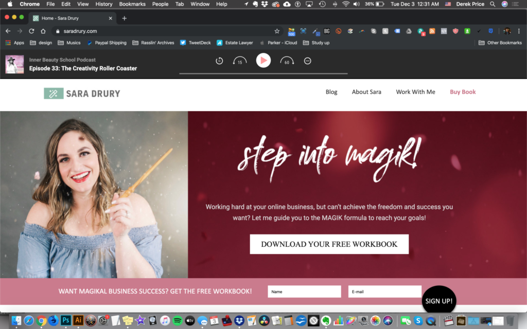
Sara Drury is a long time friend of mine. Throughout the years, she has worked with me on a variety of projects. In the Summer of 2019, she approached me about revamping her website, since she would soon be releasing a new book. She was transitioning away from a makeup focused business model to a holistic one that benefitted many aspects of women’s lives. As such, she needed to change her primary web domain name. I contacted her domain registrar directly in order to get all of that sorted out. I had a lot of ideas on how to help her reorganize the content on her life coach website design.

There was no time to waste, so Sara and I got to work brainstorming content right away.

Life Coach Website Design story – Layout and Design

As we exchanged ideas, it became apparent that she needed to emphasize the ways potential clients could engage with her. Sara’s main point of entry at that juncture was a free PDF workbook offer. The existing site displayed it both as a featured area above the fold on her site and in a popup. The call to action added potential customers to her email list funnel. She also hosted a weekly podcast, usually focusing on female empowerment, which sometimes featured business leaders as guests. With her book launch looming, we discussed ways to update both the layout and copy to help guide users more effectively.

Sara Drury refers to her business’s specific brand of life coaching as “magik”. Her method focuses on helping women nationwide find success. She specifically stresses that practicing meditation can tap into the strength found in the subconscious mind. Positive affirmation mantras are also useful keys for building her clients’ confidence. That could conceivably sound intimidating or fishy to those who are uninitiated. Therefore, it was very important for the site to appear as friendly as possible. Sara’s spunky and inviting personality comes across in the redesign. Everything from the photography, to the icons, to the font choices is important in getting this across to her visitors.

Website Design Colors

Sara sent me a very helpful guide for her brand’s media assets. It consisted of the hex colors I needed to adhere to. Bold, vibrant shades of pink and red leap off of the page. The occasional mint green accent gives just the right amount of spice to the palette. Otherwise, the site is mostly a clean, white background throughout. This lets the site breathe.

Life coach website design client Sara Drury

The Magik Maker herself, Sara Drury!

Content Optimization for Sara’s Site

As far as her changes in content went, we discussed several ways in which we could streamline it. We whittled down the menu to a much more laser focused four items. We chose to de-emphasize any pages and posts that continued to promote her skincare and makeup tutorials. Since her business model was changing, the site’s content needed to follow suit. As Donald Miller is prone to say on his podcast, “If you confuse, you lose.” In fact, his best selling book The Story Brand is a mutual favorite of Sara’s and mine. We referred to it often while finding the overall tone of her redesigned site.

Sara tasked me with editing her biography as well, which was featured on the About page. She provided a great starting point. From there, I edited a few of her grammatical and spelling errors. Afterward, I tightened up some of her sentences’ structures to make them flow better. Also, I made sure to add all of the appropriate links and images. I did this in order to give her potential clients the complete picture of Sara’s personality. That way, the services she could provide to them would become much clearer.

Business Coach Website Designer – Finishing Touches

I added a podcast player for her “Inner Beauty School” show in a discreet grey colored strip at the top of the home page. It incorporated Sara’s Libsyn RSS feed information, so that users could subscribe to the podcast right from their mobile phones. Alternately, they could choose to download the newest episode of the podcast. I also reconfigured her blog section to feature the most recent podcast episode in each entry, with optimized show descriptions.

Finally, Sara had a few important lead capturing pages already set up off site. These served as order pages for her books and workbooks, which in turn added people to her email list. I made one last run through of all of her content so I could make sure that those pages were properly set up and linked. At last, everything on the site was well organized, and in harmony with the corresponding lead capturing pages.

Visit the redesigned SaraDrury.com here!

Contact me for your Life Coach Website Design

Finally, we wrapped up the production on her new life coach website design. Afterward, Sara and I agreed to continue working on the site’s content together going forward. I committed to help her to keep the site regularly updated. My duties also included keeping each of her blog posts optimized. This would help Google and other search engines to find them more easily. We have also made a pact to help each others’ businesses grow by referring each other when possible.

Do you run your own life coaching business? Let me help you to maximize your website to reach the clients you need. Contact me today to get started.