library

Yoga poster design for kentucky libraryMuhlenberg County Public Libraries

Greenville, KY

The library director Janet contacted me regarding this project. She needed me to turn this yoga poster design around shortly after New Years. Of course, I made time after the holidays for my long time clients.

Yoga poster design story

Janet only provided the text to include on the flyer, and the format sizes I would need to design. I had worked with the library for many years, so she trusted my instincts to create the perfect promotional material. Of course, I instantly had a concept and color scheme in mind.

Initially, I envisioned a group of silhouettes performing yoga poses. Combining these with an ornate mandala pattern hearkened back to yoga’s origins in the country of India. I didn’t want to make the yoga poster design layout too busy. Therefore, I faded the mandala into the background.

I contrasted the dark, dull blue elements against the bright orange burst background. The images stayed simple. The background however included a three dimensional pattern. I fenced all of the elements in with a dotted white frame, which also helped emphasize the sponsor logos and tagline in white. These were located at the bottom and top, respectively.

For the yoga poster design main title, I chose a font containing characters similar to Hindi for the word “Yoga”. The capital “Y” moved up to make it more symmetrical. I set the words “IN THE LIBRARY” in another unusual font. I warped them in a waving flag shape. This added just the right amount of motion to the title.

Janet and the rest of the library staff loved the vibrant, inspirational design. It perfectly promoted that library patrons could stick to their New Years resolutions, and get fit with a new exercise program.

Contact me for your own yoga poster design

Are you promoting an event centered around yoga, or another exercise? I believe that promoting fitness in your community is very important, and I would love to help! Contact me today!

Library Event Poster for 2019 Spring Tea eventMuhlenberg County Public Libraries

Greenville, KY

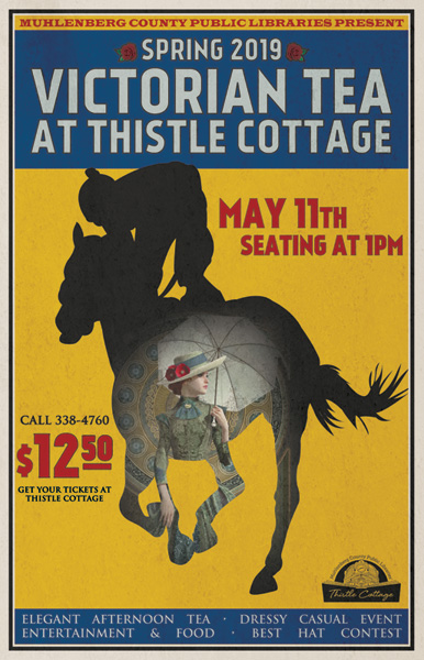
In previous years, I employed line art from Victorian age ads for MCPL’s annual Mother’s Day Tea. However, I decided to switch things up for the 2019 event. The library wanted to incorporate a theme to coincide with the Kentucky Derby. Therefore, I set out to create an authentically vintage library event poster.

Library event poster design story

I spent several hours studying minstrel show advertisements from years gone by, circuses, and other attractions. Their font treatments and type styles specifically caught my eye. These are crucial elements in capturing the look and feel of these posters. After much internal debate, I settled on a muted yellow, blue, and red color scheme. I then chose my fonts.

Library event poster typography

First of all, I employed a tall sans serif font called Kankin, reminiscent of those used in the vintage posters, for my my titles and large text. I outlined all of the large text in a thin black stroke in order to complete the period style. Next, I used the Wide Latin serif font, along with Trajan Pro, to spell out the rest of the content.

The director also suggested I incorporate some roses in the poster as part of the Derby theme, so I worked them into the main title. I situated one on either side of the words “Spring 2019” at the top to give it a little extra flair.

Horse outline used in library event poster

For a while, I had wanted to incorporate an image inside a silhouette, much like in many classic movie posters. Once the idea came to me, I jumped at the chance. The classic Victorian lady depicted could very well be on her way to a horse racing event of the day. I chose the silhouette of a jockey and horse that was the most obvious, since it was an action shot. The jockey is high up on the horse’s back, ready to cross the finish line, as the horse’s tail swishes in the wind.

Need a library event poster design? Contact me today!

Does your public library have a special event coming up? Then you need to hire a professional graphic designer to help with your advertising!  Contact me today.

Responsive library web design for Cynthiana, KY public library

Cynthiana Harrison County Public Library | Cynthiana, KY

Word gets around amongst Kentucky librarians! I have done print and web work for Muhlenberg County Public Libraries for years. Because of this, MCPL’s director recommended me to the staff at nearby Cynthiana’s library system. Cynthiana-Harrison County desperately needed a new library web design to replace their dated online presence.

Library web design colors and appearance in Kentucky

Cynthiana’s staff reached out to me with a long list of features to add, as well as content to update. Their existing site was nothing short of a relic. It had not been upgraded in years, and was not compatible with modern users’ phones and tablets. In short, the library web design needed a complete makeover to bring it up to date.

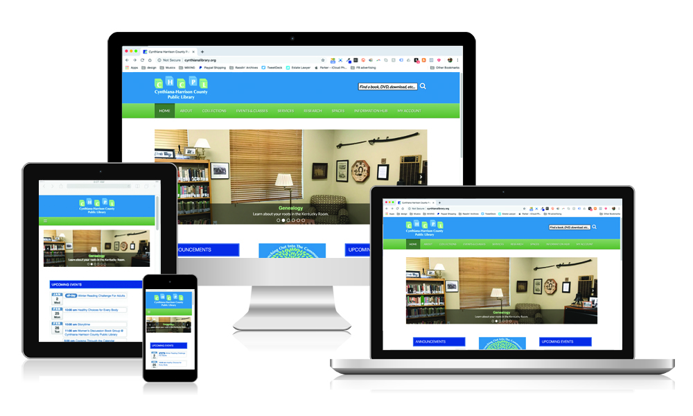
The first order of business was replacing the drab maroon and grey color scheme. I instead used a clean, bright pallet of blues and light greens. These colors lined up nicely with their new “tree and building blocks” themed logo design.

Features incorporated in the new design

A pleasing, modern appearance is important, but if the site lacks important features, it is worthless. I worked closely with the staff to craft a site true to their slogan “Branching Out Into the Community”. From the top down, Cynthiana’s redesign is feature packed, both for tech savvy users and others who are not. Every important feature sitewide is easy to find from the home page. Whether customers are using tablets, phones, or their desktops, the site is fully responsive.

Patrons can search the library catalog directly from the search box in the header. They may also drill down by choosing from categories in the site’s menu. The menu also outlines all of the many programs, services, and spaces the library offers. As the user scrolls down this library web design, the menu sticks to the top of the browser window and follows them.

A responsive slider sits beneath the menu. It highlights key content throughout the site with relevant images. I stress to my clients the importance of featuring real people engaging in their products and services. It was evident right away that Cynthiana’s library is a crucial community hub. The photos throughout the site reflect this so well.

Below the slider, three columns of widgets expand on what the library offers. The Announcements section lists excerpts of both library and community news. It links to the library’s blog for further information. In the middle, graphics link to online apps and services. The right column features a list of upcoming events. When users mouse over each listing, a graphic and excerpt pops up. They may click to register for each event and access more information.

Visit the site here.

Hire me to create your new library web design

Kentucky’s public libraries are important to both me and my family. I consider it a privilege to work with library staff to provide their ideal solutions. Does your system need print design or a perhaps a new library web design? Contact me today to get started.

Christmas event poster design for Muhlenberg County Public LibraryMuhlenberg County Public Libraries

Greenville, KY

At the end of each year, I create the Christmas event poster design for my hometown library system in Kentucky. This is always one of my favorite seasonal projects to plan and execute. I love being a Christmas poster artist!

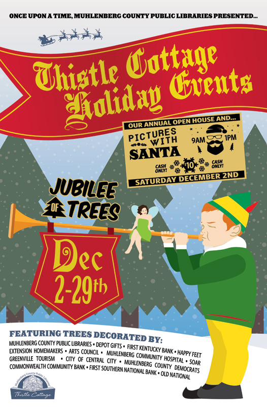
Muhlenberg County’s annual holiday events take place at their Thistle Cottage location. Thistle Cottage is a converted historic home which is located in the county seat of Greenville, KY. Many local businesses sponsor the Christmas trees that go on display throughout December at the Jubilee of Trees.

Also, kids of all ages get to take pictures with Santa Claus himself one day during the proceedings. I love coming up with a new, distinct solution for this seasonal project each and every year.

Focal image in Christmas event poster design

Since I had previously made liberal use of stock photos for their campaigns, I did not want to repeat myself. A holiday theme can be limiting if you don’t put much thought into it. Therefore, I wanted to try something both different and distinct from past projects this year. Something special was in order!

I conceptualized a simple, flat illustration which would make use of a minimal number of colors. Not unlike TV’s South Park, the cut out style gave the promotional material a lighthearted feel.

First, I used the Adobe Illustrator application to create the focal image of the poster. I drew up a pint sized elf playing a medieval style trumpet to announce the events. I actually based the illustration on a picture of my three year old son from his birthday photo shoot. He is wearing an outfit which is modeled after Will Ferrell’s character Buddy from the film Elf. The green and gold uniform is complete with a red feather in his cap. A royal red flag draped over the trumpet, heralding the December event dates. I used a mix of antique style fonts that looked like they could easily adorn a Middle Ages castle.

A tiny, smiling fairy is sitting cross legged atop his trumpet. She holds a sparkling wand in her hand, and plotting holiday mischief. I actually based the pixie’s image on a photo I had taken years ago of my wife. I added wings and recolored her dress green like Disney’s Tinkerbell.

Additional elements in the Christmas event poster design

The snowy background scene in the posters consists of rolling hills and pine trees. I desaturated the trees’ colors to dull hues in order to make it obvious that they were far off in the background. The hill in the distance is also slightly darker to achieve that purpose. In addition to the elf and fairy, the foreground elements announce the ongoing Jubilee of Trees. I continued using the simple logo I created for the event years ago.

Also, a “want ad” style poster provides all of the details for the Pictures with Santa event. I chose a simple, one color “hipster” interpretation of Old Saint Nick. The silhouette image comes complete with ironic horn rimmed glasses. The client asked if the Santa Claus image was me, since my wife and son depicted the fairy and elf, respectively. A bright red waving banner with gold trim displays across the top. I set the poster’s main title in an Old English style font called “PlainBlack”.

Many fonts I considered from my font book were perfect, stylistically. Unfortunately, they were also too hard to read. That is a big no-no for a poster design, especially for the main title text. I made sure to select the perfect font, which was both legible and regal. The white space at the bottom displays a list of event sponsors. The Thistle Cottage logo I designed years ago also displays in a pale shade of blue. Last of all, I sprinkled faint snowflakes throughout the scene.

Christmas poster artist – adjusting image formats for different situations
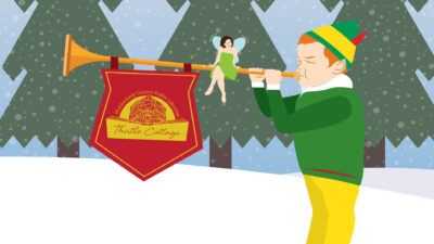
The simplified Facebook ad featured my Thistle Cottage logo on the elf's flag instead of the dates.

The simplified Facebook ad featured my Thistle Cottage logo on the elf’s flag instead of the dates.

After I finalized the design, the library distributed the final product in a variety of print sizes. First, they needed it in the largest print format, which was an 11×17″ poster. I then resized the elements and rearranged them to fit in a half page handout. Next, I created two different sizes for two local papers’ print newspaper ads. Both of the publications have their own sizes and specs, so I had to follow them closely.

They also promoted the event extensively on their social media channels. I modified the design so that it would properly fit on the public library system’s Facebook Event page. Facebook’s graphics specs limit the amount of text that advertisers can use. The graphics themselves also need to be formatted so that the feature images are positioned in specific locations. This way, every part of the image will display as it should, regardless of which device users view it on. Thus, I had to get creative, so that I could fit it into that mold. This was no problem for me, of course. I always make sure to stay informed on current social media advertising trends.

Contact me for your Christmas event poster design

The staff at Muhlenberg County Public Libraries always tell me that they love my work. Why not try me, a dedicated Christmas poster artist, for your own event ad campaign? You might just become one of my repeat customers as well! Contact me today to get started!

Wolfe County Public library Logo design by Derek PriceWolfe County Public Library

Campton, KY

This Eastern Kentucky reference center commissioned a library logo design and a website package. My hometown clients working at the Muhlenberg County Public Libraries recommended me. I previously had also provided a logo and website for them.

Traditional style green library logo design

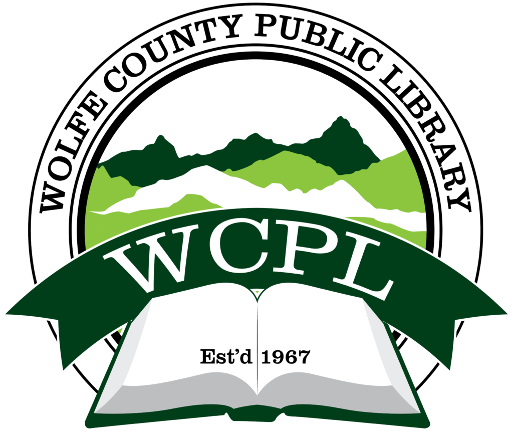
The library board did not request very many specifics at first. They needed a strong, traditional mark which incorporated shades of green. Therefore, Wolfe County’s staff chose the tried and true “donut” ring format from my initial mock up sketches. If it’s good enough for Starbucks, then it’s good enough for my clients. I selected the classic and strong Clarendon font to use throughout the library logo design. A serif font such as Clarendon is always a winner in applications like these. After that, I then wrapped the text “Wolfe County Public Library” around around the ring frame. Outline strokes of varying thicknesses in the ring helped give the mark a subtle uptown feel.

The arched ribbon that reads “WCPL” is the focus element, and also suggests a bookmark. The opened book in front of the ribbon creates depth and perspective. A simple “Est’d 1967” in front of the book reminds viewers of the library’s staying power in the community.

Finally, I topped the design off with the green and white mountains that sprawl in the background. These elements are a nod to the beautiful mountains and hollers throughout Eastern Kentucky. WCPL ordered several tweaks and revisions as the process went along. In the end, however, the library board were very happy with the finished product. It was then time to move on to their website design.

“Book” me to design your library logo design

Are you a public library coordinator? Do you run a small business or nonprofit? You need a strong, traditional mark that represents your library’s connection to the community. Contact me today.

Muhlenberg County Public Library Website Design

Muhlenberg County Public Libraries | Greenville, KY and Central City, KY

My hometown’s outdated library website design needed a complete overhaul. The existing site was rife with errors at the time. It also had a lot of content that was very hard to navigate. The design was awful as well. Naturally, MCPL called me in to step in as their new public library web designer.

Public library web designer – project details

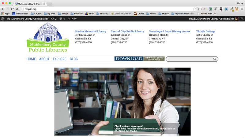
I started by updating their web presence with a clean white design. It features their new logo, which I also designed. Then, I added an image slider including relevant stock photos. I also  streamlined their existing site menu. It now includes just four main headings with drop down menu items.

Library staff members worked with me to find the best way to simplify and condense the original content. We created a system that staff could easily update by themselves. This is so important for a library website design.

Additionally, the sleek online calendar lists upcoming events. These include all happenings such as kids’ storytimes and book signings. The website calendar can easily sync with both iCal and Google Calendar.

Patrons can access all of the libraries’ online databases in order to check out books and other media. The complete catalog is conveniently at each user’s fingertips. They can search directly, right from the library website design main menu.

I also built a separate mobile version of the site. This enables patrons to keep up with both library branches on the go by using their smartphones and tablets. Customers may still access the full catalog, making for a complete web solution.

Library Website Design in Kentucky

Check out the site here! Does your business or nonprofit have a lot of content that needs updates? Perhaps your site  demands a fresh makeover. I would love to help! Hire me to be your public library web designer.

Muhlenberg County Public Library Logo designMuhlenberg County Public Libraries

Greenville and Central City, KY

Back in the year 2013, my home county’s library system contacted me for a huge rebranding project. They called on me to create a new public library logo design and website for them. Back when I was growing up in Muhlenberg County, Kentucky, I fondly remember participating in their annual summer reading program each year. I also would often stop in to check out books while I walked home on my way from my school, Greenville Elementary. Because of this, I considered the library logo art project to be a very special honor.

Public library logo design in Kentucky – fonts and Image

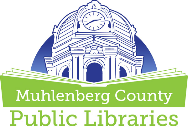
First, I created a line drawing based on the iconic county courthouse tower using the Adobe Illustrator application. This building happens to be the largest open belfry anywhere in the United States. The courthouse tower resides right across the street from the Greenville (Harbin Memorial) branch of the public library. MCPL also has a branch situated in Central City, KY.

After I drew up the focal vector image, I spelled out the words in the main title “Muhlenberg County Public Libraries”. I chose the Museo Slab serif style font. I love this font, since it creates an identity that looks both classic and modern at the same time. A simplified book shape opens up in the foreground in order to provide a tasteful contrast to the architecture portrayed behind it. It avoids the pitfall of potentially making the design too complicated by still not being too obvious or complex.

All of the elements’ weights are distributed evenly. The book’s shape gives the correct emphasis on the text. To give the piece some more variety, I set the words “Public Libraries” in a larger size at the bottom. The words “Muhlenberg County” reverse out of the book shape in white.

Public library logo color scheme and finishing touches

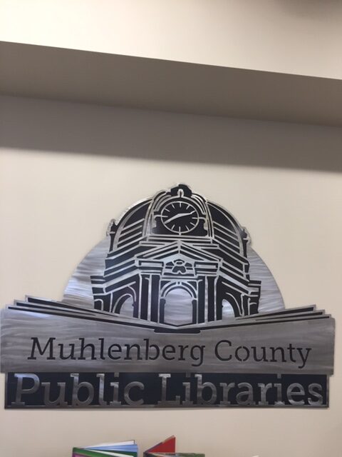
The dark blue and lime green color scheme is strong and eye catching, while still keeping things simple. Depending on the application, I set the background color in either a solid blue, or the gradient fade you see displayed here. As with all of my logo designs, I created a separate, simplified version in black and white. I have always maintained the belief that the best logos can be reduced down to this format. I love going “back home” to Western Kentucky and seeing my work displayed on signage and billboards. The library was such an important part of my childhood growing up in Muhlenberg County. Therefore, it is a good feeling to know that my work represents it to kids growing up there today.

Muhlenberg County Public Libraries Thistle Cottage Logo

Muhlenberg County Public Libraries Thistle Cottage Logo

Thistle Cottage history and public library logo design colors

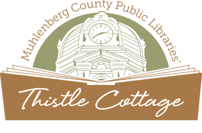
Later on in that very same year, MCPL returned to me for a new task. They requested a new variation of my original public library logo design. The new spin on the brand first involved a change in the color scheme. For this particular version, I decided we should incorporate a rustic copper brown and army green combination.

Both of these muted colors combine and hearken back to the heritage of the building represented by the mark. Thistle Cottage is a historic early 20th Century home on 122 South Cherry Street in downtown Greenville, KY. It was built in the year 1912, back when the Western Kentucky coal mining industry was still booming. It is located just around the corner from the Harbin Memorial library branch.

Thistle Cottage was formerly a cultural center that would host touring art exhibits. The city gave it to the public library system in 2013. They then converted it into a museum and art gallery space. MCPL also holds their annual community events there. These events include their Mother’s Day Victorian Tea party in May, along with their Pictures with Santa holiday series.

Thistle Cottage library logo art – fonts and finishing touches

A fun handwriting script font comes together in order to spell out the main title phrase “Thistle Cottage”. Once again, I reversed the title out of the large open book shape in white. Then, I made the book shape a bit taller. This way, it would frame in all of the main title text. I kept the “Muhlenberg County Public Libraries” text intact from the original logo design in this particular variation. Then, I arched it around the courthouse image from the original logo in the copper brown shade. Finally, I recolored the county courthouse in the olive shade of green.

The finished product I provided made the staff at MCPL very happy in the end. While it is obviously associated with the Kentucky public library system, the muted color scheme and classic script give the logo a vintage feel of its own.

Thistle Cottage logo signage gallery

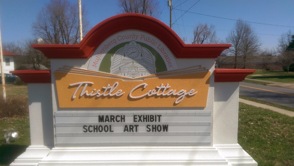
Check out the finished product in print in the photo gallery below. The library features it prominently on the sign in front of the Thistle Cottage building.

“Book” me for your public library logo design!

Are you a library director in the process of launching a brand new library system or branch in your community? Perhaps your own library system has been using the same outdated library logo art for many years. You may very well be in need of an image rebrand! Whatever your situation may be, you should contact me! Everyone in your town will be checking you out! Sorry, for better or worse, I just can’t help myself when it comes to a good pun.