Nathan Morris | Owensboro, Ky
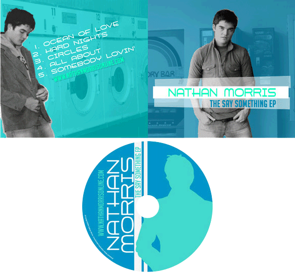
Singer songwriter Nathan Morris is an old friend who hails from Owensboro, KY. I designed this CD slip layout, which he used for his 2004 debut EP. Since “Natmo” dug the previous stickers and pop album art design I’d made for him, he hit me up again to create this CD art.
Pop album art design story
First, Nathan supplied me with the posed photography from a session he had taken at a local laundromat. His only directions to me were to keep it simple. He instructed me to use a color scheme that was both minimal and cool. I combined a mint green shade with a dark sky blue in order to achieve the effect.
First, I converted the front and back photos to black and white. Using Adobe Photoshop, I then cut out Nathan from the backgrounds. I did it in a sloppy, imprecise manner to give it a homemade, DIY feel. By keeping Nathan in black and white, while colorizing the background behind him, I made his image a focal point that really popped. This is ideal to introduce a solo artist via pop album art design.
Throughout the design, I used a combination of two fonts. The main title font has a feel that can only be described as retro futuristic. I supplemented it with one of my favorite fonts, the tall and bold face Big Noodle Titling. At the suggestion of my then-roommate Adam, I tilted the song title list on the back at the same angle that Nathan is leaning against the wall at. I also tilted the main title text on the front of the CD slip, displaying it on top of white strips which faux electrical tape. Finally, I simplified another photo of Nathan to make a silhouette on the CD face itself. I repeated the white strips as a 90 degree border, and also turned the text itself on it’s side.
Contact me to design your pop CD layout
Are you an independent musician who is in need of the perfect pop album art design? Why not contact me today? You already have a record that perfectly represents your sound. I’ll make you look your best, too.