CD Layout and Digital Download Art Design

Music has always been a huge part of my life. I have played guitar and sang in bands since my teenage years. I even spent six years on the road in a touring band. When I’m out at a show or a store, I always keep an eye out for CD layout designs that compliment artists’ visions. This is important for every artist, from folk singers to independent film producers selling DVDs.
Despite the popularity of digital streaming music, many still prefer physical media. Great album artwork still makes a big difference when it is displayed on a proud collector’s shelf.
Contact me for your own CD layout graphic design
See samples of my CD layout design and digital download art in my portfolio below. Then contact me today with your own proposal. I take great pride in helping fellow artists create the ideal image for their labor of love.

Vanessa Davis Songwriter streaming music cover art for Digital Download EPVanessa Davis

Lexington, KY

Vanessa Davis Kentucky based singer songwriter. She asked me to design the streaming music cover art for a new EP composed during the 2020 Coronavirus quarantine. She provided a few elements to get me started on the art, and then she put me to work.

Streaming music cover art story

Print poster variant of the streaming music art

Print poster variant of the streaming music art

Vanessa sent me a rough sketch of her incorporated into the foreground of a painting by her grandmother. She also provided sheet music for songs on the album, and requested that I add those in if they  fit.

First, I removed the background from her photograph, smoothing out the edges of her curly hair. I then set out to blend her seamlessly into the painting. In Photoshop, I combined an “oil painting” filter with an embossed second copy of her photo, thus mimicking the painting’s texture. Next, I modified the colors in both her picture and the painting in order to create consistency.

I then incorporated the sheet music into the image. A variety of eraser brushes gave the composition a weathered, ethereal feel, as if they were a dream by author, floating amongst the sky and landscape.

Finally, I chose a classic serif font to represent the album title. Based on our discussions revolving around her rootsy, folk based musical style, I typed out Vanessa’s name in an elegant script font. After completing the painterly art, I opted to keep the text minimal and not add any effects. I simply added a faint black feathered box under it to help its legibility.

Vanessa also requested that I design a print quality poster to complement the album art. She would send these posters out for publicity purposes. I first blurred copies of the painting together to create a new background. Then, I extended the music notes above and below the streaming EP art. Regarding the finished poster and CD, my client declared, “I LOVE THIS! I am thrilled with the work you’ve done on this.”

Check out Vanessa’s music on Youtube and follow her on Instagram.

Let me design your streaming music cover art

Since I am a musician myself, I take a keen interest in helping other artists. I understand how important it is for great music to be paired with complementary artwork. Contact me today, and I’ll make bring your artistic vision to life.

Music has always been a huge part of my life. I have played guitar and sang in bands since my teenage years. I even spent six years on the road in a touring band. When I’m out at a show or a store, I always keep an eye out for CD layout designs that compliment artists’ visions. This is important for every artist, from folk singers to independent film producers selling DVDs.
Despite the popularity of digital streaming music, many still prefer physical media. Great album artwork still makes a big difference when it is displayed on a proud collector’s shelf.
Contact me for your own CD layout graphic design
See samples of my CD layout design and digital download art in my portfolio below. Then contact me today with your own proposal. I take great pride in helping fellow artists create the ideal image for their labor of love.

Star Wars themed wedding DVD artZack and Sarah Messick

Georgetown, KY

My longtime friends Zack and Sarah became husband and wife in June of 2018. The Star Wars themed ceremony took place in a park which was located in nearby Wilmore, Kentucky. I served as one of the groomsmen. My three year old son was also in the wedding party performing the duties of the ring bearer. My friends did not anyone to film the wedding. Therefore, I volunteered to set my Zoom camera up at the altar. Then, I edited the video in iMovie, including adding the requisite “scrolling text” popularized by the film series. All I needed to do after that was to make the wedding DVD art as a Star Wars parody design.

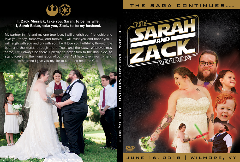
Wedding DVD art front cover design story

Original "Star Wars Episode 1: The Phantom Menace" artwork, which I based the wedding DVD art on.

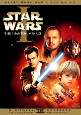
Original “Star Wars Episode 1: The Phantom Menace” artwork, which I based the wedding DVD art on.

I loosely based the design on the artwork for Star Wars Episode 1: The Phantom Menace. Critics and fans alike agree this is the worst film in the series. However, of all of the DVD layouts I found online, it stood out for this project. From the montage of the characters floating in space to the golden to the embossed title lettering, the design had the space epic feel I wanted to get across for this piece.

Wedding DVD art cover – Star Wars parody design

The logo featured in the top left of the cover is a recreation I made of the one from the couple’s wedding invitations. Since I had already recycled my copy of the printed invitation, I recreated the mark in Adobe Illustrator. The groom’s mother kindly sent me a photo she took of hers.

I set the text in the requisite “Star Jedi” font for the main title image. Afterward, I tilted it using the shear tool, in order to simulate the angle of the original mark they used. Then, I imported it into Adobe Photoshop. This way, I could add the gradient and embossing effects needed to complete the title’s finishing touches.

Photography special effects for wedding DVD cover

Melissa Rossini, the wedding’s photographer, sent me a few stills from the event for me to incorporate. I created a montage of the wedding party that was similar to the original cover. The bride, groom, flower girl, and ring bearer loom over the light saber fight candid shot below. I overlaid some paint filters and added some contrast to each person’s image to simulate the lighting and color effects of the original art.

When I was editing the “fight scene” photo, I added a glow effect to the toy light sabers in order to add authenticity. I then faded each of the figures into the red “explosion” over the outer space background. Said explosion consists of a few powder and light burst stock images. I added blur filters to both of them, then recolored them with a bright red to orange gradient.

Wedding DVD cover typography

The classic Bank Gothic font spells out the text of the wedding’s tagline “The Saga Continues…”. It also denotes the wedding ceremony’s date, as well as its location. I spread out the letters‘ tracking in much the same way the top and bottom text of the original is. Finally, the requisite “DVD video” logo adorns the Star Wars parody design cover.

Wedding DVD art back cover design story

For the back cover image, I transcribed the couple’s wedding vows from the video, since this was a surprise. I set the text in the venerable ITC Franklin Gothic. It is the same font which is used in the Star Wars films’ iconic scrolling text intros. The perfect shot of the minister and the happy couple during the ceremony provides the backdrop behind the fading black text background. Finally, I topped off the vows with the famous Star Wars symbols signifying the Rebel Alliance and the Empire.

This was a pro bono design that I made as a gift for my friends, as well as a parody of a well known film series. Therefore, I saw fit to go all the way with the Star Wars parody design thematic elements. Unlike most wedding DVD art covers, it makes a great conversation piece for visitors who see the media shelf in their humble home. The added personal touch of editing the video with Star Wars graphics and music also makes for more replay value than most couples’ wedding videos. I also included two opening and closing slideshows of wedding photos set to the song used for Sarah’s bridal march.

The happy couple absolutely loved it. All things considered, this project developed into one of my all time favorites.

Contact me for your own wedding DVD art

Will you and your sweetheart tie the knot soon? I know from my own experience how stressful it can be for a couple to keep up with all of the details as they plan for their big day. There are a variety of important elements that the bride and groom must consider. Everything from the catering to the flowers go into making the perfect wedding ceremony.

It is so important to make sure that you have your ceremony documented by professional photography and video services. Why not complete your wedding DVD with an equally professional cover art? Even if your ceremony features an unconventional theme, I am the perfect choice to design your wedding artwork. Contact me today so we can get started right away!

Music has always been a huge part of my life. I have played guitar and sang in bands since my teenage years. I even spent six years on the road in a touring band. When I’m out at a show or a store, I always keep an eye out for CD layout designs that compliment artists’ visions. This is important for every artist, from folk singers to independent film producers selling DVDs.
Despite the popularity of digital streaming music, many still prefer physical media. Great album artwork still makes a big difference when it is displayed on a proud collector’s shelf.
Contact me for your own CD layout graphic design
See samples of my CD layout design and digital download art in my portfolio below. Then contact me today with your own proposal. I take great pride in helping fellow artists create the ideal image for their labor of love.

CD Artwork for Sempervivi "Always Alive" by Kentucky CD cover artistSempervivi

Lexington, KY

Since I began my career as a graphic designer, I’ve enjoyed being a CD cover artist. The CD artwork for my own band Sempervivi proves that I am very hands on with personal projects. I departed my previous band Analog Apostles in 2014 in order to start my own solo project. After self producing an acoustic EP, I wrote new songs for this record, which necessitated a full band. I designed my own layout for “Always Alive” in 2017. This album was, in every sense of the words, both a labor of love and a family affair.

CD artwork process for Kentucky rock music

Initially, I only knew that I wanted to use a bright green color for the album’s cover. This is because the record’s concept is evergreen life. I took my time on this project in between other work and music related tasks, since my goal was to hand draw as much of the CD art as possible. At first, I even hand wrote the credits, but I was not happy with how those turned out. However, I drew or traced each and every other element in the CD and jacket composition.

CD artwork incorporating natural elements

Many of these songs’ themes center around family, growing up, and the idea of continuing one’s lineage to future generations. I wanted to incorporate many elements that were found in nature. Therefore, I researched which animals represented immortality in different world cultures. In the end, I settled on the cicada. It is a winged insect which is common here in Kentucky that can be heard chirping loudly on humid summer evenings. I incorporated a pair of these bugs as part of the front cover heraldry.

The sempervivum plant is also known as a succulent or houseleek. I featured it in red, located front and center on the cover. It is a reference to the name of the band as well. “Sempervivum” is a Latin phrase that literally translates to “ever living” or “always alive”.

CD Cover Artist – Fonts and typography for CD artwork

I did not initially set out to draw the word “SEMPERVIVI” with a particular font in mind. Instead, I decided to emulate something I would have doodled on one of my old high school notebooks. I drew, scanned, tilted, and resized the letters a few different times to get the feel just right. The varying sizes and placements of the tall serif characters make it stand out in a way that a conventional font would not.

I set the arched title “ALWAYS ALIVE”, as well as the track listing, in the “Triforce” specialty font. However, I filled in the signature openings of the letters when I traced it. This is in order to give the characters more weight. I then completed the front cover layout with some doodles of light beams and bubbles. I also created a frame to go around all of the elements using the Adobe Illustrator program. Then, I retraced it by hand in order to continue the sketch art theme. The text, frame, and drawings all have a faint white shadow that adds depth, as well as creating a subtle embossing effect.

Jacket CD artwork finishing touches

I sketched a drawing of my young son’s face on the back cover as the focal point. This made sense, since two of the songs center around becoming a father and spending time with him. The drawing offsets the album’s track listing. I used the Paint tool in Photoshop so I could highlight his face and make it pop off of the cool blue background. I also redrew the Bad Apple Records logo, which I designed for the record label in 2002. Finally, many paint splatters blend into the background. My son actually painted them at the tender age of just one and a half years old. Thus, I  made sure that he was listed prominently in the album credits at the bottom of the jacket!

Disc CD artwork layout

Last of all, I painted the compact disc itself with a deep magenta hue. It was complementary to both the green and blue backgrounds on the jacket itself. Next, I blended in a few more paint splatters from my son’s art into the background. Then, I arched the artist name and album title, once again using my altered version of the Triforce font. I traced sempervivum stalks from some photographs I found online by using a fine Sharpie marker. The traced Bad Apple Records logo is again featured, centered between the drawings. One more time, I highlighted these elements in a lighter shade of Magenta by using the Paint tool in Adobe Photoshop. After I had put in many a long hour working on it, the album art was finally ready for the press.

CD artwork that screams “YOU!”

All of the elements of this sophomore record, ranging from the songs themselves to the art detailed above, encapsulate the story of who I am. I identify with many roles. Christian, husband, father, Kentuckian, musician, friend, and graphic artist are all labels which describe me.

Do you have a distinct vision of what CD packaging should accompany your next recording project? Let me be your CD cover artist! I have years of experience designing merchandise for bands and musicians in many genres. This includes artists performing everything from country to bluegrass to alternative rock. Whether you have photography and other elements ready or not, I can get the results you need. Contact me today so we can get started on your own CD artwork!

Music has always been a huge part of my life. I have played guitar and sang in bands since my teenage years. I even spent six years on the road in a touring band. When I’m out at a show or a store, I always keep an eye out for CD layout designs that compliment artists’ visions. This is important for every artist, from folk singers to independent film producers selling DVDs.
Despite the popularity of digital streaming music, many still prefer physical media. Great album artwork still makes a big difference when it is displayed on a proud collector’s shelf.
Contact me for your own CD layout graphic design
See samples of my CD layout design and digital download art in my portfolio below. Then contact me today with your own proposal. I take great pride in helping fellow artists create the ideal image for their labor of love.

"Country Piano Corral" Digital Download Music ArtWellington Beck Music Group

Nashville, TN

This is another country music compilation for a long running client. During my run with Wellington Beck, I specialized in quick turnaround Photoshop designs for their recordings. This time around, the album features all piano based covers of popular country hits. It is available exclusively as a digital download mp3 album on iTunes and Amazon, as well as other media outlets. Since the word “CORRAL” is featured in the title, I decided I should give it a 19th Century American Old West feel.

Digital download art for country music album

The art features a vintage style mahogany piano in the bottom right. I set the album’s title in a curly Western font, then warped it into a rising shape. I also embossed the text to give the words depth. All the while, I used two different brown tones to bring some variance to the title. The word “PIANO” is larger than the other words, and I emphasized in a darker brown hue. This color echoes the dark shadows in the piano image and ties it all together.

The old timey elements all display on a dirty, distressed parchment paper background. My idea with using this was to mimic the feel of a wanted poster for an 1800s desperado.

Finally, I added a grunge texture overlay to complete the country music piece’s weathered appearance. This gave it the exact style my client was looking for. As usual, I finished the art ahead of the scheduled deadline, and I did not need to make any revisions to it.

Let me design your digital download artwork

Whether or not your genre is country music, I’ve got your art needs covered. I’ll be your Huckleberry. Contact me today for the perfect graphic design to complement your new single or album!

Music has always been a huge part of my life. I have played guitar and sang in bands since my teenage years. I even spent six years on the road in a touring band. When I’m out at a show or a store, I always keep an eye out for CD layout designs that compliment artists’ visions. This is important for every artist, from folk singers to independent film producers selling DVDs.
Despite the popularity of digital streaming music, many still prefer physical media. Great album artwork still makes a big difference when it is displayed on a proud collector’s shelf.
Contact me for your own CD layout graphic design
See samples of my CD layout design and digital download art in my portfolio below. Then contact me today with your own proposal. I take great pride in helping fellow artists create the ideal image for their labor of love.

Analog Apostles CD Art for "The Other Side of the Sea" EP

Analog Apostles

Lexington, KY

I designed this CD art for Lexington, KY alternative rock band Analog Apostles‘ debut EP “The Other Side of the Sea”. Since I played lead guitar in the band at the time, it was a no brainer for me to do the artwork. I was also very involved in the music production side.

Ben, the main songwriter and rhythm guitarist, thought of the title long before we recorded the first note. The album name and many of the songs made references to water, so we decided together on a nautical theme.

CD art – setting sail for the high seas

The four panel digipak layout started with an antique style treasure map background. Then, I overlaid a classical pirate ship illustration in brown as the focal point. The “A” monogram mark from the logo I designed was later superimposed onto the ship’s main sail.

After that, I set the band‘s name in an antique “swashbuckling” style font face. The album’s title then materialized in a classic cursive script. I capped off the design with a ghostly image of the band’s “A” icon over the dark blue ocean background in the tray card. Since the record’s theme suggested high adventure, a hint of supernatural mystery put it over the top.

From start to finish, this record truly was a DIY project. We performed every aspect of the production, from the recording process to ordering the album duplication. Ben’s wife Amanda did a great job with the posed band photography. Our fan base fully funded the CD’s production online via Indiegogo, which is a great fundraising tool for artists on a budget.

Hire me to design your CD art

Are you a band or record label currently hoisting the main sails on a new album? Contact me today for a CD layout design that will shiver your fans’ timbers.

Music has always been a huge part of my life. I have played guitar and sang in bands since my teenage years. I even spent six years on the road in a touring band. When I’m out at a show or a store, I always keep an eye out for CD layout designs that compliment artists’ visions. This is important for every artist, from folk singers to independent film producers selling DVDs.
Despite the popularity of digital streaming music, many still prefer physical media. Great album artwork still makes a big difference when it is displayed on a proud collector’s shelf.
Contact me for your own CD layout graphic design
See samples of my CD layout design and digital download art in my portfolio below. Then contact me today with your own proposal. I take great pride in helping fellow artists create the ideal image for their labor of love.

Karaoke album art design for country music CDWellington Beck Music Group

Nashville, TN

The groundbreaking “American Country Hits” series rolled on with the latest installment, Volume 19. Each volume includes both a “Hits” version (covers recorded by studio musicians) and a “Karaoke” version with instrumental tracks only. The karaoke album art design version that I created is pictured above.

Karaoke album art design story

This time out, I decided I should use a deep turquoise background. I blended a mottled grunge pattern that resembled marble into the rich greenish blue color. Then, I created an inner shadow layer effect for it. This effect fades into the background from a light to dark shade.

I also added a bright white burst brush shape located in the center of the artwork. I situated it between the background and the main title logo layers. When I added a glow layer effect to it, it really made it shine. It also caused the main title text to pop off of the screen.

After that, I contrasted the background elements against the main title. This title uses the same logo I created for the previous installments of the series. I set the words in the LHF Boston Truckstyle font. I proceeded to color it with a rusty shade of red, then added both satin and inner shadow effects to the letters. A light golden yellow inside stroke came together with a thicker brown outline in order to complete the title text’s rustic theme.

All of the elements come together to create an outstanding karaoke album art design. This, as well as all of the other installments in the series, is available on many online music retailers. These include Amazon, iTunes, and many others.

Contact me to create your karaoke album art design

Do you own a record label or a digital music publisher? If you need quick turnaround art to accompany your digital music, I am your graphic designer. Contact me today to get started!

Music has always been a huge part of my life. I have played guitar and sang in bands since my teenage years. I even spent six years on the road in a touring band. When I’m out at a show or a store, I always keep an eye out for CD layout designs that compliment artists’ visions. This is important for every artist, from folk singers to independent film producers selling DVDs.
Despite the popularity of digital streaming music, many still prefer physical media. Great album artwork still makes a big difference when it is displayed on a proud collector’s shelf.
Contact me for your own CD layout graphic design
See samples of my CD layout design and digital download art in my portfolio below. Then contact me today with your own proposal. I take great pride in helping fellow artists create the ideal image for their labor of love.

Nashville Country Hits - Digital Download Graphic Design

Wellington Beck Music Group

Nashville, TN

This is a digital download graphic design for a compilation of many popular country music singles of the day. This series is much like digital albums such as Kidz Bop and NOW! That’s What I Call Music. The collection of songs is exclusively available online via iTunes, Amazon, and other online music outlets.

It is a part of the long running series of cover albums produced by Wellington Beck that I designed art for. Quick turnaround was the name of the game for these projects. I excelled at exceeding my client’s expectations on time, each and every time.

Digital download graphic design for country music single

My client requested me to base the album artwork concept on the hit ABC TV series Nashville. I mimicked the show’s mix of serif and condensed sans serif fonts, as well as the bright pink and grey color scheme. The music publisher also made the request that I incorporate an image of a vintage tube television. I started with these ideas, and then decided to expand on them.

Finally, I incorporated a retro television “test pattern” graphic to complete the image’s layout. Many older listeners and fans of the days when television stations signed off for the night with similar images enjoyed this touch. I made an instant hit with both my client and their listeners.

Hire me for your digital download graphic design

These album art web graphics are among some of my favorite projects. I found it exciting whenever a new assignment would come across my desk.

Are you a music publisher or an artist who needs a quality design created to meet digital retailers’ standards? I am just as passionate about music as I am about top shelf graphic design. Contact me today to get started.

Music has always been a huge part of my life. I have played guitar and sang in bands since my teenage years. I even spent six years on the road in a touring band. When I’m out at a show or a store, I always keep an eye out for CD layout designs that compliment artists’ visions. This is important for every artist, from folk singers to independent film producers selling DVDs.
Despite the popularity of digital streaming music, many still prefer physical media. Great album artwork still makes a big difference when it is displayed on a proud collector’s shelf.
Contact me for your own CD layout graphic design
See samples of my CD layout design and digital download art in my portfolio below. Then contact me today with your own proposal. I take great pride in helping fellow artists create the ideal image for their labor of love.

Country music album art for 50: Country by the Numbers - Digital Download CD

Wellington Beck Music Group

Nashville, TN

This country music album art complements a compilation of country singles produced by some longtime regular clients. Wellington Beck produced digital exclusive albums featuring cover versions of songs by popular artists like Luke Bryan, Blake Shelton, and others. As with past projects, they gave me a lot of creative “rope” and very few specific guidelines.

Country music album art story

I felt that sticking with a base of primary colors and a text focused design would help the art stand out. The client asked me to make the number “50” the most prominent part of this country music album art. Therefore, I set it in a bold red tall serif. I stylized it with a faint inner glow effect and an opaque shadow in order to give it just the right depth.

On the top and bottom, I typed “Country by the Numbers” in a deep blue shade. For these words, I used the Trade Gothic font in a light weight. In keeping with the Old West theme, I then added a rope “lassoing” it the number 50, swooping in from the bottom to grab it. The rope envelopes the number in front and back, creating three dimensions.

Finally, I overlaid the bold and bright artwork with a rusty, sputtered grunge pattern. There is also a faint outline of arrows flying up and to the right. The background also contains some bright beams of light. I was happy that this art successfully blended primary hues with grunge elements and Western themes.

Contact me for your country music album art

Are you an independent country music artist, a record label, or a publisher? Whether you need a print CD art, or a quick turnaround digital art solely for streaming services, I’ve got you covered.  Contact me to get started today.

Music has always been a huge part of my life. I have played guitar and sang in bands since my teenage years. I even spent six years on the road in a touring band. When I’m out at a show or a store, I always keep an eye out for CD layout designs that compliment artists’ visions. This is important for every artist, from folk singers to independent film producers selling DVDs.
Despite the popularity of digital streaming music, many still prefer physical media. Great album artwork still makes a big difference when it is displayed on a proud collector’s shelf.
Contact me for your own CD layout graphic design
See samples of my CD layout design and digital download art in my portfolio below. Then contact me today with your own proposal. I take great pride in helping fellow artists create the ideal image for their labor of love.

Cowboy covers CD art design - "Cowboys Undercover" Digital Music Download Art for Wellington BeckWellington Beck Music Group

Nashville, TN

My client was very happy with how this collection of country music covers CD art design turned out. The only specific requests the publisher Wellington Beck gave me for the design were to incorporate an old school microphone in the title. As always, they trusted me completely to create a professional, quick turnaround graphic. The latest compilation in their country music series became a huge hit and this design was a big part of that.

Country music covers CD art design story

The name of the project suggests mystery, so I sought to create a scene which was teaming with anonymous silhouettes. I also went for an 80’s Western movie poster feel, which is similar to this one. In the image’s background, horsemen gallop along a ghostly trail set in the smoky sky above a purple and blue mountain range. Perhaps the cowboys in the foreground are searching for some outlaw horse thieves.

Continuing the retro 80’s movie theme, I then spelled “Cowboys” in large, stretched pink script font in the title. In order to give it some shine, I added a gradient effect. Also, I colored the vintage microphone in a deep turquoise so as to complement the main title. It is featured between the words “Under” and “Cover”, which are spelled in a radical, classic block font.

These letters also feature a white to grey gradient and a white shadow to create contrast against the cowboy figures in the foreground. This digital download cover art is like Miami Vice meets Gunsmoke!

Contact me for your covers CD art design

Are you an artist or record label that is planning to release a record of cover songs? There is no need to go undercover for your compilation album art graphic design. Contact me today to get started!

Music has always been a huge part of my life. I have played guitar and sang in bands since my teenage years. I even spent six years on the road in a touring band. When I’m out at a show or a store, I always keep an eye out for CD layout designs that compliment artists’ visions. This is important for every artist, from folk singers to independent film producers selling DVDs.
Despite the popularity of digital streaming music, many still prefer physical media. Great album artwork still makes a big difference when it is displayed on a proud collector’s shelf.
Contact me for your own CD layout graphic design
See samples of my CD layout design and digital download art in my portfolio below. Then contact me today with your own proposal. I take great pride in helping fellow artists create the ideal image for their labor of love.

Country cd art designer - Music Digital Download Compilation ArtworkWellington Beck Music Group

Nashville, TN

I thoroughly enjoyed the time when I worked for Wellington Beck Music Group as a country CD art designer. The Nashville based music publisher sold digital music via Amazon mp3 and iTunes, as well as many other online outlets.

Country CD art designer story

This is a compilation of popular country singles featuring the steer skull mascot from their “American Country Hits” series.

Wellington Beck asked me to recreate a $100 United States dollar bill with the steer skull instead of Benjamin Franklin’s portrait. I desaturated the colors from the original image, then blended it into the oval portrait in the center using Adobe Photoshop.

I was particularly happy with how the texture of the dollar bills turned out. It adds a much needed air of realism. The simulated currency looks like actual crinkled American dollars. The green cowboy hat stamped over the characters spelling out the number “100” also looks great.

A dark brown wood grain patterned table completes the rustic look, which you can expect from a good country CD art designer. The final result turned out to be a huge seller for the digital music publisher, and still is in streaming rotation today. We did not leave any cold, hard cash on the table when it came to this project!

Hire me to be your Country CD art designer

Do you work with a music publisher? Perhaps you own your own independent record label. You may offer digital music, along with traditional physical CDs. You know better than anyone that image is just as important as the music that accompanies it. Instead of trying to do it yourself, or relying on a cut rate, fly by night firm, you should hire a pro with years of experience. Contact me today and put your money where your mouth is!

Music has always been a huge part of my life. I have played guitar and sang in bands since my teenage years. I even spent six years on the road in a touring band. When I’m out at a show or a store, I always keep an eye out for CD layout designs that compliment artists’ visions. This is important for every artist, from folk singers to independent film producers selling DVDs.
Despite the popularity of digital streaming music, many still prefer physical media. Great album artwork still makes a big difference when it is displayed on a proud collector’s shelf.
Contact me for your own CD layout graphic design
See samples of my CD layout design and digital download art in my portfolio below. Then contact me today with your own proposal. I take great pride in helping fellow artists create the ideal image for their labor of love.

Country music art design for "Hey Soul Sister" cover song singleWellington Beck Music Group

Nashville, TN

This was a new series of country music covers from regular clients Wellington Beck. The “American Pop Goes Country” series included both compilation albums and popular singles. This country music art design covers the ubiquitous Train hit song “Hey Soul Sister”.

Country music art design story

I stayed with the basic theme of my client’s previous “American Country Hits” series. The same Western fonts and tribal elements of the original’s main title are still present here. However, for this “pop idol” themed series, I modified the original series logo. I “painted” it on the grungy stage wall with a rounded circle incorporated. This gives the piece’s logo mark an overall smooth feel. I basically merged the original ACH logo with the famous American Idol mark.

I based all of the country music art design elements, other than the logo, on actual stock photographs. Out front, the vintage Shure “Fat Boy” microphone stands out against the weathered stage. Clad in a red bandanna, it beckons the viewer to take the stage and sing along. The lighting rig overhead and the opened red curtains frame the warm orange tinted scene in. I used a few high contrast, glow, and shadow effects to give the digital album art a crisp, high end feel. The “American Pop Goes Country” cover song series was a big hit. These singles and compilations are still available online today. The label exclusively offers them as digital downloads. Outlets such as iTunes and Amazon Music and carry it for streaming and purchase.

Contact me for your country music art design

Are you a musician or perhaps an country music record label? Do you need album artwork created? I have years of experience designing one of a kind CD and digital download artContact me today to get started!

Music has always been a huge part of my life. I have played guitar and sang in bands since my teenage years. I even spent six years on the road in a touring band. When I’m out at a show or a store, I always keep an eye out for CD layout designs that compliment artists’ visions. This is important for every artist, from folk singers to independent film producers selling DVDs.
Despite the popularity of digital streaming music, many still prefer physical media. Great album artwork still makes a big difference when it is displayed on a proud collector’s shelf.
Contact me for your own CD layout graphic design
See samples of my CD layout design and digital download art in my portfolio below. Then contact me today with your own proposal. I take great pride in helping fellow artists create the ideal image for their labor of love.

CD Graphic Design for Stellar Kin "We Need to Know" - Kentucky rock bandStellar Kin

Bowling Green, KY

I made this CD graphic design for Kentucky indie rock band Stellar Kin. I founded the hardcore emo trio in 2000 while studying at Murray State University.  By 2002, the lineup was solidified and we began recording and touring. “We Need to Know” was our 2004 full length sophomore release on Bad Apple Records. It features conceptual design and photography by myself, as well as posed photography by the famed Neil Visel. My friend Holly posed for the front and back covers.

CD Graphic Design for Kentucky indie rock band

The album lyrics cover serious spiritual themes. Therefore, the art consists of black and red colors and stone faced expressions. I set the main titles in the tall serif Big Noodle Titling font. The letter spacing varies to fit phrases into each outside panel, which spell out “What we don’t know is hurting us. Now more than ever, we need to know”. I set the CD graphic design’s track listing, along with other information, in the classic Gill Sans font.

The front and inside of the booklet tell the story of a young woman who has been tied up by an assailant. On the front cover, she grasps hold of a kitchen knife while cutting herself free from the ropes that bind her. Finally, she stalks her kidnapper with the knife on the booklet inside. The empty chair sits alone on the back cover. I reversed the words We Need to Know out, using the wood paneling from the photograph.

Lastly, the CD cover features a simplified, one color image of the rope. I simplified the individual band member headshots to grey, which gives them a ghostly feel against the black background. This is same grey hue also fills the words Stellar Kin on the front cover.

Contact me for your CD Graphic Design

If you are a band or a solo artist, then you need professional artwork for your next record. Contact me today to get started.

Music has always been a huge part of my life. I have played guitar and sang in bands since my teenage years. I even spent six years on the road in a touring band. When I’m out at a show or a store, I always keep an eye out for CD layout designs that compliment artists’ visions. This is important for every artist, from folk singers to independent film producers selling DVDs.
Despite the popularity of digital streaming music, many still prefer physical media. Great album artwork still makes a big difference when it is displayed on a proud collector’s shelf.
Contact me for your own CD layout graphic design
See samples of my CD layout design and digital download art in my portfolio below. Then contact me today with your own proposal. I take great pride in helping fellow artists create the ideal image for their labor of love.

pop album art design - Singer Nathan Morris "Say Something" EP CDNathan Morris

“The Say Something EP”

Singer songwriter Nathan Morris is an old friend who hails from Owensboro, KY.  I designed this CD slip layout, which he used for his 2004 debut EP. Since “Natmo” dug the previous stickers and pop album art design I’d made for him, he hit me up again to create this CD art.

Pop album art design story

First, Nathan supplied me with the posed photography from a session he had taken at a local laundromat. His only directions to me were to keep it simple. He instructed me to use a color scheme that was both minimal and cool. I combined a mint green shade with a dark sky blue in order to achieve the effect.

First, I converted the front and back photos to black and white. Using Adobe Photoshop, I then cut out Nathan from the backgrounds. I did it in a sloppy, imprecise manner to give it a homemade, DIY feel. By keeping Nathan in black and white, while colorizing the background behind him, I made his image a focal point that really popped. This is ideal to introduce a solo artist via pop album art design.

Throughout the design, I used a combination of two fonts. The main title font has a feel that can only be described as retro futuristic. I supplemented it with one of my favorite fonts, the tall and bold face Big Noodle Titling. At the suggestion of my then-roommate Adam, I tilted the song title list on the back at the same angle that Nathan is leaning against the wall at. I also tilted the main title text on the front of the CD slip, displaying it on top of white strips which mimic electrical tape. Finally, I simplified another photo of Nathan to make a silhouette on the CD face itself. I repeated the white strips as a 90 degree border, and also turned the text itself on it’s side.

Contact me for your pop album art design

Are you an independent musician who is in need of the perfect pop album art design? Why not contact me today? You already have a record that perfectly represents your sound. I’ll make you look your best, too.