 Auto Shop Showcase / Bowling Green, KY
My longtime client Gary Gunn started up a new business in 2023, returning to mentoring auto repair shop owners. Gary collaborated with me on his new website, as well as his online and print advertising campaigns. This postcard mailer design has been a huge success for Gary’s startup business. In fact, it has attracted several valuable automotive business owners to join his monthly mentoring meetings.
Postcard Mailer Design Story – Changing Business Model
Gary Gunn started his career in the automotive industry in 1979. When we first crossed paths in 2006, he hired me to work in office doing clerical duties, sales calls, and human resources tasks. Soon, he saw my talent for graphic design and allowed me to manage his website and lay out CDs and printed curriculum for his coaching clients. When I moved to Lexington from Bowling Green, KY years later, he kept me on hand as a freelancer. Gary eventually sold his coaching company and helped others start their own mentoring and coaching businesses. In 2023, he finished his tenure working with them and started a new business, Auto Shop Showcase.
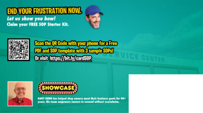
The back side of the auto shop coach postcard mailer design.
Initially, Gary’s business model centered around interviewing shop owners and other automotive industry professionals. I got his podcast and Youtube channel up and running, as well as his website. Soon, his business model changed, as business models often do. While his business’ end game was always recruiting auto repair shop owners to his monthly coaching calls, the weekly interviews were unsustainable. I soon shifted to editing daily social media Reels, in addition to the long form Youtube “Auto Shop Tips” videos. In addition to creating and managing his Facebook Ads, I laid out this postcard mailer design.
Postcard Mailer Design – Getting Started
We all get bulk presorted mail in our mailboxes. A lot of what we receive is “junk mail” that we chuck in the recycle bin right away. Business owners especially are bombarded with unsolicited offers. However, the right offer, coupled with an eye catching layout, can break through. Gary and I collaborated to create just that. Which elements came together in order to create a campaign that continues to deliver results?
When Gary first came to me for this postcard mailer design, I already knew what he was looking for. Since I had designed print projects for him for so many years, I knew his tastes by heart. Our collaboration method has not changed much since I left Bowling Green and started working from home. Gary begins the process with a mockup in Microsoft Word. He includes a few suggested images, headlines, and copy in order to get his point across. I start by correcting any grammar and spelling errors and selecting the most effective text. Then, I make my own tweaks to it before moving on to Adobe Photoshop for the actual design.
Graphics And Layout For Direct Mail Card Design – Front Side
Regarding this piece, I already had the perfect stock image in mind. The older gentleman featured is a blue collar worker who looks like he could be right at home managing an auto repair shop. He is clearly frustrated. By what? In this instance, it is a lack of written SOP’s (Standard Operating Procedures). Without a clear operations manual, none of his mechanics, service advisors, or management know how to do their tasks properly. You can see why he is so frustrated!
Gary’s business Auto Shop Showcase has the solution. When a shop owner scans the QR code on the card with their phone, it takes them to an online form. When they provide their email address, they receive a free starter kit teaching them how to write SOPs, step by step. Gary also follows up with them in order to make sure they understand. This also opens the door for him to offer them a spot in his monthly mentoring meetings.
Returning to the elements that make the card effective, I added a motion blur to the shop owner, since he is shaking his fist. I employed a bright purple to pink background behind him, with an image of a repair shop faded into it. In order to make the headline pop, I used the wacky title font made famous by the video game Fortnite, heavily stroked in black. The phrase “Frustrated by SOPs?” is highlighted in golden yellow. Futura Black spells out the rest of the card’s content.
Back Of Card Design – Completing The Message
The back of the card repeats the faint automotive shop image, this time over a bright teal blue background. Gary’s smiling face is beaming to the left of his bio. The shop owner from the front of the card returns, this time with a smile of satisfaction on his disembodied head. A final nudge urges the reader to “End Your Frustration Now”. Clearly, it has been an effective campaign thus far. After all, many automotive repair shop owners have signed up for the starter kit using the link.
Do You Need Your Own Postcard Mailer Design?
Despite the many rumors of its demise, direct mail advertising is alive and well! Gary has had massive success in the auto repair industry with this campaign. It all starts with an eye catching layout. That all starts with an experienced graphic designer. Investing in my skills will pay your business back in spades, so contact me today.

")

")


 Muhlenberg County Public Libraries
 Muhlenberg County Public Libraries
 Local Violence
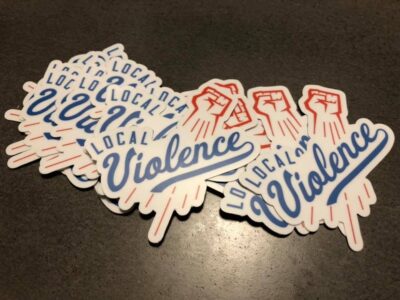
 Muhlenberg County Public Libraries
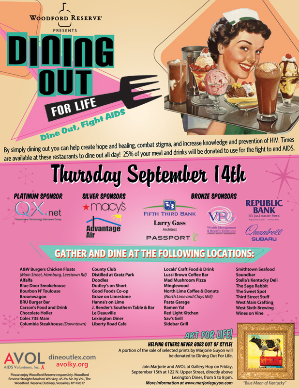 AVOL
AVOL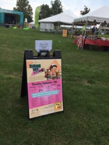
 Hiram Grooming Co.
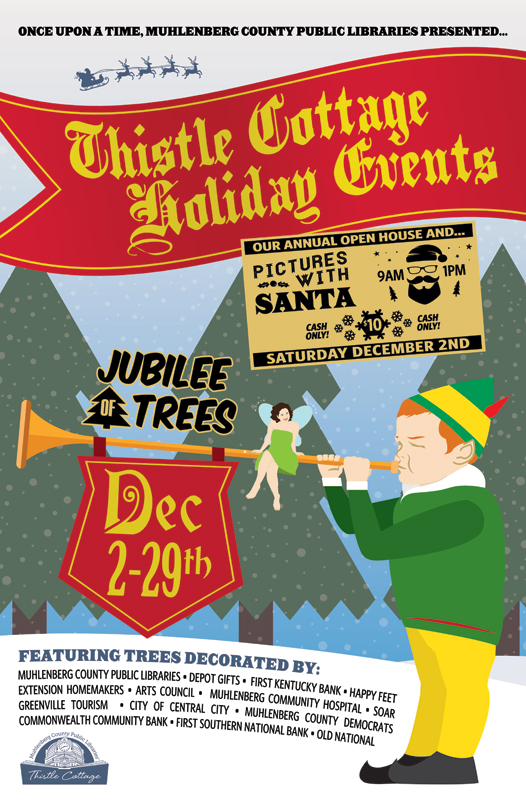
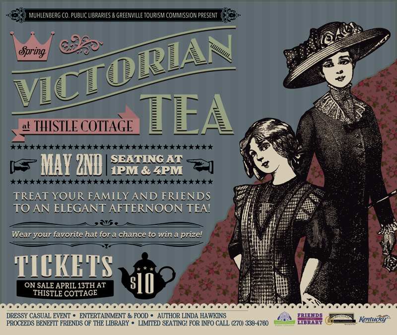 Muhlenberg County Public Libraries / Thistle Cottage
