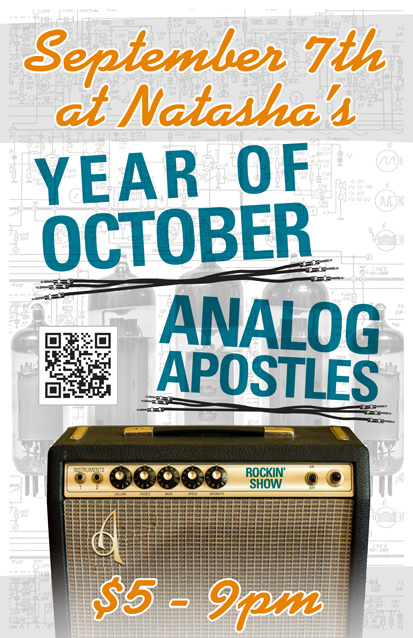
Year of October is a blues rock band based in Nashville, TN. I designed this 11×17″ concert poster art for a show with my band at the time Analog Apostles. The gig took place at the now defunct Natasha’s Bistro and Bar here in Lexington, KY. I had a lot of fun incorporating both of my passions, graphic design and music, into this composition.
Concert poster art design story
I themed the poster around a vintage Fender silverface tube guitar amp, which is similar to the 1978 Fender Twin Reverb I once owned. First of all, I replaced the Fender logo over the speaker grill cloth with the Apostles’ “A” insignia. I added a shiny chrome effect and embossed it to mimic the original element.
I also Photoshopped out the blue amp model name, and then replaced it with the words “Rockin’ Show” in a similar font. Guitar gearheads appreciated the attention to detail I added to this concert poster art.
As for the text, I used a sans serif font in turquoise for the band names, while choosing a fat script colored orange for the other information. The band name titles are colored similar to the amp name, and also use the same font. I “underlined” both bands’ names with sets of unrolled guitar cables. The orange script almost has a neon signage feel.
Finally, I overlaid a set of vacuum tubes on top of the amp schematic drawing in the background. I changed their colors to black and white to make the colors in the forefront pop. That is why these images come together to make the perfect background arrangement. I almost hid them in effect, but if you take the time to examine them, they really add to the whole package.
Contact me to design the poster for your next event
Do you have a big show coming up? You want to fill up the venue, right? Then you need concert poster art that stands out! Contact me today.
The living dead returned, roaming the streets of Western Kentucky for the sequel to 2011’s Zombie Walk event! The previous year’s undead themed charity walk turned out to be a huge success. Therefore, Main Street Costumes once again called me for their event promotion design. The small town costume shop printed variations of this artwork as eight feet long banners, postcards, and t-shirts.
Since this was the second annual event, I multiplied the featured zombies by two. I felt that the stock image of the purple female zombie was a tad too immodest for a family event, so I photoshopped more clothing to cover her. I also adjusted some proportions of the characters to better fit the space.
Then, I drew the red “2” so that the second event artwork would call back to 1980s slasher film sequels. The brightly colored characters and titles pop off of the stark background. I used the heavyweight Gotham font for the copy. See my work on display in this Youtube commercial for the event:
Screen printed shirt for event promotion design
I rose to the challenge of simplifying the full color poster and card designs to create a three color screen printed shirt. Since my background includes over five years of working in the screen printing industry, it was second nature to me.
My client agreed that we should reduce the art to pink and purple with white highlights. We stuck with the black background for the shirt. Black therefore functions as a de facto fourth color, outlining the words and images, and coloring hair and grunge elements.
Hire a professional graphic designer for your event’s artwork
Are you planning a community event such as a costume party, fundraiser, or fun run 5K race? Contact me today! I will bring your vision to life.
Ramma-lamma-lamma – Rock n’ Roll is King! I always have fun when I create a project that involves one of my outside interests. Whether it’s designing band merchandise such as one-inch buttons, or a wrestling poster design such as this one, I always have an edge because of my lifelong passion for the subject matter.
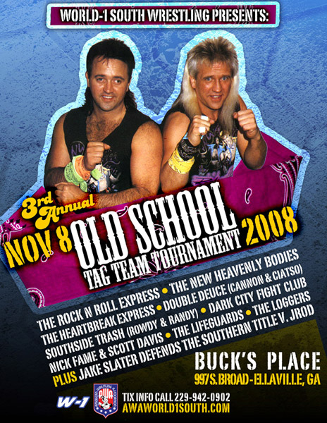
Years ago, the AWA pro wrestling promotion was one of my main print and web design clients. During this time, the AWA was divided into several regional offices in the USA. An independent promoter ran each territory. The Georgia based World-1 South group hired me to create this poster for an upcoming event in Ellaville, GA. A tournament featuring 80s stalwart tag team stars the Rock n’ Roll Express was the main event of the evening.
Old school pro wrestling poster design
I poured through a few of my old coffee table wrestling books to find the perfect old photo to feature. Ricky and Robert are putting their dukes up, ready for action.
Then I scanned in an old bandanna to frame in the classic babyface team. My actual bandanna was turquoise, but I recolored it pink to make it pop over the blue grunge background.
I used the Mesquite “Wild West” style font for the main title “Old School Tag Team Tournament”, as well as a grunge stamp style font throughout for a strong, masculine feel. The vintage disco style font for the words “3rd Annual” tops the design off with a flamboyant flair. Finally, I tilted the elements in the foreground to help the art catch a few more eyes.
Hire me – I’m an experienced sports promotion graphic designer.
We made a big hit with this new school take on an old school pro wrestling poster design. Are you a promoter with an upcoming wrestling or sports event? You need a professional poster design! Tag me in and we’ll make history together!