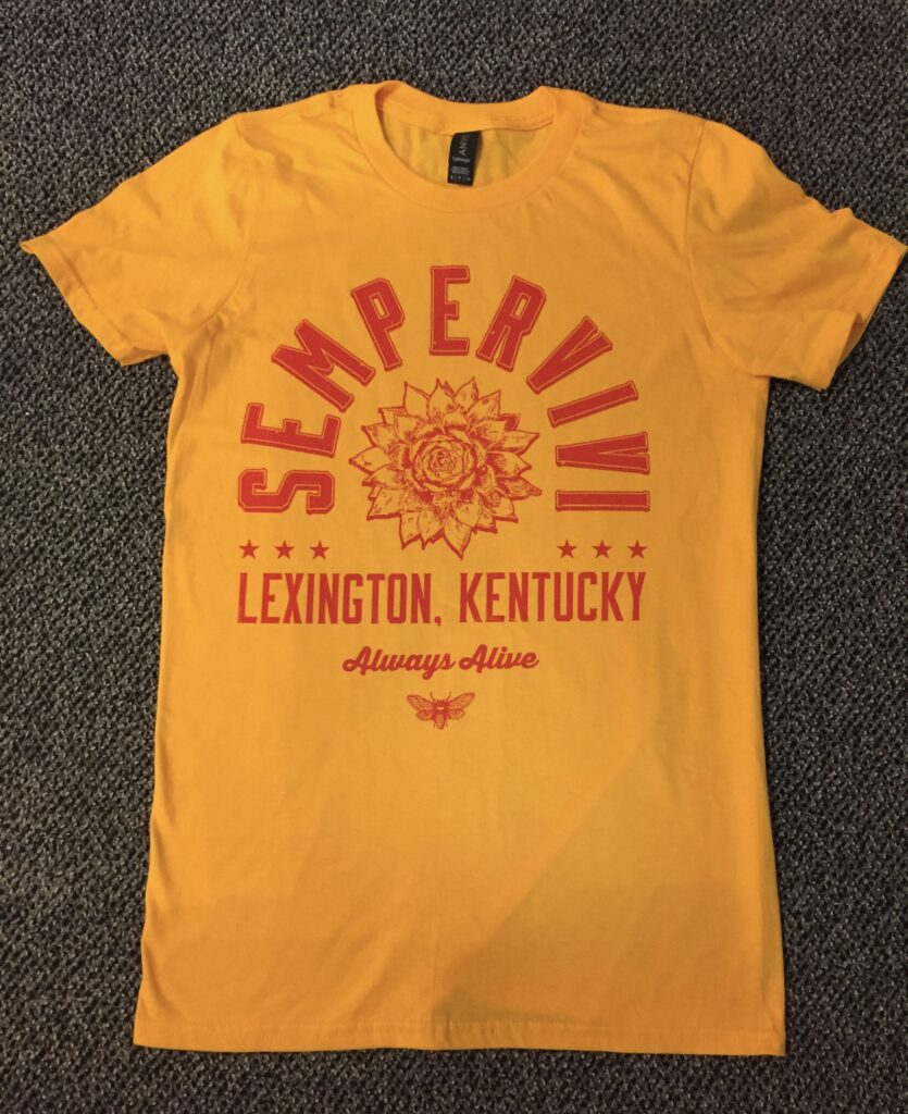
sempervivi

Sempervivi Hoodie Graphic Design - Front and BackSempervivi

Lexington, KY

Since 2015, I’ve designed several shirts for my pop punk project Sempervivi. As the band has grown, so have our merchandise offerings. We decided to take the next logical step by putting out some hoodies. I have done hoodie graphic design before, but this was special, since it was for my own music project.

Hoodie Graphic Design Story

Printing hoodies can be expensive. I wasn’t sure if there would be a big enough demand for Sempervivi hoodies, so setting up a preorder on our website for a limited run made sense. My friend who prints our shirts (Jeremiah at Flesh and Blood Printshop) might have a few extra blanks lying around. I asked him, and it turned out he had a lucky number of 13 surplus hoodies, both pullovers and full zip ups. There was also a mix of black, dark green, and heather grey garments, in a wide variety of sizes, so it helped create a sense of scarcity.

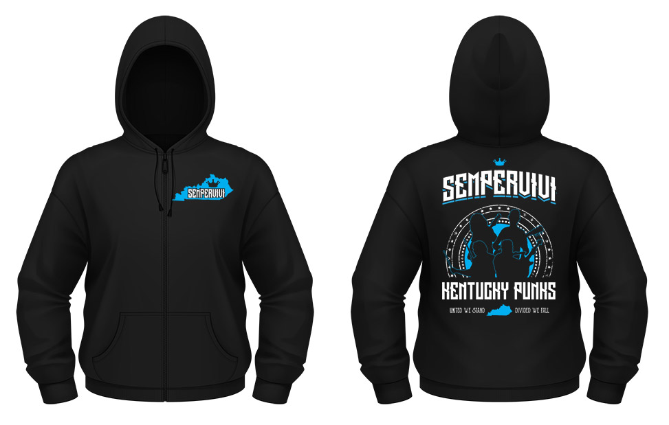
Once I got our plan in place, I started working on a design, which is usually backward from my usual order of doing things. Our bassist suggested that I create the design around silhouettes of us rocking out. I’ve done this theme several times over the years, both for artists and businesses. I used Adobe Illustrator to outline a few screen captures of live video footage, as well as some professional photos our friend Carmen had taken.

After I arranged the silhouettes, I framed them in a grungy circle of stars, adding the phrase “Kentucky Punks” underneath. To punctuate that phrase, I added our state’s motto “United We Stand, Divided We Fall”. Then, I arched the band name at the top using a tall retro title font. I adjusted the “M” for legibility, and added a small crown at the top to finish the back art.

Finally, I added the front design to the left chest. The silhouette of Kentucky contains the new logo font without the arch, along with the crown.

Hoodie Graphic Design Color Variants

Since we were printing on three different colored garments, I asked our printer to use three different ink color combinations. In addition to this being our first hoodie design, it was our first apparel to feature more than one ink color. For the black hoodies, we used a combination of cyan blue and white. The forest green garments featured orange and white. Lastly, the heather grey hoodie graphic design was printed using black and pink ink.

When I finally nailed down the design and the color schemes, we set up the online preorder for our fans. Once we had sold enough hoodies in advance to break even, I sent the files to press. Suffice to say that everyone loved them! Order yours here.

Contact Me For Your Hoodie Graphic Design

Inspired to offer hoodies for your fans? Contact me today to create a hoodie graphic design for your own band or business.

Sempervivi t-shirt designSempervivi

Lexington, KY

Just as with the T-shirt design for my previous band Analog Apostles, the first Sempervivi shirt design has been a big seller out of the gate. Releasing and promoting an album is a lot of work, but I never slack off when it comes to the accompanying merch. Therefore, I put in some serious time on the minutia of this apparel project. Since I was spending my own money to print these, and I wanted fans to actually buy them, every detail counted.

Lexington, KY Band T-Shirt Design Story

Sempervivi T-Shirt Design, modeled by Jeremiah Duncan of Lexington, Kentucky

My buddy Jeremiah modeling the design.

Shirt art was not originally in the plans or budget after finishing the record. However, my wife liked the idea and encouraged me to splurge, within reason. I felt like there were enough black and heather grey band shirts in the world. I needed my shirt art to stand out. My music is, generally speaking, positive and upbeat, so bright yellow seemed like a good choice. You can’t go wrong pairing it with red ink. The primary colors pop sitting on the merch table! Keeping the art at one ink color offset the cost of springing for super soft, vintage tees.

I wanted to go for a sports feel with the layout, similar to designs by Roots of Fight. The arching “SEMPERVIVI”, as well as “LEXINGTON, KENTUCKY” are set in the tall title font Moonshiner. I mixed it with the bold, trendy script Thirsty, which spells “Always Alive”.

Since this is a promotional item tying in with the new record, I reused some hand drawn elements from the CD art. Specifically, I made the succulent the focal point of the art. The much smaller cicada at the bottom punctuates the composition. Finally, I used a grunge brush to create a distressed feel throughout the artwork.

Music T-Shirt Design for Bands in Kentucky

If you have a band or other music project, I’ve got your hookup for apparel design. I will work with you on a budget friendly design that will still stand out. Contact me to get started!

CD Artwork for Sempervivi "Always Alive" by Kentucky CD cover artistSempervivi

Lexington, KY

Since I began my career as a graphic designer, I’ve enjoyed being a CD cover artist. The CD artwork for my own band Sempervivi proves that I am very hands on with personal projects. I departed my previous band Analog Apostles in 2014 in order to start my own solo project. After self producing an acoustic EP, I wrote new songs for this record, which necessitated a full band. I designed my own layout for “Always Alive” in 2017. This album was, in every sense of the words, both a labor of love and a family affair.

CD artwork process for Kentucky rock music

Initially, I only knew that I wanted to use a bright green color for the album’s cover. This is because the record’s concept is evergreen life. I took my time on this project in between other work and music related tasks, since my goal was to hand draw as much of the CD art as possible. At first, I even hand wrote the credits, but I was not happy with how those turned out. However, I drew or traced each and every other element in the CD and jacket composition.

CD artwork incorporating natural elements

Many of these songs’ themes center around family, growing up, and the idea of continuing one’s lineage to future generations. I wanted to incorporate many elements that were found in nature. Therefore, I researched which animals represented immortality in different world cultures. In the end, I settled on the cicada. It is a winged insect which is common here in Kentucky that can be heard chirping loudly on humid summer evenings. I incorporated a pair of these bugs as part of the front cover heraldry.

The sempervivum plant is also known as a succulent or houseleek. I featured it in red, located front and center on the cover. It is a reference to the name of the band as well. “Sempervivum” is a Latin phrase that literally translates to “ever living” or “always alive”.

CD Cover Artist – Fonts and typography for CD artwork

I did not initially set out to draw the word “SEMPERVIVI” with a particular font in mind. Instead, I decided to emulate something I would have doodled on one of my old high school notebooks. I drew, scanned, tilted, and resized the letters a few different times to get the feel just right. The varying sizes and placements of the tall serif characters make it stand out in a way that a conventional font would not.

I set the arched title “ALWAYS ALIVE”, as well as the track listing, in the “Triforce” specialty font. However, I filled in the signature openings of the letters when I traced it. This is in order to give the characters more weight. I then completed the front cover layout with some doodles of light beams and bubbles. I also created a frame to go around all of the elements using the Adobe Illustrator program. Then, I retraced it by hand in order to continue the sketch art theme. The text, frame, and drawings all have a faint white shadow that adds depth, as well as creating a subtle embossing effect.

Jacket CD artwork finishing touches

I sketched a drawing of my young son’s face on the back cover as the focal point. This made sense, since two of the songs center around becoming a father and spending time with him. The drawing offsets the album’s track listing. I used the Paint tool in Photoshop so I could highlight his face and make it pop off of the cool blue background. I also redrew the Bad Apple Records logo, which I designed for the record label in 2002. Finally, many paint splatters blend into the background. My son actually painted them at the tender age of just one and a half years old. Thus, I  made sure that he was listed prominently in the album credits at the bottom of the jacket!

Disc CD artwork layout

Last of all, I painted the compact disc itself with a deep magenta hue. It was complementary to both the green and blue backgrounds on the jacket itself. Next, I blended in a few more paint splatters from my son’s art into the background. Then, I arched the artist name and album title, once again using my altered version of the Triforce font. I traced sempervivum stalks from some photographs I found online by using a fine Sharpie marker. The traced Bad Apple Records logo is again featured, centered between the drawings. One more time, I highlighted these elements in a lighter shade of Magenta by using the Paint tool in Adobe Photoshop. After I had put in many a long hour working on it, the album art was finally ready for the press.

CD artwork that screams “YOU!”

All of the elements of this sophomore record, ranging from the songs themselves to the art detailed above, encapsulate the story of who I am. I identify with many roles. Christian, husband, father, Kentuckian, musician, friend, and graphic artist are all labels which describe me.

Do you have a distinct vision of what CD packaging should accompany your next recording project? Let me be your CD cover artist! I have years of experience designing merchandise for bands and musicians in many genres. This includes artists performing everything from country to bluegrass to alternative rock. Whether you have photography and other elements ready or not, I can get the results you need. Contact me today so we can get started on your own CD artwork!