 Pedestryans
Lexington, KY
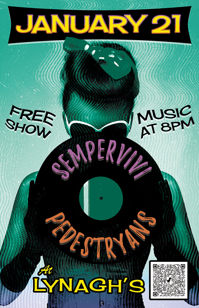
Here’s a retro concert poster that I designed for a 2022 show at Lynagh’s Irish Pub in Lexington. My friend Destry is a classy lady who sings and plays guitar in the blues based alternative rock band Pedestryans. Her selfie game is on point, and she often rocks a variety of vintage styles, so I thought featuring a classic 1950s style pin up girl would fit.
Retro Concert Poster Story
When I chose the vintage style pin up girl photo from my extensive stock image collection, I knew that I wanted to bathe it in an aqua blue tint. I overlaid the whole image with a wavy “static” pattern, so as to imitate vintage TV interference. Also, I envisioned wrapping the band names around the black vinyl record that she is holding. The bright pink and orange hues of the names help them stand out over the wax circle.
For the date at the top, I manually jumbled the letters in order to give it a retro, playful feel. I also jumbled the letters at the bottom of the page that spell out the venue name. The bright yellow date is encased in a typical 50’s “futuristic” style black curved shape. I then added a subtle gradient that fades the aqua blue to purple at the bottom in order to highlight “At Lynagh’s”. Other event information floats to the left and right of the pin up girl in black. I added a wave warp effect to it in order to give it some movement and also to increase the kitsch factor.
Contact Me If You Need A Retro Concert Poster
Are you holding an event that would benefit from a retro concert poster design? I love incorporating vintage 1950s elements into promotional ads! Contact me today to get started.

Analog Apostles
Lexington, KY
I designed this CD art for Lexington, KY alternative rock band Analog Apostles‘ debut EP “The Other Side of the Sea”. Since I played lead guitar in the band at the time, it was a no brainer for me to do the artwork. I was also very involved in the music production side.
Ben, the main songwriter and rhythm guitarist, thought of the title long before we recorded the first note. The album name and many of the songs made references to water, so we decided together on a nautical theme.
CD art – setting sail for the high seas
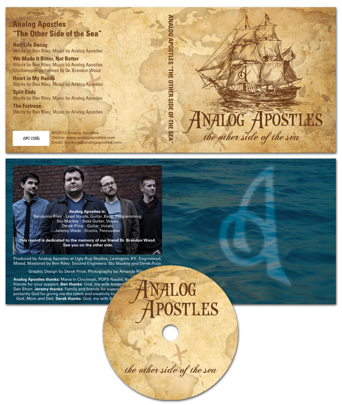
The four panel digipak layout started with an antique style treasure map background. Then, I overlaid a classical pirate ship illustration in brown as the focal point. The “A” monogram mark from the logo I designed was later superimposed onto the ship’s main sail.
After that, I set the band‘s name in an antique “swashbuckling” style font face. The album’s title then materialized in a classic cursive script. I capped off the design with a ghostly image of the band’s “A” icon over the dark blue ocean background in the tray card. Since the record’s theme suggested high adventure, a hint of supernatural mystery put it over the top.
From start to finish, this record truly was a DIY project. We performed every aspect of the production, from the recording process to ordering the album duplication. Ben’s wife Amanda did a great job with the posed band photography. Our fan base fully funded the CD’s production online via Indiegogo, which is a great fundraising tool for artists on a budget.
Hire me to design your CD art
Are you a band or record label currently hoisting the main sails on a new album? Contact me today for a CD layout design that will shiver your fans’ timbers.
 Pedestryans