ky

Website Redesign for Hardin County Water District Number One Hardin County Water District No. 1 | Elizabethtown, KY

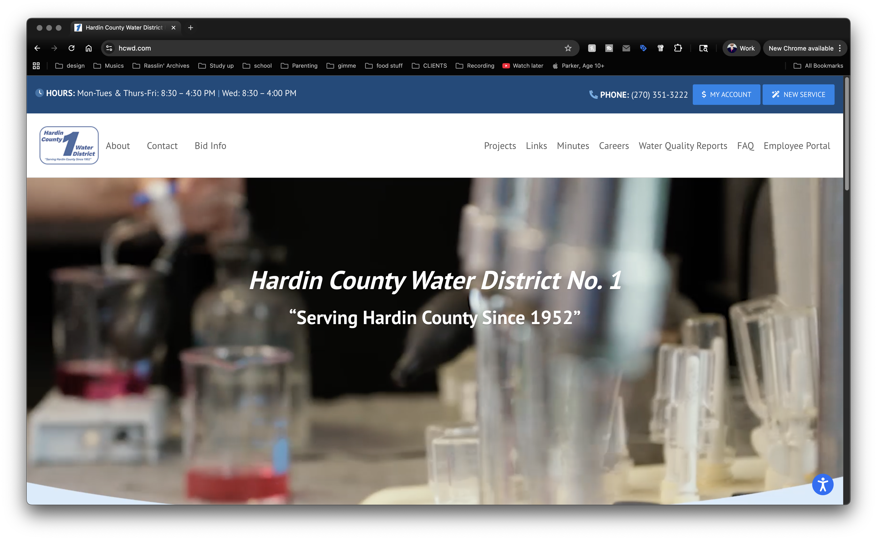
Years ago, while living in Elizabethtown, Kentucky, I struck up a friendship with a coworker named Robert. We kept in contact after I moved to Lexington and went to work for myself full time. Robert also got a new job, working for the local water company. He hired me to design their online customer portal a few years later. Others changed up the site as the years went by, and it was in dire need of a facelift. Customers’ needs were changing, as were web accessibility standards. Robert brought me back on board for Hardin County Water District Number 1’s website redesign.

Website Redesign For Kentucky Utility Company

Once Robert supplied the list of needed features, I got to work on the new test site. I recommended my old friends at Sublime Media Group in Bowling Green, KY to shoot new footage for the homepage. Once I had the raw footage in hand, I edited it down to a 15-second clip, optimized down to 5mb for web streaming. Robert requested a few changes and the video was ready for prime time.

After completing the video, I focused on cleaning up the site’s layout. I made sure the site stayed clean and inviting, sticking to white and shades of blue. I unified the fonts to help the new site’s cohesion. Then, I made sure customers could easily access the most important elements of the site. I positioned the District’s hours and phone number, along with the buttons to add new service and access customer accounts, at the top.

Under the main site video, I positioned two family focused stock images, highlighting links to pay the customer’s bill and connect new service. Finally, the news section rounds out the homepage layout. Thumbnails and excerpts from the four most recent news items automatically populate this area. Users can click the “Read More” links in each excerpt to read the full articles, or click the “News Archives” link to read all of the posts.

Wrapping Up The Website Redesign

After my client approved the homepage, we worked together to shape up the rest of the site. Robert and I worked together to update, clean up, and organize each page. I added a stock photo to each page with a water theme. Each of them also centered around smiling families and kids.

Last, but definitely not least, I worked with the water utility company on securing their forms. They deal with sensitive, personal information tied to each customer, so it had to be encrypted. I also edited existing forms, adding new features to help prospective new account holders and potential employees.

Does Your Company Need Need A Fresh Website Redesign?

Function is important. When it comes to your online presence, style is, too. If you have a stale site, you can trust me for your website redesign. Contact me today.

Concert Poster Designer Derek Price

Rebel Rebel Lounge | Berea, KY

Here’s one of my favorites. As a punk poster designer, I incorporated a few of my favorite elements into the layout. Between a classic rock reference, digital character illustration, mixing textures with light effects, and varying font weights, this art hits all the high notes.

Punk Poster Designer Strikes Again

My band Sempervivi was set to make our debut in Berea, Kentucky’s popular Rebel Rebel venue. Since the venue shared the name of a David Bowie song, I based this poster on the iconic “lightning bolt” photo on the cover of his album “Aladdin Sane”.

The main subject is my childhood teddy bear Flash, also the band’s mascot. I drew him using Procreate on my iPad, then imported him into Photoshop. I set him in front of an actual bear fur texture background. Flash gives off a mysterious, supernatural vibe, courtesy shadow and light effects.

The lightning bolt color scheme repeats throughout the design, both in the typography and the background. I set the main title “Rebel Rebel”, as well as the information at the bottom, in the tall serif font Moonshiner. For the main title, I skewed it upwards and added a double shadow in the red and blue lightning bolt scheme.

Poster Typography Story

Each band name displays prominently in a lightweight variant of Futura. I justified them all and spaced each one out, in order to help them stand out despite the lighter weight font.

To top it all off, I then framed the design in with a thick, black outline. This adds weight and additional darkness to the background, thus helping the white text pop off the composition.

DIY Till You Die? Hire Me Today.

Punk Poster Designer is one of my favorite titles. I love helping DIY artists and musicians get the word out about their events. Full color 11×17″ posters are my favorites. Contact me today.

Rough Customers Concert Poster Design - Lexington, KY ska band

The Rough Customers | Lexington, KY

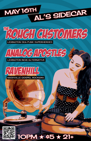
Pick it up! The Rough Customers are Lexington, KY’s only third wave ska band – as far as we know! In 2014, my band at the time Analog Apostles performed with them and Nashville, TN soul rockers Ravenhill. Ravenhill made a tour stop in Lexington at the Sidecar, next door to Al’s Bar. The Rough Customers’ live show is all about fun, and that’s the vibe I was going for with this concert poster design.

Large format concert poster design

The featured photo of the classic pin-up girl and phonograph was given a “washed out” effect, which I made by reducing the colors using Adobe Illustrator. I then added the hypnotizing bright blue swirl in the background to enhance the kitsch factor.

I lettered the bands’ names in a watermelon red using the retro “Badaboom” font, since it always signals good times. Additionally, I used the “Cherry Cream Soda” font for the other text, completing the poster’s vintage 50s feel. Finally, I added a QR code to the concert poster design, so that potential concert goers could RSVP to the event on Facebook by scanning the poster with their smartphones.

The Rough Customers never disappoint when they take the stage, and always draw a big crowd. This show was definitely no different, since we filled the small room to capacity. I would like to think that my eye catching design helped with that aspect.

I always design and print my own 11×17″ posters to promote shows and other events that I put together. The large format gives me more canvas to play with. It also stands out more than a letter sized flyer when I hang them in store windows.

Hire me for your next event poster artwork

Are you a musician or band who needs a concert poster design? Contact me!

banner design - Misty Mountain String Band 3x5'

Misty Mountain String Band / Louisville, KY

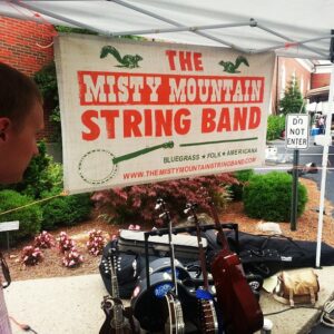
Misty Mountain String Band's banner design on display at a show.

Misty Mountain String Band’s banner design on display at a performance.

After designing MMSB’s CD layout for “Went to the Well”, the band returned, asking me to create a large banner design. This three foot by five foot vinyl banner traveled with the band and helped the guys look professional when on stage.

Banner design for Kentucky bluegrass and folk band

The affable string band described their sound as “What it sounds like when a banjo smiles.” Similarly, this banner is both warm and inviting.

The large banner layout features text and ornaments arranged in a vintage two color “show poster” style. First, I set the stage with a neutral color background with a rough burlap texture. I then mixed the two big, bold fonts for the main title in bright orange.

Afterward, I reversed the words “Misty Mountain” out of a long orange block using a Western style font. This is a divider in the middle of the main title to break the banner design up visually. It also functions as ground for the squirrels to stand on.

I set the rest of the band’s name in a heavy sans serif style font. Some of the letters were randomly nudged in order to make the title appear to be manually screen printed at a letterpress such as Nashville’s Hatch Show Print.

After that, I added the band’s requested twin squirrel and banjo line drawings in a bold, dark green. This gives the overall design a natural feel with more weight. Finally, I added some distress to the entire banner design composition using a grunge pattern eraser. How much more bluegrass can you get? The answer is none – none more bluegrass!

Hire me to design your brand and concert promotional flags

Are there big summer music festival bookings in your future? Do you need a large banner design to make your group look more professional on stage? Contact me today to get started!

Muhlenberg County Public Library Website Design

Muhlenberg County Public Libraries | Greenville, KY and Central City, KY

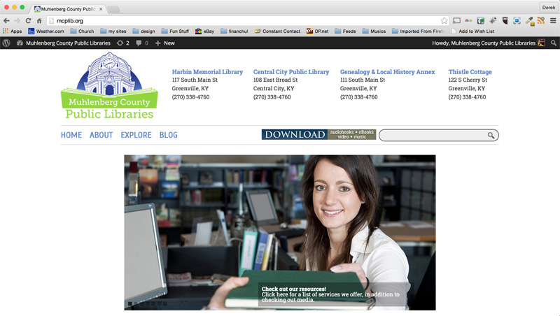
My hometown’s outdated library website design needed a complete overhaul. The existing site was rife with errors at the time. It also had a lot of content that was very hard to navigate. The design was awful as well. Naturally, MCPL called me in to step in as their new public library web designer.

Public library web designer – project details

I started by updating their web presence with a clean white design. It features their new logo, which I also designed. Then, I added an image slider including relevant stock photos. I also  streamlined their existing site menu. It now includes just four main headings with drop down menu items.

Library staff members worked with me to find the best way to simplify and condense the original content. We created a system that staff could easily update by themselves. This is so important for a library website design.

Additionally, the sleek online calendar lists upcoming events. These include all happenings such as kids’ storytimes and book signings. The website calendar can easily sync with both iCal and Google Calendar.

Patrons can access all of the libraries’ online databases in order to check out books and other media. The complete catalog is conveniently at each user’s fingertips. They can search directly, right from the library website design main menu.

I also built a separate mobile version of the site. This enables patrons to keep up with both library branches on the go by using their smartphones and tablets. Customers may still access the full catalog, making for a complete web solution.

Library Website Design in Kentucky

Check out the site here! Does your business or nonprofit have a lot of content that needs updates? Perhaps your site  demands a fresh makeover. I would love to help! Hire me to be your public library web designer.

Muhlenberg County Public Library Logo design

Muhlenberg County Public Libraries / Greenville and Central City, KY

Way back in 2013, my home county’s library system contacted me for a huge rebranding project. They called on me to create a new public library logo design and website for them. When I was growing up in Muhlenberg County, Kentucky, I fondly remember participating in their annual summer reading program each year. I also would often stop in to check out books while I walked home on my way from my school, Greenville Elementary. Because of this, I considered the library logo art project to be a very special honor.

Public library logo design in Kentucky – fonts and Image

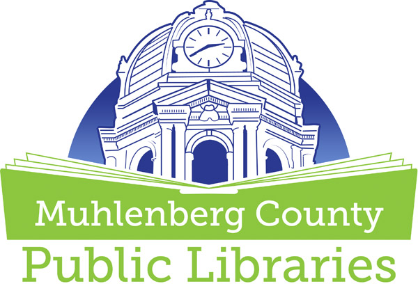
First, I created a line drawing, which was based on the iconic county courthouse tower using the Adobe Illustrator application. This building happens to be the largest open belfry anywhere in the United States. The courthouse tower resides right across the street from the Greenville (Harbin Memorial) branch of the public library. MCPL also has a branch situated in Central City, KY.

After I drew up the focal vector image, I spelled out the words in the main title “Muhlenberg County Public Libraries”. I chose the Museo Slab serif style font. I love this font, since it creates an identity that looks both classic and modern at the same time. A simplified book shape opens up in the foreground in order to provide a tasteful contrast to the architecture portrayed behind it. It avoids the pitfall of potentially making the design too complicated by still not being too obvious or complex.

All of the elements’ weights are distributed evenly. The book’s shape gives the correct emphasis on the text. To give the piece some more variety, I set the words “Public Libraries” in a larger size at the bottom. The words “Muhlenberg County” reverse out of the book shape in white.

Public library logo color scheme and finishing touches

The dark blue and lime green color scheme is strong and eye catching, while still keeping things simple. Depending on the application, I set the background color in either a solid blue, or the gradient fade you see displayed here. As with all of my logo designs, I created a separate, simplified version in black and white. I have always maintained the belief that the best logos can be reduced down to a one color format. I love going “back home” to Western Kentucky and seeing my work displayed on signage and billboards. The library was such an important part of my childhood growing up in Muhlenberg County. Therefore, it is a good feeling to know that my work represents it to kids growing up there today.

Muhlenberg County Public Libraries Thistle Cottage Logo

Muhlenberg County Public Libraries Thistle Cottage Logo

Thistle Cottage history and public library logo design colors

Later on in that very same year, MCPL returned to me for a new task. They requested a new variation of my original public library logo design. The new spin on the brand first involved a change in the color scheme. For this particular version, I decided we should incorporate a rustic copper brown and army green combination.

Both of these muted colors combine and hearken back to the heritage of the building represented by the mark. Thistle Cottage is a historic early 20th Century home on 122 South Cherry Street in downtown Greenville, KY. It was built in the year 1912, back when the Western Kentucky coal mining industry was still booming. The Cottage is located just around the corner from the Harbin Memorial library branch.

Thistle Cottage was formerly a cultural center that would host touring art exhibits. The city gave it to the public library system in 2013. They then converted it into a museum and art gallery space. MCPL also holds their annual community events there. These events include their Mother’s Day Victorian Tea party in May, along with their Pictures with Santa holiday series.

Thistle Cottage library logo art – fonts and finishing touches

A fun handwriting script font comes together in order to spell out the main title phrase “Thistle Cottage”. Once again, I reversed the title out of the large open book shape in white. Then, I made the book shape a bit taller. This way, it would frame in all of the main title text. I kept the “Muhlenberg County Public Libraries” text intact from the original logo design in this particular variation. Then, I arched it around the courthouse image from the original logo in the copper brown shade. Finally, I recolored the county courthouse in the olive shade of green.

The finished product I provided made the staff at MCPL very happy in the end. While it is obviously associated with the Kentucky public library system, the muted color scheme and classic script give the logo a vintage feel of its own.

Thistle Cottage logo signage gallery

Check out the finished product in real life below! The library features it prominently on the sign in front of the Thistle Cottage building.

My then-young son and I in front of the Thistle Cottage sign at my gallery exhibit in 2019.

My then-young son and I in front of the Thistle Cottage sign at my gallery exhibit in 2019.

“Book” me for your public library logo design!

Are you a library director who will soon launch a new library system or branch in your community? Perhaps your own library system has been using the same outdated library logo art for many years. You may very well be in need of an image rebrand! Whatever your situation may be, you should contact me! Everyone in your town will be checking you out! Sorry, for better or worse, I just can’t help myself when it comes to a good pun.

Ronald Jenkees shirt design

Ronald Jenkees | Louisville, KY

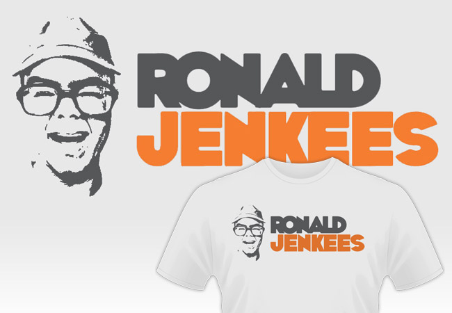
This Ronald Jenkees shirt design is one of my biggest hits! RJ is a friend of my old band from Kentucky. If you’ve never heard of him, he is an electronic music prodigy, as well as a YouTube phenom.

RJ is instantly recognizable, squinting in his Coke bottle glasses while wearing an assortment of fedoras and other hats. In his live performance videos, he always encourages viewers to have fun with their music, no matter what their skill level may be. This makes him a kindred soul to me, so I was happy to work up some apparel art for him.

He commissioned a simple shirt design in 2013, which he would release along with a new album. His only request was that I keep the shirt to a simple two to three colors. Since I have a background in screen printing, simple designs are a specialty of mine. He encouraged me to get creative with shirt colors and depictions of him.

Ronald Jenkees shirt design story

First, I used Boris Black Bloxx for the text, which a thick, wacky font. I decreased the spacing of it in order to add to the fun. Then, I simplified a screen capture from one of Ronald’s Youtube jam videos to create a one color image. Finally, the product displays his vibrant personality while promoting his jaw dropping musical prowess.

This version is the men’s style, which is displayed on an Ice Grey T-shirt with orange and dark grey inks. The design is also available in a grey ladies cut with pink and dark grey ink colors. Order Jenkees swag for yourself here! Then go see him in action on “the YouTubes” here!

Shirt design for musicians and Youtube stars alike

Are you crowdfunding your next album and in need of a shirt design for one of the perks? Do you need merchandise to capitalize on your viral videos that are blowing up on Youtube? Contact me today for the perfect shirt design!

Zombie poster design for Kentucky costume shop event

Main Street Costumes / Greenville, KY

My longtime friends Clint and Lori Cobb built their successful local costume shop Main Street Costumes (now The Halloween Shirt Company) from the ground up. They bolted onto their successful eBay store with a brick and mortar. It fast became a fixture in my small hometown of Greenville, KY, famous for the giant skull in the window. When they started planning a “Zombie Walk” event to benefit a local charity, Clint and Lori called on me to create a promotional design. They  featured this zombie poster design on 3’x5′ banners, postcards, and t-shirts, as well as other mediums.

Zombie poster design story

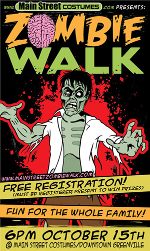
I set out to create a feel that was somewhat gory, yet still lighthearted enough for local families. First, I began the zombie poster design with the stock featured image, a white eyed “walker”.

The gruesome figure, complete with green decaying skin, a tattered shirt, and disheveled hair, still needed a little work. I felt that the size of his head was too small. Therefore, I used Adobe Photoshop to adjust it. Additionally, I tweaked a few colors and features before moving on to the rest of the poster.

In order to make the rest of the zombie poster design elements pop against the black background, I used bright colors. The zombie is outlined in a bloody red splatter. His head juts in front of the event logo in order to add depth.

Bright yellow and orange banners zig zag across the front like caution tape, displaying the event details. I used a frenetic, handwritten style font so it would have a comic book feel.

The debut event was a huge success, since it drew over 350 costumed “zombies” to Main Street in the heart of Muhlenberg County.

Hire me for your business’s event promotion art

Are you holding a zombie or horror themed event? Perhaps a Halloween bash for your local community? Contact me today!

Big Blue Customs Hot Rod Logo Design in Lexington, KY

Big Blue Customs / Lexington, KY

Regular client Chris Curtis, owner of the Chip Magician body shop, started taking on more custom work in 2010. Because of this, he decided to launch a new brand around it. I created this hot rod logo design for him based on a pencil sketch he had drawn up by a third party. Chris needed a masculine, powerful image to represent his brand. The end result needed to retain the attitude of the original sketch, while pumping it up with extreme shine.

Hot rod logo design story

First, I started by tackling the color scheme. Here in Lexington, Kentucky everyone bleeds UK Wildcats blue, so I Pantone matched that particular shade for this design’s background. The warped varsity style block lettering in white makes that theme obvious enough. It pairs perfectly with the word “Customs”, appropriately set in a custom font below it. The words are stroked multiple times and shadowed, as is the background. This adds just the right amount of over the top boldness.

Behind the words and background, I added an image of a custom chrome wheel. There is no doubt when you see this that the business caters to an audience who is passionate about customizing their cars. I then framed the wheel at the bottom using two tribal ornaments that subtly suggest flames. Throughout the design, I embellished with chrome effects, gradients, shadows, as well as inner and outer strokes to grab the viewer’s attention.

Finally, I added in some extra bling to the corners of the word “CUSTOMS” for maximum shine. There you have it – one high end, hot rod logo design!

Start your engines! Hire me for your hot rod logo design

If you’re looking for a bold, chromed out logo for your business, then I am your man. Contact me today to get started!

CD Graphic Design for Stellar Kin "We Need to Know" - Kentucky rock band

Stellar Kin | Bowling Green, KY

I made this CD graphic design for Kentucky indie rock band Stellar Kin. I founded the hardcore emo trio in 2000 while studying at Murray State University.  By 2002, the lineup was solidified and we began recording and touring. “We Need to Know” was our 2004 full length sophomore release on Bad Apple Records. It features conceptual design and photography by myself, as well as posed photography by the famed Neil Visel. My friend Holly posed for the front and back covers.

CD Graphic Design for Kentucky indie rock band

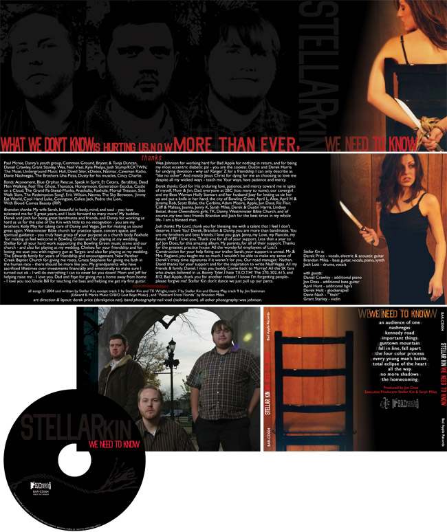
The album lyrics cover serious spiritual themes. Therefore, the art consists of black and red colors and stone faced expressions. I set the main titles in the tall serif Big Noodle Titling font. The letter spacing varies to fit phrases into each outside panel, which spell out “What we don’t know is hurting us. Now more than ever, we need to know”. I set the CD graphic design’s track listing, along with other information, in the classic Gill Sans font.

The front and inside of the booklet tell the story of a young woman who has been tied up by an assailant. On the front cover, she grasps hold of a kitchen knife while cutting herself free from the ropes that bind her. Finally, she stalks her kidnapper with the knife on the booklet inside. The empty chair sits alone on the back cover. I reversed the words We Need to Know out, using the wood paneling from the photograph.

Lastly, the CD cover features a simplified, one color image of the rope. I simplified the individual band member headshots to grey, which gives them a ghostly feel against the black background. This is same grey hue also fills the words Stellar Kin on the front cover.

Hire Me To Be Your Album Art Designer

If you are a band or a solo artist, then you need professional artwork for your next record. Contact me today to get started.