Local Violence / Lexington, KY
I created this band sticker design for a group based here in Lexington. Local Violence was a DIY pop punk band that included some friends from my local music scene. I have been designing band merch since 1999, so they reached out to me in order to help promote their band.

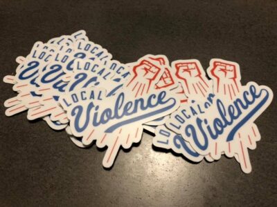
The finished product is ready for the masses! Here is a printed and die cut band sticker design.
Band sticker design story
The band already used a fist icon in their initial branding. They wanted to somehow incorporate it in a parody of the Los Angeles Dodgers‘ iconic logo. I both cleaned up and recolored their existing fist art in red using Adobe Illustrator. Then, I added motion lines in red, so that it would mimic the Dodgers’ “flying baseball” image.
After that, I found a similar script font to replace the word Dodgers with “Violence” in blue. A few adjustments to the text made the font more authentic.
Finally, the word “Local” tops off the design in a blue sans serif Varsity font. I spaced out the letters and also warped them with an arch effect.
At last, the baseball parody sticker art was complete.
Local Violence loved the finished band sticker design. They took advantage of a special promotion with Sticker Mule to both print and die cut their stickers. This created a white stroke effect around the design. The precise outline of the shape really stands out amongst other bands’ standard square and circle shaped stickers.
Hire me to be your merch designer.
Is your new band just getting your feet wet with merch? Perhaps you have been in the game for awhile and you all just need a fresh new design. Contact me today to hire me for your new band sticker design!