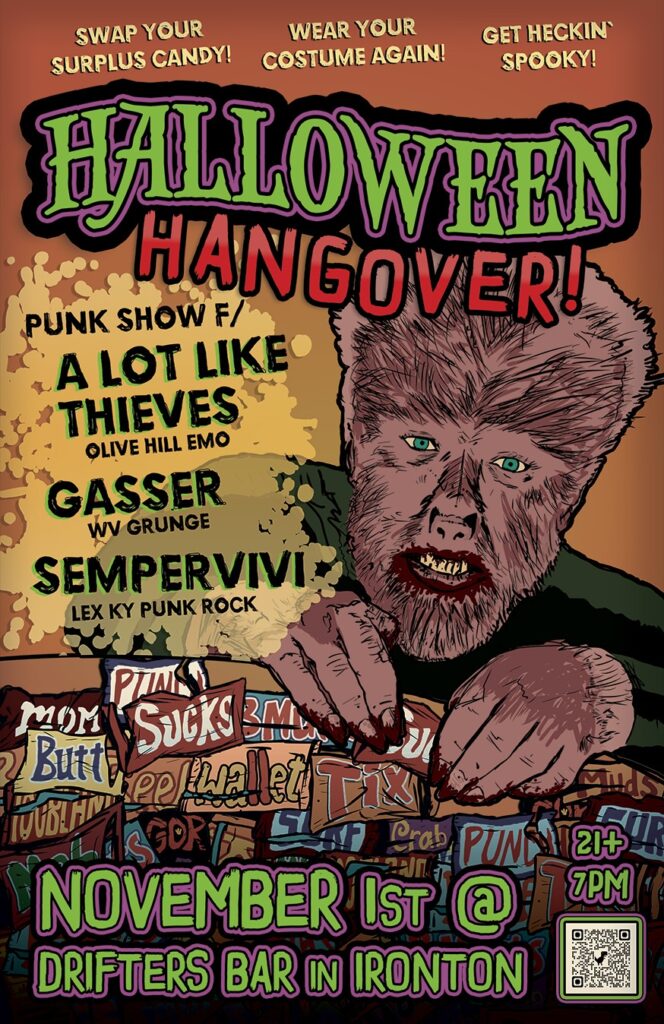
Concert Poster Design

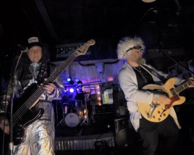
Concert poster design is where my two main interests in life dovetail. I have been playing guitar and singing in bands since 1998. I have also booked bands for countless shows and festivals. When doing so, my responsibilities include designing flyers to promote concerts. I also often print and distribute them myself. It’s a very important part of being a successful independent musician.
I love to create full color, large format printed posters. It is very fulfilling to find the right visual image for an upcoming gig. Sometimes, I like to create black and white handbill variations. They can also be effective promotional tools.

Contact me for your own concert poster design

Are you in a music group that has a big local show or festival gig coming up? Perhaps you are a regional or national concert promoter looking for the perfect poster designer. Contact me for a striking design to promote your event.

Skate Punk Concert Poster Design

Skunch | Lexington, KY

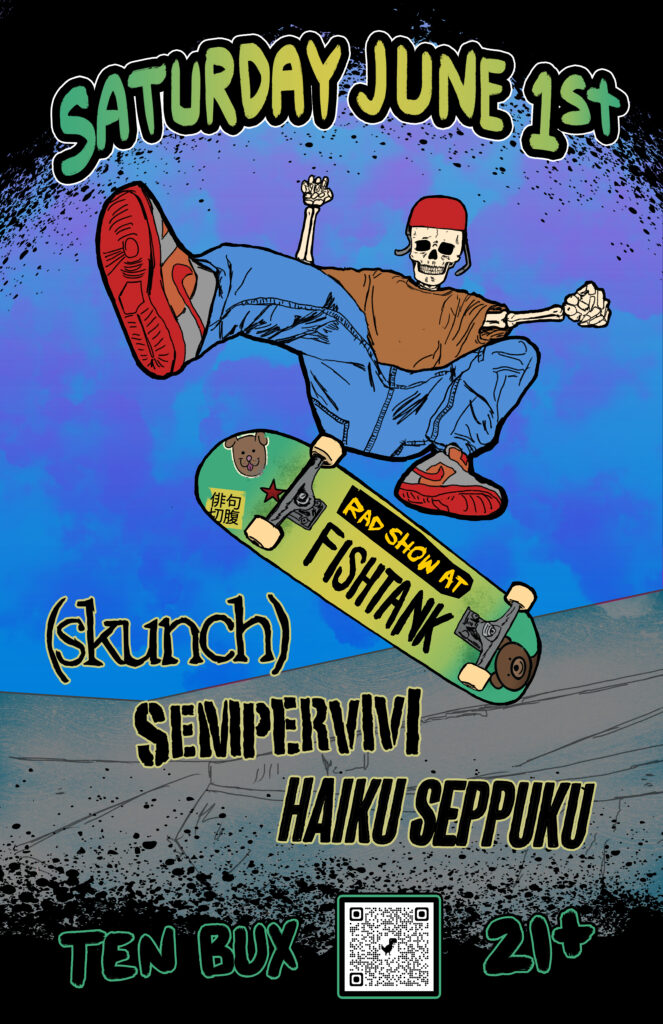
My band Sempervivi had to take long hiatus from playing out, due to me breaking two fingers in 2023. Since we could not perform live, I was not designing any flyers for shows. I got back in the game big time with this punk concert poster design, for our gig at the Euclid Avenue institution, The Fishtank.

Punk Concert Poster Design for Lexington, Kentucky Bands

I went into this project with intention of making it portfolio worthy. Also, I decided to try something new. This is the first print design I drew completely using the Procreate app on my iPad. I knew from the jump that I wanted to depict a skeleton performing a skateboard trick. What could be more punk rock than that?

After selecting the perfect skate trick photo to model from, I experimented with a few different pens and brushes. I outlined the skateboarder’s body, then studied images of skulls and bones to complete the skeleton figure. After sketching out the board and the skatepark, the black outlines were complete.

I then hand drew the text, listing out the show information. Rather than just copy and paste the band logos, I freehanded them in order to continue the “DIY” feel of the punk concert poster design.

Color And Finishing Touches

Once I was finished with drawing the black outlines, I imported them into Photoshop to complete the flyer. I employed a few more brushes and effects to color it in. The show date is warped into an arch at the top, colored in with a green to yellow to green gradient effect. I repeated that gradient on the skate deck, then added “stickers” referencing each of the bands to it. A “grunge” eraser brush gave the appearance of scuffs on the deck, as well as rips and fading on the stickers themselves.

After coloring in all of the foreground elements, I used a sponge brush and a few gradient and overlay effects for the cloudy sunset. I also blended the brush in faintly with the faded concrete of the skatepark, creating a watercolor feel. The outlines of the skatepark stayed lighter than the foreground elements, adding further depth.

Once I had colored in all of the elements, I felt like something was missing. I added some black splatters to the top and bottom of the punk concert poster design, which added weight and helped the show information stand out.

Do You Need a Punk Concert Poster Design? Contact Me!

If you can’t do it yourself, don’t worry. I’m your guy. Promote your big show with a punk concert poster design by the premier graphic designer in Kentucky. Holler at me.

Pop Art Poster for Rock Concert - Courtney From Work - Columbus, OH

Courtney From Work | Columbus, OH

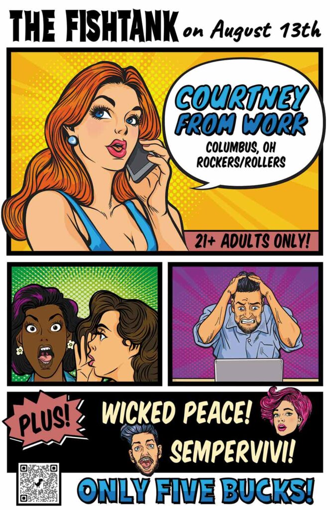
Our upcoming gig with Wicked Peace and Courtney From Work was approaching. These bands are known for their energetic live shows and are loads of fun to hang out with. That’s why I chose to lay out a pop art poster design in order to promote it. The bright colors, halftone patterns, and exaggerated facial expressions common in vintage comic strip and pulp stories were perfect to match this bill’s vibe.

Pop Art Poster Design story

While perusing royalty free stock art online, I chose a few images that I could lay out in order to tell a story. The focal character in the top panel is on her phone, starting a rumor. In the next panel, another lady whispers the gossip into her friend’s ear. Finally, in the last panel, the man is frustrated at reading the news on his computer. These Jezabels have ruined his reputation!

In reality, the story came second to the details about the show. I patterned the venue and date displayed at the top after a comic strip name and author byline. The top panel heralds the headline act in a mix of bright blue and black, popping out from the speech balloon. “21+ Adults Only!”, the banner at the bottom of the panel declares. Underneath the main illustrations, I added the other band names in a classic comic strip font. Then, I accented the band names with two more eye catching pop art poster characters splashed over the stark black background. Finally, the poster declares the door charge “Only Five Bucks!”. You just can’t beat that for a night of entertainment!

Hire me to design your event poster artwork!

Are you promoting an upcoming concert or event? Looking to promote it with a splash of tongue in cheek kitsch? Then you should contact me today!

Pedestrians Kentucky Blues Concert Poster

Pedestryans | Lexington, KY

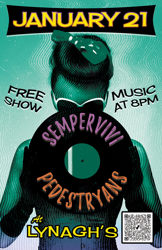
Here’s a retro concert poster that I designed for a 2022 show at Lynagh’s Irish Pub in Lexington. My friend Destry is a classy lady who sings and plays bass guitar in the blues based alternative rock band Pedestryans. Her selfie game is on point, and she often rocks a variety of vintage styles. Featuring a classic 1950s style pin up girl would fit perfectly.

Retro Concert Poster Story

When I chose the vintage style pin up girl photo from my extensive stock image collection, I knew that I wanted to bathe it in an aqua blue tint. I overlaid the whole image with a wavy “static” pattern, so as to imitate vintage TV interference. Also, I envisioned wrapping the band names around the black vinyl record that she is holding. The bright pink and orange hues of the names help them stand out over the wax circle.

For the date at the top, I manually jumbled the letters in order to give it a retro, playful feel. I also jumbled the letters at the bottom of the page that spell out the venue name. The bright yellow date is encased in a typical 50’s “futuristic” style black curved shape. I then added a subtle gradient that fades the aqua blue to purple at the bottom in order to highlight “At Lynagh’s”. Other event information floats to the left and right of the pin up girl in black. Every retro concert poster needs a wave warp effect. I added this element in order to give it some movement and also to increase the kitsch factor.

I’m the poster designer you’ve been looking for!

Are you holding an event that would benefit from a retro concert poster design? I love incorporating vintage 1950s elements into promotional ads! Contact me today to get started.

LGBTQ Fairness Benefit Poster Design

Fairness WV | Huntington, WV

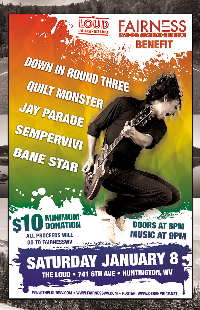
West Virginia based band Jay Parade offered my band Sempervivi a spot on this benefit show they were holding for Fairness WV. The guys liked my poster design for another show we did together, so they asked if I would donate my time for this cause. I happily agreed to provide this LGBTQ fairness poster design.

LGBTQ Fairness Poster Design Story

Josh from Jay Parade gave me all of the information about the equality event, such as the bands performing and the starting time. I contacted the venue, as well as Fairness WV, to obtain their logos. Since the organization had confidence in my skills, they did not insist on any specific design elements for the layout. Although I knew I wanted to include a rainbow in some way, I didn’t want to stoop to cliches or pandering. When working on a project such as this, it is easy to make it too cute. I needed to create an eye catching, bright poster that clearly announced what the event was, as well as its goal.

Using negative space for some of the typography was another goal. White “paint” splatters create that negative space in front of the rainbow color gradient background. I reversed out both the logos at the top, as well as the date and other information at the bottom. Then I added a rad rocker jumping with his guitar as the focal image. I reduced the image down to black and white, so it would stand out in front of the rainbow background. Once I added a motion blur filter, the guitarist was complete. Each of the band names features a perspective warp to give it some motion as it wraps around the guitarist.

When I put all of those elements together, I thought it was good, but not quite complete yet. In order to complete the LGBTQ Fairness Poster Design, I shrunk everything down and centered it. Then, I created an homage to the Appalachian mountains shared by West Virginia and my home state of Kentucky. I added some black and white mountain photos to make the new background. Now, the rainbow scheme really pops!

Contact Me For Your Benefit Fundraiser Art

Will your fairness campaign hold a fundraiser soon? You need a professional graphic designer to help draw attention to your benefit event.  Contact me today.

St. Patrick's Day Poster Design for Lexington, KY Irish Bar

Lynagh’s Irish Pub | Lexington, KY

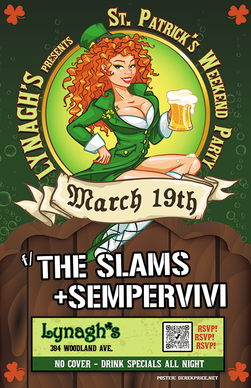
I experienced some of my favorite memories of performing original music live on stage at Lynagh’s. Lexington’s finest Irish Pub was always good to me and my bandmates in Sempervivi. Since they are an Irish themed bar and grill, St Patricks Day was a hugely successful time of year for them. The Slams are a local favorite Celtic Punk style band. Therefore, booking them to play with us at the pub on this occasion was a no brainer. Of course, I took on the task of drawing up the St Patricks Day poster design, so let’s dive in, shall we?

St Patricks Day Poster Design Story

I knew right away that the central image would need to feature a buxom Irish lass. Therefore, the perfect illustrated stock image portrays a luscious redhead in green leprechaun garb holding aloft a mug of foamy beer. After adding her to the composition, I wrapped the event name around the circular frame behind her. “March 19th” displays in a scrolling banner using an old English style font, while each of the band names is “stenciled” on the wooden fence our lucky lady sits on.

Additional event information also displays in a lime and dark green box at the bottom. In order to add a little flair to the dark green background, I inserted some fizzy bubbles, mimicking those founding in the beer mug. Finally, I added a solid orange shamrock shape in each corner to contrast the green and tie everything together.

 Contact Me For Your Irish Pub Party Artwork

Are you planning a big concert event or party at your venue for St Patricks Day? Don’t press your luck! Hire a professional graphic artist with over 20 years of experience to design your poster. Contact me today!

Funko Pop Poster Design - Concert Flyer

Al’s Bar | Lexington, KY

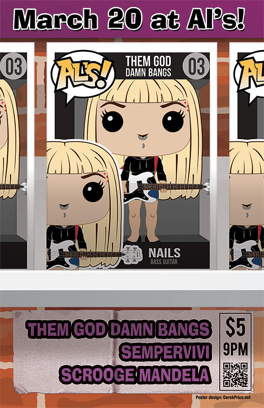
My punk band Sempervivi scheduled a local show at the fabled Al’s Bar back in March of 2020. Some bands we were friends with based in Lexington and Louisville also joined on the bill. I blocked off some time in between my clients’ projects to draw up a special poster for this event. Since Josh, the singer and guitarist from Them God Damn Bangs, was an emphatic collector, I decided to create a Funko Pop poster design.

Funko Pop poster design "Josh" variant

Funko Pop poster design “Josh” variant

This would be an ambitious effort that would allow me to flex my creative muscles and try some new techniques. Also, it was the first poster I had ever planned multiple variants for, so I was excited to spend all the time I could on it.

Funko Pop poster design story – base toy and package templates

I began this printed poster project by seeking out Funko Pop templates. Fans can go to Funko’s website to create their own avatars in the form of these vinyl collectibles. First, I worked up base images for the three most visible members of the band, Dawn, Josh, and Nails. These images were low resolution images, which also did not include the packaging templates. Most collectors prefer to display their Pops in the boxes on their shelves, rather than taking the toys out of them. Because of this fact, I also sought out packaging templates to start recreating the boxes.

Once I found the right packaging and toy templates to base my work on, I began adding little details to further personalize the flyer. First, I added the band name, along with the member names and their roles to the packaging, using the Bebas sans serif font in different weights and styles. I numbered each box 01-03, and parodied the word “POPS!” in the top left corner with the word “AL’S” for the venue. A grey background added the illusion of depth, and a faint, transparent grey simulated the clear portion of the packaging.

Each of the band members needed their own accessories and outfit modifications for authenticity. For instance, Nails and Josh play very distinct instruments. While I did not aspire to reproduce every single tattoo and nuance of their appearances, they had to be easily recognizable.

Adding some personalization to the figures

Nails usually plays a white Eastwood bass guitar, modeled after the vintage Univox Hi-Flyer. Since this is not as widely played as popular models like the Fender Jazz Bass or the Ernie Ball Stingray, I could not find any vector images for it online. I started with a photograph of the instrument, and drew up a simple approximation of it using Adobe Illustrator.

In addition to her bass, I added details of Nails’ personal style. This included adding the brown lowlights to her hair, as well as her lip and nose piercings. Her red star tattoos line her left eyebrow. Considering that Funko Pop vinyl figures do not include mouths, I find it funny that her non-existent lip is pierced.

Funko Pop poster design "Dawn" variant

Funko Pop poster design “Dawn” variant

Since Josh is the biggest Funko Pop enthusiast in the Lexington music scene, getting his figure mods perfect was the most important of the three. Josh often plays a very rare orange Fender Cyclone II onstage. While I was able to find a simple outline of the model, I needed to edit it and add several details in order to make it authentic. From the correct shade of orange to the Fender logo, I had to make it just right.

Dawn’s figure, on the other hand, was easier. I added her signature purple to both her hair and her glasses. Then, I added a zipper and some bling to her black mini skirt. Finally, I redrew her arms so she could hold a microphone.

Funko Pop poster design story – finishing touches

The time came to put the finishing touches on the poster. I added the event details to a sticker affixed to the red brick wall background. I created the sticker effect from scratch.  A mixture of Adobe Photoshop filters and effects made it appear worn and peeled up.

Each poster design variant boasts its own distinct, bright color for the banner at the top, as well as the band names at the bottom. Dawn’s poster used a bright shade of blue. Josh’s info appeared in Starbucks green, while Nails’ design featured a purplish pink hue. I typed all of the information in the fun, kitschy Ad Lib font.

I copied each band members’ figure boxes. Then, I set them three in a row on a white shelf bolted into the brick wall. I cropped the left and right boxes off of the canvas. I did this so the center image could be as large enough to feature it.

Unfortunately, due to the Coronavirus outbreak, this show was cancelled, along with all other mass gatherings in America. The COVID-19 virus changed everyone’s lives worldwide. Specifically, it caused a speed bump for independent musicians needing live performances to fund their endeavors. Unfortunately, the posters could not attract concert goers to the event. At least I got a cool poster design to feature on my portfolio.

Contact me for your own Funko Pop poster design

Can I interest you in featuring a collectible toy motif on your promotional piece? I can add the “pop” you need to attract potential your audience’s attention. Contact me today so we can get to work on some serious fun!

Sempervivi music poster design with wrestling theme

Sempervivi | Lexington, KY

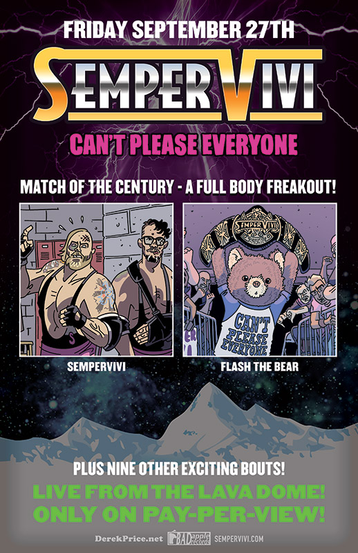
I created this music poster design for my band Sempervivi’s crowdfunding campaign. We were raising money to release our first full length album, “Can’t Please Everyone”. I contracted comic artist Chris Schweizer to bring my concept to life. The band would be shown wrestling my childhood teddy bear Flash. The results were even better than I had imagined.

Music poster design with wrestling theme

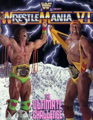
While brainstorming the perks we would our backers, I determined that limited edition posters would be ideal. The old school wrestling theme could include many aspects. Ultimately, I decided to mimic a pivotal event in my childhood, the WWE wrestling spectacular Wrestlemania VI on pay per view. The larger than life “Immortal” Hulk Hogan met the enigmatic wildman Ultimate Warrior for the WWE Championship in Toronto. Posters depicted them in front of a frozen mountain range, with lightning bolts lighting up the sky. In order to faithfully hearken back to this classic image, I had my work cut out for me.

Wrestlemania VI promo art this music poster design is based on

Wrestlemania VI promo art this music poster design is based on

I had already created a parody style logo based on the classic Wrestlemania logo. Next, I carefully reproduced the original metallic chrome and gold gradients. My striking tribute caught old school wrestling fans’ eyes. The retro neon pink and green subtexts also jumped off the landscape.

I then added images from our album art. The “Match of the Century” was on! Chris’s drawings show Flash with his championship belt. Meanwhile, the band stood in the locker room vowing revenge.

After I arranged the foreground images, I then built the fantasy background. Rather than a photo montage, I combined illustrations to create the stormy glacier scene. I had successfully paid tribute to the original 1990 WWE poster without outright copying it. Victory!

Contact me if you need a poster for your next event

All in all, this music poster design is one of my favorites. I always enjoy when I can combine my interests into one ad. Can I interest your band, record label, or music festival in a poster graphic design? Perhaps you’re a wrestling promoter needing high end promo art. Contact me today.

Rick Danko concert poster design (The Band) by Lexington, KY graphic designer

Lynagh’s Irish Pub | Lexington, KY

From 1981 to 2023, Lynagh’s Irish Pub hosted many local and national concerts here in Lexington. The owners commissioned me to create a series of posters to commemorate many of the famous acts they have hosted over the years. I created this Rick Danko concert poster design for one such act, the bassist of the legendary group The Band. He performed solo at Lynagh’s in 1999, just a few weeks before his untimely death.

Rick Danko concert poster, along with another event flyer I used the template for.

Rick Danko concert poster, framed along with another event flyer I used the template to create.

Rick Danko concert poster design story

I sought out to create a vintage style poster simulating screen printed art. First, I found a suitable photo with a creative commons license attached. I then simplified it down to just black, and cut out the elements of the background, leaving only Rick, his microphone, and bass in the shot. After that, I added a solid green shade back in behind Danko. This made the image pop out from the neutral background.

After laying out the focal image, I added all of the show information. As with many old school posters, the layout of the text blocks is important. Of course, I made the name of the headline artist the largest and set it in the heaviest weight. The supporting artists list in the accent color green, with a horizontal rule above it to further emphasize the headliner’s name. Varying weights of the same font create continuity, while still keeping the information distinct enough not to get lost. Finally, I reversed out the show date from a black block. The block containing the Lynagh’s logo balances it out at the top. I surrounded said logo with a celtic knot pattern on either side. This is a nod to the Irish theme of the bar.

Lynagh’s asked me to create a template from this Rick Danko concert poster design, which we would use for future events. Essentially, I can just replace the main photo, change the accent color, and the specific information. Thus far, I have used this for a handful of events and everyone loves them.

Like this Band poster artwork? Contact me for your own!

This Rick Danko concert poster design is one of my favorites. Do you need a graphic designer for your next event promotion? Contact me today!

Louisville, Kentucky CD release flyer by Bluegrass poster designer

Misty Mountain String Band | Louisville, KY

I worked with my prized clients The Misty Mountain String Band on many projects, from T-shirt designs to vinyl banners. After creating the CD layout for their 2018 album Kentucky Bound, I was honored to also design the CD release poster. I am proud of my reputation as a Bluegrass poster designer, so this project was very satisfying.

Kentucky CD release show flyer by Bluegrass poster designer

The Bluegrass quartet gave me the option to either base the design off of the album artwork, or create something entirely new. I chose the former. The vintage paintings of nature elements, as well as the roots instruments, perfectly compliment to the old time feel of MMSB’s music.

The original illustrator supplied several large images to choose from. I, being the Bluegrass poster designer, chose to incorporate two robins, which I cut out of a larger composite image. Also, I cleaned up her painting of a collection of different flowers. Then, I combined them and arranged them so that they creep around the bottom of the posed photo of the band. I recolored the photograph as well.

Both the sepia tint and the grunge overlay give it a worn, vintage look. I used a single font throughout the piece, the decorative title SwistInk Moabhoers. The banners in each corner feature sandstone textured backgrounds.

Finally, all of the elements rest on a black background adorned with a cracked texture. This background reminds me of the weathered Formica countertops in my grandmother’s house. The outdoor event was a huge success. It attracted over 200 attendees. I received a lot of great feedback on the 11×17″ poster from the band, as well as their fans.

Hire me to help promote your next Bluegrass event

Are you promoting a Bluegrass concert or festival? You need to hire the best concert poster designer in Kentucky. Contact me today.

Custom concert poster design for Guided by Voices band

Guided by Voices | Dayton, OH

The legendary indie rock band Guided by Voices scheduled a tour date in my hometown of Lexington, KY. As such, they were in need of a custom concert poster design for it. Their New York City based management company found me via Google search and then contacted me to pitch a unique proposition. I was hired on as the official Guided By Voices poster designer for this event!

The group asked me to design, print, and hand number a limited edition of 100 show posters. After approval of the design, I would then mail one copy to management. I also was required to hang a few copies at the concert’s host venue, The Burl. Finally, on the day of the show, I could set up a table next to the band’s merch station and sell the rest. I am always selling my own services. Therefore, I jumped at the chance to take part in this project.

Guided By Voices gave me carte blanche creatively. It was totally up to me to determine the poster’s artistic concept, as well as the subsequent design. The band had only rejected one poster art in their 30 plus year existence. They had developed a keen taste for quality design over their many years in the business. My reputation locally here in Lexington, KY for concert poster design preceded me. It felt great to know that both the iconic rock band and their management had so much confidence in me.

Custom concert poster design story – Guided By Voices Poster Designer

First, I Googled other posters that were designed for the band’s previous tour dates in order to do some research. Most of the other graphic artists sought to emulate screen printed designs. Thus, they only featured three or less colors in their posters. My planned design necessitated more colors. I wanted to create a flat, cartoon style illustration. It had to convey the necessary information while staying both fun and unique.

From the start of the project, I knew I wanted to incorporate an equestrian theme. Also, I intended for the piece’s concept to tip it’s proverbial hat to the culture of my home state of Kentucky.

I felt that it was a bit too cliche to use an image of a horse race as I initially had planned. All of my favorite concert posters incorporate a striking, slightly odd focal image. I had to think outside of the box. I traveled down to the uncanny valley by drawing a rowdy bartender wearing a rubber horse mask. Those who know me are well aware that people wearing realistic animal masks make me very uncomfortable. However, I resolved to face my fears by drawing this poster’s focal image.

Straight (bourbon) from the horse’s mouth on a custom concert poster design

The masked bartender brandishes a bottle of bourbon in one hand and a can of beer in the other. These containers mimic native Kentucky brands Maker’s Mark and West Sixth Brewing respectively. However, they incorporate the band’s icon logo and name instead. The main character stands behind the bar and in front of the The Burl’s signature wood paneling. Also, I framed her popping out of a circular, bright red and blue stained glass design. This is similar to the club’s famous circular window, which has been seen glowing on stage behind many iconic musical acts over the years.

Finally, I topped the main image off with a faux red wax seal. This seal resembles the one that is used by Maker’s Mark for their branding. However, it showcases the GBV icon logo instead of the Maker’s text. I achieved this effect by using an SVG Emboss filter in the Adobe Illustrator application.

Finishing touches – font and color choices

Selling posters at Guided By Voices merch table

Selling posters at Guided By Voices merch table

I splattered the light brown background behind the main elements with various black spots. This gives it an appearance similar to a cork board. I framed the entire poster in with a thick black stroke. This ties all of the elements together and adds just enough weight to it. Last of all, I highlighted the text with a darker shade of the electric blue featured on the stained glass window frame.

I set the main title in a mix of both the Birch Standard tall serif and Thirsty Script Extra Bold fonts. To add depth, as well as emphasize the words “GUIDED BY VOICES”, I added a faint white shadow effect. I also tilted the main title to make it stand out and create the appearance of motion. I wrote both the date and location of the event in an old west style font called Captain Howdy.

To make it resemble the font The Burl uses in their own logo, I modified the original font by closing in the characters’ open spaces. The word “in” repeats the usage of the popular Thirsty Script font, adding some variety to the bottom text.

Guided by Voices concert poster design – Purchase a limited edition print

Being chosen to be the Guided By Voices poster designer was such an honor. Everyone praised my poster design, ranging from the band’s rabid Facebook fan base to the owner of the club. What could be better than creating an effective advertisement that also doubles as a collectible art print? This was a very is fulfilling experience for me overall. As of this writing, I have a very limited stock remaining. Buy one for yourself!

      $20

Contact me for your own event poster art

Are you a concert promoter, or perhaps a touring band with a big date coming up? You need an original art piece that will turn heads and sell tickets. You need me to create your custom concert poster design. I have designed countless print ads to promote events since I started my own graphic design business in 1999. Contact me today to get started.