band

Sempervivi

Lexington, KY

I’m a big time band merch nerd. Especially stickers. If I don’t have the money budgeted to buy a shirt or hoodie from a band at their show, I will at least purchase some stickers. They end up either on my truck, toolbox, or the filing cabinet in my office. I always make sure my band Sempervivi’s merchandise table is fully stocked with items ranging from inexpensive to higher priced items. In 2022, we were running low on previous sticker design concepts, so I took advantage of a Sticker Mule sale and stocked up. I worked up four different designs and had all of them printed in order to offer some variety to our fans.

Sticker Design Story

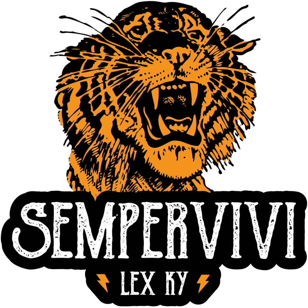
First, I thumbed through some old line art books and picked out a nice roaring tiger. I colored in the tiger’s fur with a golden yellow hue. Then, I combined this expertly detailed illustration with our name uppercase in a vintage font. Our hometown “LEX KY” nestles between two simple lightning bolt icons in yellow, completing the first sticker design.

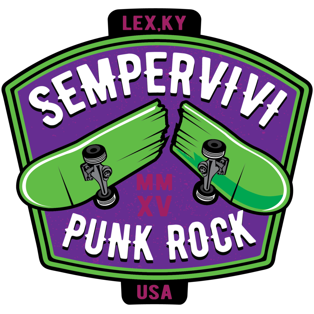
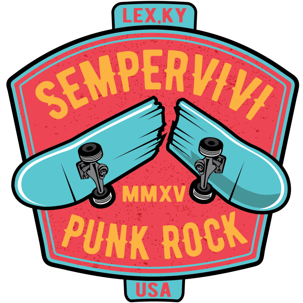
Since many would call our band’s genre “skate punk”, I incorporated a rad broken skateboard image into an old school signage layout. The bold image of the broken deck jumps out in front of the marquee font spelling our band name. I added our hometown and Roman numerals for the year 2015, the year when our band began. I played with a few different different color schemes. The band members couldn’t choose between the two palettes I pared it down to, so we had both printed. I love the alternative “Joker” combination of mostly purple and lime green. The melon red and Carolina blue scheme is lighter, cleaner, and more fun.

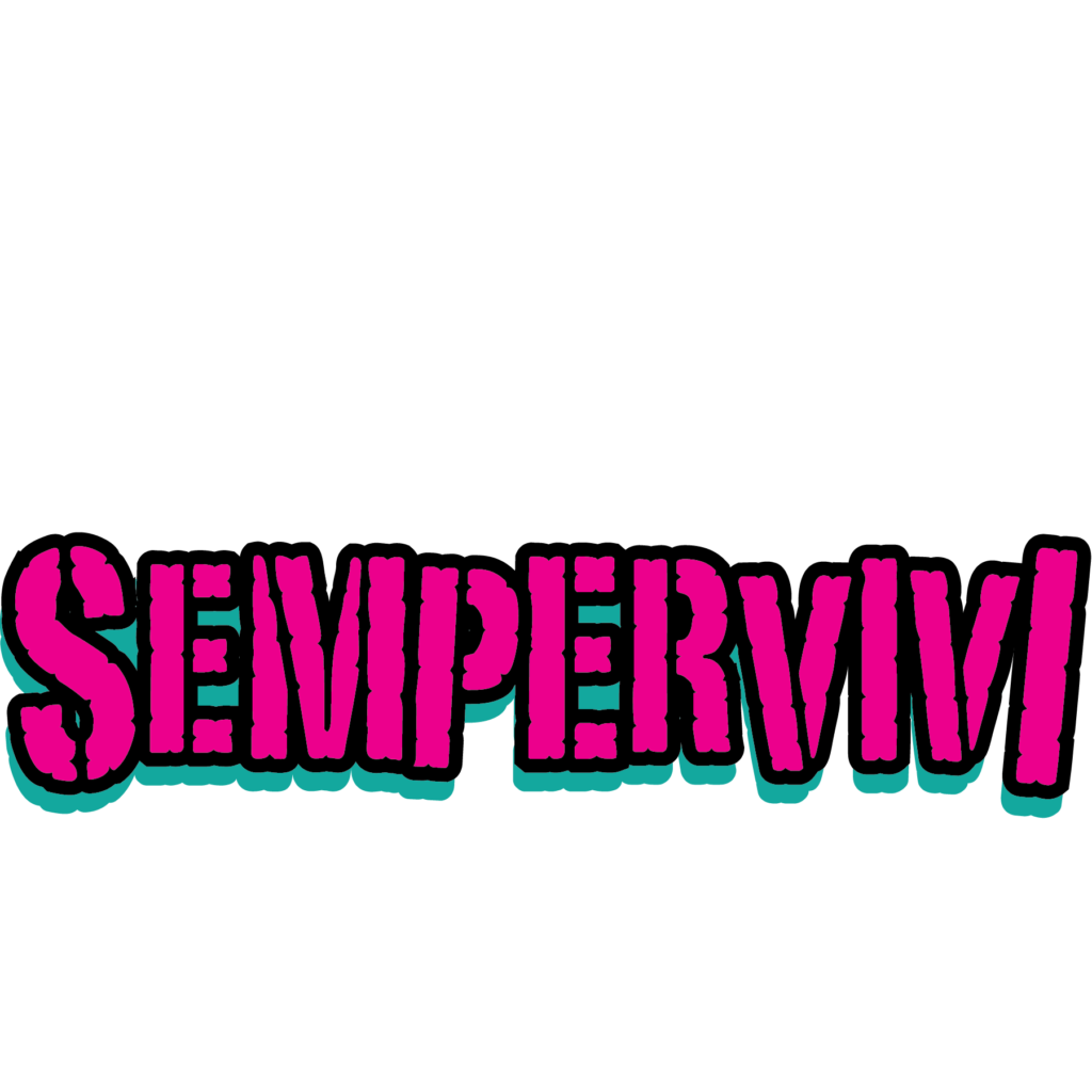
Finally, I had been toying around with a rugged “stamp” style logo for the band. I jumbled the sizes of the letters and tilted them, creating a chaotic style to match our fast, loud punk sound. The final touches came together as I filled in the characters in neon pink and turquoise. Then, I outlined the letters in black and added a solid black shadow to the art to make it pop.

Contact Me For Your Band’s Sticker Design

Every musician needs merch. If you are a live performer, your fans want to buy merch to support you. An inexpensive way to get started?  Contact me today to bring your sticker design to life.

Pedestrians Kentucky Blues Concert Poster

Pedestryans | Lexington, KY

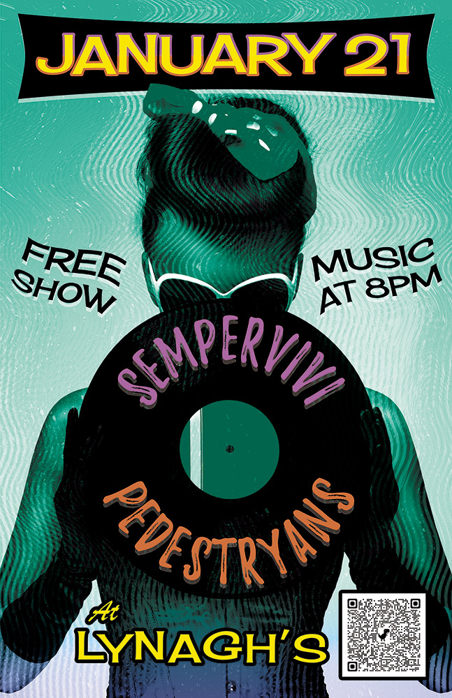
Here’s a retro concert poster that I designed for a 2022 show at Lynagh’s Irish Pub in Lexington. My friend Destry is a classy lady who sings and plays bass guitar in the blues based alternative rock band Pedestryans. Her selfie game is on point, and she often rocks a variety of vintage styles. Featuring a classic 1950s style pin up girl would fit perfectly.

Retro Concert Poster Story

When I chose the vintage style pin up girl photo from my extensive stock image collection, I knew that I wanted to bathe it in an aqua blue tint. I overlaid the whole image with a wavy “static” pattern, so as to imitate vintage TV interference. Also, I envisioned wrapping the band names around the black vinyl record that she is holding. The bright pink and orange hues of the names help them stand out over the wax circle.

For the date at the top, I manually jumbled the letters in order to give it a retro, playful feel. I also jumbled the letters at the bottom of the page that spell out the venue name. The bright yellow date is encased in a typical 50’s “futuristic” style black curved shape. I then added a subtle gradient that fades the aqua blue to purple at the bottom in order to highlight “At Lynagh’s”. Other event information floats to the left and right of the pin up girl in black. Every retro concert poster needs a wave warp effect. I added this element in order to give it some movement and also to increase the kitsch factor.

I’m the poster designer you’ve been looking for!

Are you holding an event that would benefit from a retro concert poster design? I love incorporating vintage 1950s elements into promotional ads! Contact me today to get started.

Analog Apostles "Diver" Band Shirt Design by Kentucky Band Merch Artist

Analog Apostles | Lexington, KY

Ahoy, ye scurvy sea dogs! This band shirt design for my former rock band Analog Apostles is one of my favorites. I created this two color screen printed art before we loaded up our van and left for our Summer 2014 tour of the USA. These eery shirts were instantly hot sellers. Several years after they were pressed, I still see them around town here in Lexington on occasion. I love being a band merch artist and creating musician shirt art! We’re going to plunge 20,000 leagues into the sea and talk about the thought and work that went into this band apparel design.

Band Shirt Design – limited inks for apparel printing on a budget

Everybody loves to wear a good black band shirt. I know I do, at least. Seriously, I have probably filled half of my t-shirt drawer with black apparel featuring musician shirt art. Mostly for my clients’ budgetary reasons, my shirt designs usually feature only one or two screen printed ink colors. Also, black is the most popular shirt color. Many shirt printing businesses offer special discounts on them. I can still make a big impact, even though I am not drawing from a large color palette.

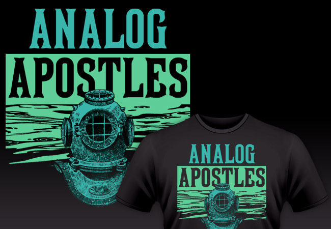
This design definitely provided a lot of bang for our indie band’s very limited bucks! I chose a color combination that consisted of cool turquoise blue and a light green shade. They come together to create an aura that is both mysterious and soothing. This makes the two distinctly bright ink colors really stand out against the stark black background of the shirt itself.

Deep sea themed band shirt design for a Kentucky indie rock group

The chilling deep sea diver bust is up front wearing a vintage style diving helmet. I feel that this element adds to the mystery of the overall design. Who or what could be lurking behind the mask? The unknown figure in the foreground makes for an unsettling and potentially dangerous focal point. How spooky is that?

It turns out that the uncanny valley has a body of water running through it. A pattern of waves comes together in order to create the green background behind the diver. I actually took the cool water shapes from a photograph of the ocean. I simplified the aquatic image down to just two colors using Adobe Photoshop. This way, it would work on the screen printed art. Then, I finished cleaning it up for the vector art application using the Adobe Illustrator application. This way, I removed the shadows so that it would only display the highlights in green.

Band merch artist details fonts and styles

Finally, I added the band’s name at the top of the design in a tall serif style type. Because of the deep sea theme, I used a vintage font that I felt could easily be found on a pirate ship flag. Perhaps one might even find it emblazoned on a buried treasure map. In fact, it is the very same font that has been used by Major League Baseball team the Pittsburgh Pirates in the past, MLB Tuscan.

I began by first setting the word “ANALOG” at the top in the turquoise hue. Then, I continued by reversing out the word “APOSTLES” so that it would read in black over the green water background. Therefore, it makes the best use possible of the negative space of the shirt itself. It creates the illusion of a three color design. This way, it still remains legible as part of the name of the band, while adding some depth to the overall design. Do you get the dad joke that I was making there? Depth? Water? I am a father who has a young son, so silly puns are my forte’.

Analog Apostle musician shirt art modeled by a cool guy in Kentucky.

Not sure what the world’s coolest guy Fred is doing here, but the shirt looks good on him.

You need a professional band shirt design of your own

Way back in 1999, I was a student at Murray State University studying Art, with an emphasis on Graphic Design. During that time, I started up my own freelance graphic design business right from my dorm room. I have been playing the guitar and singing in independent bands all around Kentucky since 1997. Over the years, I have combined my two passions many times.

I have made designing music merchandise for bands one of my specialties. In fact, it’s one of my favorite things to do. Networking with other musicians has taught me a lot about this print graphic design genre. This art was a callback to our most recent independent EP “The Other Side of the Sea”, which I also designed the layout for. Some players prefer more literal, music based interpretations in their merch designs instead.

Every band or artist should sell some physical merchandise at their shows. If you want to successfully grow your fanbase, it helps to have some quality merch items on your table. Buttons, stickers, CDs, refrigerator magnets, and can koozies are great ideas.

One of the most effective ways for music fans to support their favorite local artists is wearing their shirts wherever they go. An eye catching apparel design can start up conversations with both friends and strangers alike. Subsequently, this investment would make a great way to help spread the word about your own brand.

Contact me for your own musician shirt art

Do you need a band merch artist? Let’s work together to find your perfect fit. Contact me today if your indie band or record label needs a rad shirt design of your very own!
Rough Customers Concert Poster Design - Lexington, KY ska band

The Rough Customers | Lexington, KY

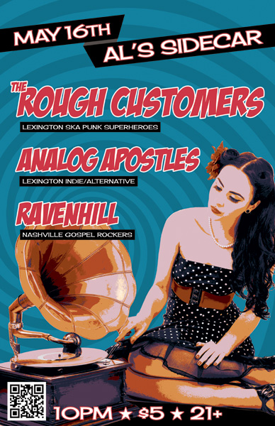
Pick it up! The Rough Customers are Lexington, KY’s only third wave ska band – as far as we know! In 2014, my band at the time Analog Apostles performed with them and Nashville, TN soul rockers Ravenhill. Ravenhill made a tour stop in Lexington at the Sidecar, next door to Al’s Bar. The Rough Customers’ live show is all about fun, and that’s the vibe I was going for with this concert poster design.

Large format concert poster design

The featured photo of the classic pin-up girl and phonograph was given a “washed out” effect, which I made by reducing the colors using Adobe Illustrator. I then added the hypnotizing bright blue swirl in the background to enhance the kitsch factor.

I lettered the bands’ names in a watermelon red using the retro “Badaboom” font, since it always signals good times. Additionally, I used the “Cherry Cream Soda” font for the other text, completing the poster’s vintage 50s feel. Finally, I added a QR code to the concert poster design so that potential concert goers could RSVP to the event on Facebook by scanning the poster with their smartphones.

The Rough Customers never disappoint when they take the stage, and always draw a big crowd. This show was definitely no different, since we filled the small room to capacity. I would like to think that my eye catching design helped with that aspect.

I always design and print my own 11×17″ posters to promote shows and other events that I put together. The large format gives me more canvas to play with. It also stands out more than a letter sized flyer when I hang them in store windows.

Hire me for your next event poster artwork

Are you a musician or band who needs a concert poster design? Contact me!

Analog Apostles CD Art for "The Other Side of the Sea" EP

Analog Apostles | Lexington, KY

I designed this CD art for Lexington, KY alternative rock band Analog Apostles‘ debut EP “The Other Side of the Sea”. Since I played lead guitar in the band at the time, it was a no brainer for me to do the artwork. I was also very involved in the music production side.

Ben, the main songwriter and rhythm guitarist, thought of the title long before we recorded the first note. The album name and many of the songs made references to water, so we decided together on a nautical theme.

CD art – setting sail for the high seas

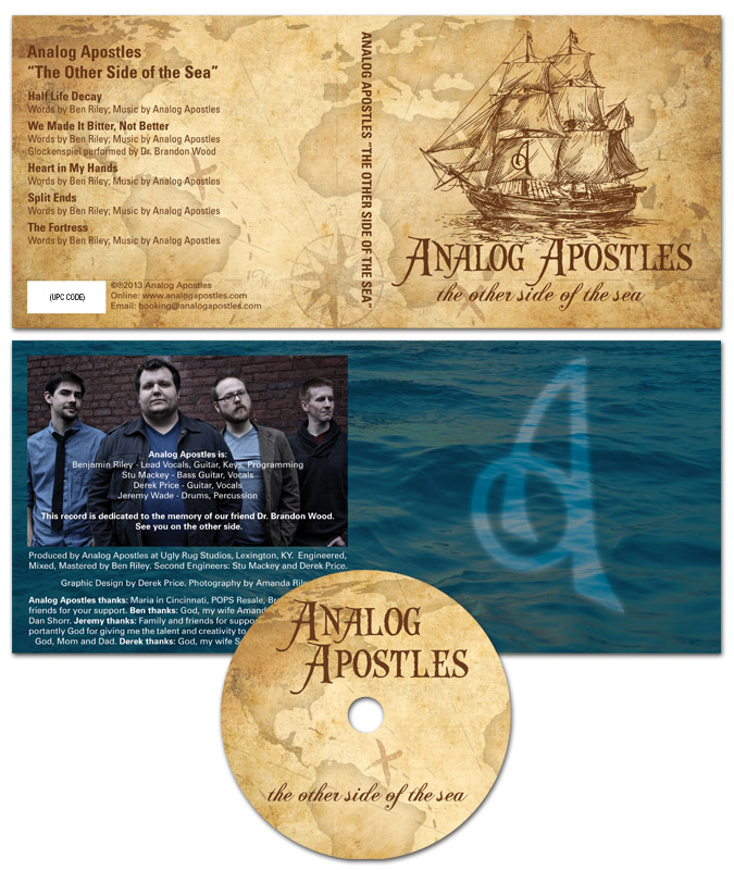
The four panel digipak CD art started with an antique style treasure map background. Then, I overlaid a classical pirate ship illustration in brown as the focal point. The “A” monogram mark from the logo I designed was later superimposed onto the ship’s main sail.

After that, I set the band‘s name in an antique “swashbuckling” style font face. The album’s title then materialized in a classic cursive script. I capped off the design with a ghostly image of the band’s “A” icon over the dark blue ocean background in the tray card. Since the record’s theme suggested high seas adventure, a hint of supernatural mystery put it over the top.

From start to finish, this record truly was a DIY project. We performed every aspect of the production, from the recording process to ordering the album duplication. Ben’s wife Amanda did a great job with the posed band photography. Our fan base fully funded the CD’s production online via Indiegogo, which is a great fundraising tool for artists on a budget.

Hire me to design your Album Cover

Are you a band or record label currently hoisting the main sails on a new album? Contact me today for a CD art design that will shiver your fans’ timbers.

Band merch design - Stellar Kin "heart" shirt

Stellar Kin | Bowling Green, KY

I toured with the band Stellar Kin for six years. In addition to writing and performing, I created all of our band merch design. It is a special feeling to know that there are hundreds of these floating around out there with my former band’s name emblazoned on them.

Band merch design story

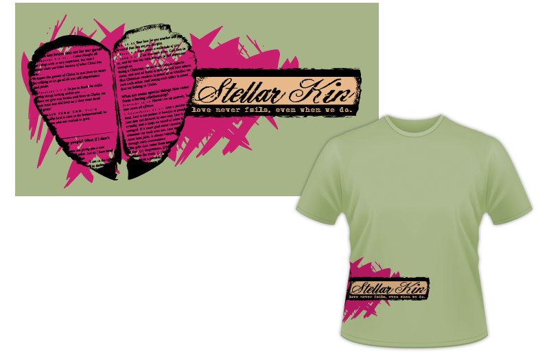
This shirt design is one of my favorites. I sought out to use an alternative placement from the beginning. Why not wrap the art around the side? The story of how the artwork came together for this jade green shirt is a unique one.

When I lived in Bowling Green, Kentucky, I came home from work one day to find that a neighbor’s home had burned down. Some of the debris had blown into my yard. I picked up a burnt piece of a page from the Bible. It instantly inspired me to create a unique band merch design. Not only did it contain scriptures about how we are called by God to love one another, it was distinctly shaped like one half of a heart. I scanned both sides of the page and simplified it to a simple high contrast solid black.

After I mirrored the two sides of the page to form the focal heart image, the phrase “Love never fails, even when we do.” came to mind. It sums up the main idea of the scriptures, as well as a personal mantra for myself. I set this text in a distressed typewriter font across a grungy faux papyrus scroll.

I distressed the band name “Stellar Kin” as well, featuring it in a pirate style script. Finally, I colored in the background of the art with some hot pink paint swaths to add extra chaos, while still tying the art together.

Your band needs a graphic artist for your apparel art.

I love working with independent musicians when they need merchandise designs. Bonus points for an unusual concept or a random twist on a conventional idea. Contact me today to get started!