kentucky

Local Violence band sticker design

Local Violence / Lexington, KY

I created this band sticker design for a group based here in Lexington. Local Violence was a DIY pop punk band that included some friends from my local music scene. I have been designing band merch since 1999, so they reached out to me in order to help promote their band.

The finished product is ready for the masses! Here is a printed and die cut band sticker design.

The finished product is ready for the masses! Here is a printed and die cut band sticker design.

Band sticker design story

The band already used a fist icon in their initial branding. They wanted to somehow incorporate it in a parody of the Los Angeles Dodgers‘ iconic logo. I both cleaned up and recolored their existing fist art in red using Adobe Illustrator. Then, I added motion lines in red, so that it would mimic the Dodgers’ “flying baseball” image.

After that, I found a similar script font to replace the word Dodgers with “Violence” in blue. A few adjustments to the text made the font more authentic.

Finally, the word “Local” tops off the design in a blue sans serif Varsity font. I spaced out the letters and also warped them with an arch effect.

At last, the baseball parody sticker art was complete.

Local Violence loved the finished band sticker design. They took advantage of a special promotion with Sticker Mule to both print and die cut their stickers. This created a white stroke effect around the design. The precise outline of the shape really stands out amongst other bands’ standard square and circle shaped stickers.

Hire me to be your merch designer.

Is your new band just getting your feet wet with merch? Perhaps you have been in the game for awhile and you all just need a fresh new design. Contact me today to hire me for your new band sticker design!

Louisville, Kentucky CD release flyer by Bluegrass poster designer

Misty Mountain String Band | Louisville, KY

I worked with my prized clients The Misty Mountain String Band on many projects, from T-shirt designs to vinyl banners. After creating the CD layout for their 2018 album Kentucky Bound, I was honored to also design the CD release poster. I am proud of my reputation as a Bluegrass poster designer, so this project was very satisfying.

Kentucky CD release show flyer by Bluegrass poster designer

The Bluegrass quartet gave me the option to either base the design off of the album artwork, or create something entirely new. I chose the former. The vintage paintings of nature elements, as well as the roots instruments, perfectly compliment to the old time feel of MMSB’s music.

The original illustrator supplied several large images to choose from. I, being the Bluegrass poster designer, chose to incorporate two robins, which I cut out of a larger composite image. Also, I cleaned up her painting of a collection of different flowers. Then, I combined them and arranged them so that they creep around the bottom of the posed photo of the band. I recolored the photograph as well.

Both the sepia tint and the grunge overlay give it a worn, vintage look. I used a single font throughout the piece, the decorative title SwistInk Moabhoers. The banners in each corner feature sandstone textured backgrounds.

Finally, all of the elements rest on a black background adorned with a cracked texture. This background reminds me of the weathered Formica countertops in my grandmother’s house. The outdoor event was a huge success. It attracted over 200 attendees. I received a lot of great feedback on the 11×17″ poster from the band, as well as their fans.

Hire me to help promote your next Bluegrass event

Are you promoting a Bluegrass concert or festival? You need to hire the best concert poster designer in Kentucky. Contact me today.

Christmas event poster design for Muhlenberg County Public Library

Muhlenberg County Public Libraries / Greenville, KY

At the end of each year, I create the Christmas event poster design for my hometown library system in Kentucky. This is always one of my favorite seasonal projects to plan and execute. I love being a Christmas poster artist!

Muhlenberg County’s annual holiday events take place at their Thistle Cottage location. Thistle Cottage is a converted historic home which is located in the county seat of Greenville, KY. Many local businesses sponsor the unique Christmas trees that go on display throughout December at the Jubilee of Trees.

Also, kids of all ages get to take pictures with Santa Claus himself one day during the proceedings. I love coming up with a new, distinct solution for this seasonal project each and every year.

Focal image in Christmas event poster design

Since I had previously a plethora of stock art for their campaigns, I did not want to repeat myself. A holiday theme can be limiting if you don’t put much thought into it. Therefore, I wanted to try something both different and distinct from past projects this year. Something special was in order!

I conceptualized a simple, flat illustration which would make use of a minimal number of colors. Not unlike TV’s South Park, the cut out style gave the promotional material a lighthearted feel.

First, I used the Adobe Illustrator application to create the focal image of the poster. I drew up a pint sized elf playing a medieval style trumpet to announce the events. I actually based the illustration on a picture of my three year old son from his birthday photo shoot. He is wearing an outfit which is modeled after Will Ferrell’s character Buddy from the film Elf. The green and gold uniform is complete with a red feather in his cap. A royal red flag draped over the trumpet, heralding the December event dates. I used a mix of antique style fonts that looked like they could easily adorn a Middle Ages castle.

A tiny, smiling fairy is sitting cross legged atop his trumpet. She holds a sparkling wand in her hand, and plotting holiday mischief. I actually based the pixie’s image on a photo I had taken years ago of my wife. I added wings and recolored her dress green like Disney’s Tinkerbell.

Additional elements in the Christmas event poster design

The snowy background scene in the posters consists of rolling hills and pine trees. I desaturated the trees’ colors to dull hues in order to make it obvious that they were far off in the background. The hill in the distance is also slightly darker to achieve that purpose. In addition to the elf and fairy, the foreground elements announce the ongoing Jubilee of Trees. I continued using the simple logo I created for the event years ago.

Also, a “want ad” style poster provides all of the details for the Pictures with Santa event. I chose a simple, one color “hipster” interpretation of Old Saint Nick. The silhouette image comes complete with ironic horn rimmed glasses. The client asked if the Santa Claus image was me, since my wife and son depicted the fairy and elf, respectively. A bright red waving banner with gold trim displays across the top. I set the poster’s main title in an Old English style font called “PlainBlack”.

Many fonts I considered from my font book were perfect, stylistically. Unfortunately, they were also too hard to read. That is a big no-no for a poster design, especially for the main title text. I made sure to select the perfect font, which was both legible and regal. The white space at the bottom displays a list of event sponsors. The Thistle Cottage logo I designed years ago also displays in a pale shade of blue. Last of all, I sprinkled faint snowflakes throughout the scene.

Christmas poster artist – adjusting image formats for different situations

The simplified Facebook ad featured my Thistle Cottage logo on the elf's flag instead of the dates.

The simplified Facebook ad featured my Thistle Cottage logo on the elf’s flag instead of the dates.

After I finalized the design, the library distributed the final product in a variety of print sizes.

First, they needed it in the largest print format, which was an 11×17″ poster. I then resized the elements and rearranged them to fit in a half page handout. Next, I created two different sizes for two local papers’ print newspaper ads. Both of the publications have their own sizes and specs, so I had to follow them exactly.

MCPL also promoted the event extensively on their social media channels. I modified the design so that it would properly fit on the public library system’s Facebook Event page. Meta’s graphics specs limit the amount of text that advertisers can use. The graphics themselves also need to be formatted so that the feature images are positioned in specific locations. This way, every part of the image will display as it should, regardless of which device users view it on. Thus, I had to get creative, so that I could fit it into that mold. This was no problem for me, of course. I always make sure to stay informed on current social media advertising trends.

Contact me for your Christmas event poster design

The staff at Muhlenberg County Public Libraries always tell me that they love my work. Why not try me, a dedicated Christmas poster artist, for your own event ad campaign? You might just become one of my repeat customers as well! Contact me today to get started!

Band shirt graphic design for The Rough Customers

The Rough Customers | Lexington, KY

My friends in Lexington’s favorite (only) ska band The Rough Customers approached me for a new band shirt graphic design. They requested a parody of the famous Ale-8-One soft drink logo. Ale-8-One (“A Late One”) bottles their ginger based soda near here in Winchester, KY.

Since it is a symbol of Kentucky culture, the band chose it to represent them at both local shows and tour dates. Also, the band had just added a new singer, so new merchandise would be a great way to celebrate the new era of the band.

Band shirt graphic design story

Many of my projects involve brainstorming ideas with clients. However, we did not need much back and forth discussion for this shirt design. The band simply requested a parody logo replacing the product name with their own. The design would go on a kelly green shirt, reminiscent of the brand’s bottles. I suggested replacing the stars in the original design with trumpets, in order to give it a subtle nod to the band’s genre.

Rough Customers band shirt design on display at their merch table.

The shirt makes its debut at the band’s merch table.

I began the design by tracing the outline of the soft drink’s signature red and white badge. The brand name actually uses a hand drawn mark, instead of a conventional font. As such, I studied the original. I wondered what other characters would look like if they were written in this style. Then, I started working in Adobe Illustrator.

Shirt Typography In Adobe Illustrator

I started with the conventional sans serif font Myriad Pro, spelling out each letter. After that, I outlined them, and warped them using envelope filters, as well as the pen tool. I spent the bulk of my time getting the sizes and weights of each new character just right in order to mimic the original logo’s feel.

Finally, I substituted the aforementioned trumpets in place of the original’s stars. The end result? The Rough Customers‘ fans loved donning the bright green, red, and white shirts while skanking at the band’s shows.

Contact me for your band shirt graphic design

Do you play ska, punk, metal, or rock music? Perhaps you perform Mongolian throat singing? I’ve got you covered. I love designing shirts for bands and music artists. Contact me today to get started.

Dining Out for Life full page ad campaign design

AVOL / Lexington, KY

I created this ad campaign design for AVOL in Lexington, KY. It is a nonprofit which organizes AIDS volunteers. They loved the trade publication ads I made for them previously. Therefore, they contracted me for their biggest annual event campaign. For one day every September, local restaurants donate 25% of their proceeds to fighting AIDS. The organization needed a few different print sizes. These included an 11×17″ poster size and varying newspaper ad sizes, as well as bookmarks.

Ad campaign design story for AIDS benefit

Sandwich board sized poster design for the AIDS charity event

Sandwich board sized poster design for the AIDS charity event

My local chapter of the AIDS charity gave me creative freedom on this project. They only suggested a retro 1950s diner theme. They also sent a few public domain images to inspire me. These included the vintage waitress illustration I finally chose. I also redesigned their existing event logo with a new one which continued the theme.

After my instructions, I poured through old 1950s ad campaign designs for inspiration. Their futuristic floating shapes and pastel color palettes, as well as their kitschy mixed fonts made the cut.

I arranged these elements to suggest motion and give them a fun feeling overall. I did this by tilting text blocks and highlighting objects with different shades. A pink gradient gives shine to the restaurant and sponsor lists.

The ad pieces had many moving parts, from the list of participating restaurants to information about a related art exhibit. I got creative to ensure synergy and legibility from the biggest to smallest versions.

I met the challenge of making the ad art both attractive and easy to read. Also, I crushed the deadline in plenty of time for last minute revisions. My clients raved about the finished product.

Can I design your event’s advertising pieces?

I’ve improved the ad campaign design results of many charity nonprofits and small businesses. Contact me today to join the growing list. Let’s get started with your advertising campaign!

Analog Apostles "Diver" Band Shirt Design by Kentucky Band Merch Artist

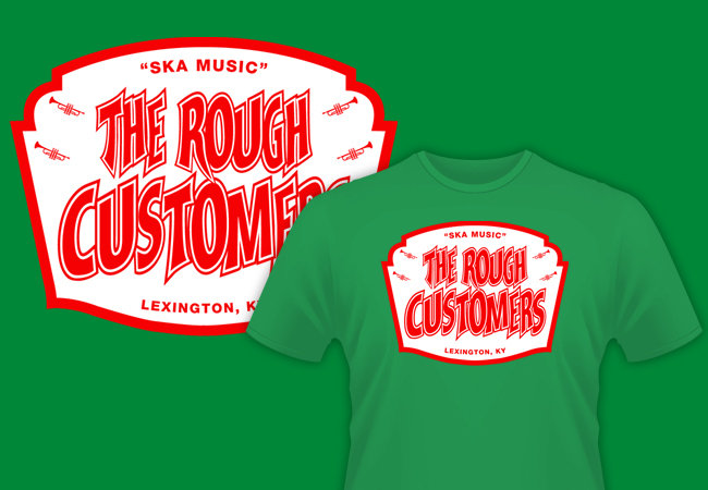
Analog Apostles | Lexington, KY

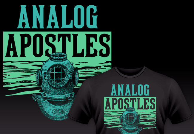
Ahoy, scurvy sea dogs! This band shirt design made for the alternative rock band Analog Apostles is one of my favorites. I created this two color screen printed art before we loaded up our van and left for our Summer 2014 tour of the USA. These eery shirts were instantly hot sellers. Several years after they were pressed, I still see them around town here in Lexington on occasion. I love being a band merch artist and creating musician shirt art! We’re going to plunge 20,000 leagues into the sea and talk about the thought and work that went into this band apparel design.

Band Shirt Design – limited inks for apparel printing on a budget

Everybody loves to wear a good black band shirt. I know I do, at least. Seriously, I have probably filled half of my t-shirt drawer with black apparel featuring musician shirt art. Mostly for my clients’ budgetary reasons, my shirt designs usually feature only one or two screen printed ink colors. Also, black is the most popular shirt color. Many shirt printing businesses offer special discounts on them. I can still make a big impact, even though I am not drawing from a large color palette.

This design definitely provided a lot of bang for our indie band’s very limited bucks! I chose a color combination that consisted of cool turquoise blue and a light green shade. They come together to create an aura that is both mysterious and soothing. This makes the two distinctly bright ink colors really stand out against the stark black background of the shirt itself.

Deep sea themed band shirt design for a Kentucky indie rock group

The chilling deep sea diver bust is up front wearing a vintage style diving helmet. I feel that this element adds to the mystery of the overall design. Who or what could be lurking behind the mask? The unknown figure in the foreground makes for an unsettling and potentially dangerous focal point. How spooky is that?

It turns out that the uncanny valley has a body of water running through it. A pattern of waves comes together in order to create the green background behind the diver. I actually took the cool water shapes from a photograph of the ocean. I simplified the aquatic image down to just two colors using Adobe Photoshop. This way, it would work on the screen printed art. Then, I finished cleaning it up for the vector art application using the Adobe Illustrator application. This way, I removed the shadows so that it would only display the highlights in green.

Band merch artist details fonts and styles

Finally, I added the band’s name at the top of the design in a tall serif style type. Because of the deep sea theme, I used a vintage font that I felt could easily be found on a pirate ship flag. Perhaps one might even find it emblazoned on a buried treasure map. In fact, it is the very same font that has been used by Major League Baseball team the Pittsburgh Pirates in the past, MLB Tuscan.

I began by first setting the word “ANALOG” at the top in the turquoise hue. Then, I continued by reversing out the word “APOSTLES” so that it would read in black over the green water background. Therefore, it makes the best use possible of the negative space of the shirt itself. It creates the illusion of a three color design. This way, it still remains legible as part of the name of the band, while adding some depth to the overall design. Do you get the dad joke that I was making there? Depth? Water? I am a father who has a young son, so silly puns are my forte’.

Analog Apostle musician shirt art modeled by a cool guy in Kentucky.

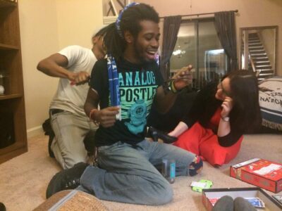
Not sure what the world’s coolest guy Fred is doing here, but the shirt looks good on him.

You need a professional band shirt design of your own

Way back in 1999, I was a student at Murray State University studying Art, with an emphasis on Graphic Design. During that time, I started up my own freelance graphic design business right from my dorm room. I have been playing the guitar and singing in independent bands all around Kentucky since 1997. Over the years, I have combined my two passions many times.

I have made designing music merchandise for bands one of my specialties. In fact, it’s one of my favorite things to do. Networking with other musicians has taught me a lot about this print graphic design genre. This art was a callback to our most recent independent EP “The Other Side of the Sea”, which I also designed the layout for. Some players prefer more literal, music based interpretations in their merch designs instead.

Every band or artist should sell some physical merchandise at their shows. If you want to successfully grow your fanbase, it helps to have some quality merch items on your table. Buttons, stickers, CDs, refrigerator magnets, and can koozies are great ideas.

One of the most effective ways for music fans to support their favorite local artists is wearing their shirts wherever they go. An eye catching apparel design can start up conversations with both friends and strangers alike. Subsequently, this investment would make a great way to help spread the word about your own brand.

Contact me for your own musician shirt art

Do you need a band merch artist? Let’s work together to find your perfect fit. Contact me today if your indie band or record label needs a rad shirt design of your very own!

Girls Who Code Shirt Design for Kentucky College Group for Women Programmers

Girls Who Code | Murray, KY

I created this retro shirt design for a Murray State University based programming club. Since the organizer loved my shirt design for her previous group “Women in Computing”, she reached out to me once again. Since she asked for housewives from vintage ads on pink shirts, that design was decidedly more “girly”. This time around, she wanted something less feminine, since there were also male students helping with her new group “Girls Who Code”.

She still wanted to continue our previous kitsch art theme, while keeping the “nerd” vibe going. Her only other requirements were for the design to use just two ink colors screen printed on navy shirts. I was more than happy to comply. I excel at this format because many of my apparel clients stick with only one or two ink colors. My specs were now on paper, so I got to work right away.

Retro shirt design empowers females in technology fields

First, I searched through my vast stock photography catalog. I quickly found a retro photograph of a wind-up robot that would obviously be a perfect fit. The robot’s colors were then simplified down to only cyan blue.

Next, I overlaid it partially on both the white strips and the negative space. Thus, I added just the right amount of contrast.

I then laid out the text in mixed “Chicago” and “MT Script” fonts to add to the fun. I tilted both the robot and text section at opposite angles, so I could give the art a little more movement. Therefore, it really jumps out at the viewer instead of a more conventional design.

Finally, no coding related design would be complete without incorporating some ones and zeros. Thus, I had to top it off with a few.

Your club or organization needs to hire a professional graphic designer

Are you in a programming club in need of a shirt design that stands out? Then contact me today!

Wolfe County Public library Logo design by Derek Price

Wolfe County Public Library / Campton, KY

This Eastern Kentucky reference center commissioned me for their library logo design and a website package. My hometown clients working at the Muhlenberg County Public Libraries recommended me. I previously had also provided a logo and website for them.

Traditional style green library logo design

The library board did not request very many specifics at first. They needed a strong, traditional mark which incorporated shades of green. Therefore, Wolfe County’s staff chose the tried and true “donut” ring format from my initial mock up sketches. If it’s good enough for Starbucks, then it’s good enough for my clients.

I selected the classic and strong Clarendon font to use throughout the library logo design. A serif font such as Clarendon is always a winner in applications like these. After that, I then wrapped the text “Wolfe County Public Library” around around the ring frame. Outline strokes of varying thicknesses in the ring helped give the mark a subtle uptown feel.

The arched ribbon that reads “WCPL” is the focus element, and also suggests a bookmark. The opened book in front of the ribbon creates depth and perspective. A simple “Est’d 1967” in front of the book reminds viewers of the library’s staying power in the community.

Finally, I topped the design off with the green and white mountains that sprawl in the background. These elements are a nod to the beautiful mountains and hollers throughout Eastern Kentucky. WCPL ordered several tweaks and revisions as the process went along. In the end, however, the library board were very happy with the finished product. It was then time to move on to their website design.

“Book” me to design your library logo design

Are you a public library coordinator? Do you run a small business or nonprofit? You need a strong, traditional mark that represents your library’s connection to the community. Contact me today.

Iron Will Fitness Studio Logo - Lexington, KY

Iron Will Fitness Studio / Lexington, KY

I designed this fitness logo for a new workout studio startup based here on the South side of Lexington, KY. The owner was up against a tight deadline to open his first location. Luckily for him, tight deadlines are my specialty! I was up for the challenge and we worked closely together to bring his original sketch to life. His mark was ready with time to spare, gracing the signage at his independent gym’s grand opening.

Iron Will Fitness Logo displayed at the Lexington, KY storefront

Iron Will Fitness Studio’s logo displayed on their Lexington, KY storefront

Fitness Logo Design for Kentucky Gym Brand

The client provided me with a rough sketch of the Greek mythological figure Sisyphus pushing his fabled boulder up a hill. I thought that was a great representation of building strength through repetition.

The original drawing suggested a simplified shadowy figure, so I made the hill a simple “swoosh”, and shaded the boulder with straight black lines.

I chose a modern sans serif and varsity combination to suggest a simple, quick to the point philosophy, while nodding to the athletic clientele. Then I colored the high contrast logo in a black, white, and red combination. You just do not get more clean or powerful than that.

Finally, the simple kettlebell weight silhouette as the negative space in the “O” puts a nice finishing touch on the mark. There is no mistaking that this fitness center is where you go to build strength and become your personal best.

The client wanted to keep his options open, so I also provided him with a few other color combinations. As with all of my logos, I Pantone color matched each version. This ensures that the colors display the same, no matter what the application. Find out more about Iron Will Fitness Studio at their website.

Contact me for your own fitness logo design

Are you opening up a new gym? Perhaps you need to rebrand your existing fitness center. Contact me so we can get started.

Thistle Cottage Spring 2015 Victorian Tea Poster Design

Muhlenberg County Public Libraries / Greenville, KY

For the second year running, MCPL once again hired me to make their annual Victorian Tea poster design. I started by laying this design out in the large kiosk size. Then, I resized the art into several smaller formats. Half page newspaper ads were the smallest size.

Thistle Cottage holds their annual Victorian Tea in downtown Greenville, Kentucky. The party is a Victorian themed event where both mothers and daughters dress up and enjoy a traditional tea party. It is a popular event where local families can go back to experience a simpler time in history that their ancestors once knew. The air of nostalgia brings little girls’ tea parties to life. Servers and staff also dress in period attire. An elegant event such as this called for an equally classy poster design.

Victorian Tea Poster Design in Kentucky

I really enjoy sifting through vintage Victorian ads. Obviously, I patterned this poster design after them. I started with the featured black and white illustration of the mother and daughter characters. The poster’s background is dressed in a “shabby chic wallpaper” pattern with the drab colors that were fashionable in that era.

My favorite feature of any good Victorian ad is the variety of fonts and dingbats in use. Artists seem to always use a dozen fonts in any given piece. It looks like the advertiser aimed to use as many fonts as possible in one space. These warped font styles often remind me of the circus. It’s as if the carnival barker pulled double duty and was also hired to design the poster layout. Both the teapot and pointing finger ornaments give the composition an old time “over the top” feel. Step right up!

Contact Me For Your Ladies Event Promotional Art

Are you hosting a retro event? Hire me today for your own Victorian Tea poster design!