music

Sempervivi music poster design with wrestling theme

Sempervivi | Lexington, KY

I created this music poster design for my band Sempervivi’s crowdfunding campaign. We were raising money to release our first full length album, “Can’t Please Everyone”. I contracted comic artist Chris Schweizer to bring my concept to life. The band would be shown wrestling my childhood teddy bear Flash. The results were even better than I had imagined.

Music poster design with wrestling theme

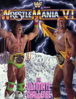
While brainstorming the perks we would our backers, I determined that limited edition posters would be ideal. The old school wrestling theme could include many aspects. Ultimately, I decided to mimic a pivotal event in my childhood, the WWE wrestling spectacular Wrestlemania VI on pay per view. The larger than life “Immortal” Hulk Hogan met the enigmatic wildman Ultimate Warrior for the WWE Championship in Toronto. Posters depicted them in front of a frozen mountain range, with lightning bolts lighting up the sky. In order to faithfully hearken back to this classic image, I had my work cut out for me.

Wrestlemania VI promo art this music poster design is based on

Wrestlemania VI promo art this music poster design is based on

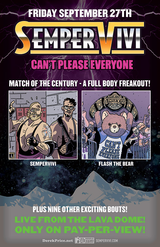
I had already created a parody style logo based on the classic Wrestlemania logo. Next, I carefully reproduced the original metallic chrome and gold gradients. My striking tribute caught old school wrestling fans’ eyes. The retro neon pink and green subtexts also jumped off the landscape.

I then added images from our album art. The “Match of the Century” was on! Chris’s drawings show Flash with his championship belt. Meanwhile, the band stood in the locker room vowing revenge.

After I arranged the foreground images, I then built the fantasy background. Rather than a photo montage, I combined illustrations to create the stormy glacier scene. I had successfully paid tribute to the original 1990 WWE poster without outright copying it. Victory!

Contact me if you need a poster for your next event

All in all, this music poster design is one of my favorites. I always enjoy when I can combine my interests into one ad. Can I interest your band, record label, or music festival in a poster graphic design? Perhaps you’re a wrestling promoter needing high end promo art. Contact me today.

CD Artwork for Sempervivi "Always Alive" by Kentucky CD cover artist

Sempervivi | Lexington, KY

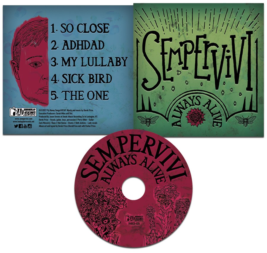
Since I began my career as a graphic designer, I’ve enjoyed being a CD cover artist. The CD artwork for my own band Sempervivi proves that I am very hands on with personal projects. I departed my previous band Analog Apostles in 2014 in order to start my own solo project. After self producing an acoustic EP, I wrote new songs for this record, which necessitated a full band. I designed my own layout for “Always Alive” in 2017. This album was, in every sense of the words, both a labor of love and a family affair.

CD artwork process for Kentucky rock music

Initially, I only knew that I wanted to use a bright green color for the album’s cover. This is because the record’s concept is evergreen life. I took my time on this project in between other work and music related tasks, since my goal was to hand draw as much of the CD art as possible. At first, I even hand wrote the credits, but I was not happy with how those turned out. However, I drew or traced each and every other element in the CD and jacket composition.

CD artwork incorporating natural elements

Many of these songs’ themes center around family, growing up, and the idea of continuing one’s lineage to future generations. I wanted to incorporate many elements that were found in nature. Therefore, I researched which animals represented immortality in different world cultures. In the end, I settled on the cicada. It is a winged insect which is common here in Kentucky that can be heard chirping loudly on humid summer evenings. I incorporated a pair of these bugs as part of the front cover heraldry.

The sempervivum plant is also known as a succulent or houseleek. I featured it in red, located front and center on the cover. It is a reference to the name of the band as well. “Sempervivum” is a Latin phrase that literally translates to “ever living” or “always alive”.

Album Cover Artist – Fonts and typography

I did not initially set out to draw the word “SEMPERVIVI” with a particular font in mind. Instead, I decided to emulate something I would have doodled on one of my old high school notebooks. I drew, scanned, tilted, and resized the letters a few different times to get the feel just right. The varying sizes and placements of the tall serif characters make it stand out in a way that a conventional font would not.

I set the arched title “ALWAYS ALIVE”, as well as the track listing, in the “Triforce” specialty font. However, I filled in the signature openings of the letters when I traced it. This is in order to give the characters more weight. I then completed the front cover layout with some doodles of light beams and bubbles. I also created a frame to go around all of the elements using the Adobe Illustrator program. Then, I retraced it by hand in order to continue the sketch art theme. The text, frame, and drawings all have a faint white shadow that adds depth, as well as creating a subtle embossing effect.

Jacket CD artwork finishing touches

I sketched a drawing of my young son’s face on the back cover as the focal point. This made sense, since two of the songs center around becoming a father and spending time with him. The drawing offsets the album’s track listing. I used the Paint tool in Photoshop so I could highlight his face and make it pop off of the cool blue background. I also redrew the Bad Apple Records logo, which I designed for the record label in 2002. Finally, many paint splatters blend into the background. My son actually painted them at the tender age of just one and a half years old. Thus, I made sure that he was listed prominently in the album credits at the bottom of the jacket!

Finishing the compact disc layout

Last of all, I painted the compact disc itself with a deep magenta hue. It was complementary to both the green and blue backgrounds on the jacket itself. Next, I blended in a few more paint splatters from my son’s art into the background. Then, I arched the artist name and album title, once again using my altered version of the Triforce font. I traced sempervivum stalks from some photographs I found online by using a fine Sharpie marker. The traced Bad Apple Records logo is again featured, centered between the drawings. One more time, I highlighted these elements in a lighter shade of Magenta by using the Paint tool in Adobe Photoshop. After I had put in many a long hour working on it, the album art was finally ready for the press.

CD artwork that screams “YOU!”

All of the elements of this sophomore record, ranging from the songs themselves to the art detailed above, encapsulate the story of who I am. I identify with many roles. Christian, husband, father, Kentuckian, musician, friend, and graphic artist are all labels which describe me.

Do you have a distinct vision of what CD packaging should accompany your next recording project? Let me be your CD cover artist! I have years of experience designing merchandise for bands and musicians in many genres. This includes artists performing everything from country to bluegrass to alternative rock. Whether you have photography and other elements ready or not, I can get the results you need. Contact me today so we can get started on your own CD artwork!
Rough Customers Concert Poster Design - Lexington, KY ska band

The Rough Customers | Lexington, KY

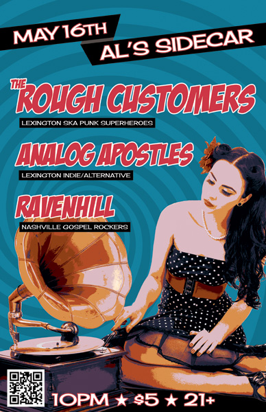
Pick it up! The Rough Customers are Lexington, KY’s only third wave ska band – as far as we know! In 2014, my band at the time Analog Apostles performed with them and Nashville, TN soul rockers Ravenhill. Ravenhill made a tour stop in Lexington at the Sidecar, next door to Al’s Bar. The Rough Customers’ live show is all about fun, and that’s the vibe I was going for with this concert poster design.

Large format concert poster design

The featured photo of the classic pin-up girl and phonograph was given a “washed out” effect, which I made by reducing the colors using Adobe Illustrator. I then added the hypnotizing bright blue swirl in the background to enhance the kitsch factor.

I lettered the bands’ names in a watermelon red using the retro “Badaboom” font, since it always signals good times. Additionally, I used the “Cherry Cream Soda” font for the other text, completing the poster’s vintage 50s feel. Finally, I added a QR code to the concert poster design so that potential concert goers could RSVP to the event on Facebook by scanning the poster with their smartphones.

The Rough Customers never disappoint when they take the stage, and always draw a big crowd. This show was definitely no different, since we filled the small room to capacity. I would like to think that my eye catching design helped with that aspect.

I always design and print my own 11×17″ posters to promote shows and other events that I put together. The large format gives me more canvas to play with. It also stands out more than a letter sized flyer when I hang them in store windows.

Hire me for your next event poster artwork

Are you a musician or band who needs a concert poster design? Contact me!

Analog Apostles CD Art for "The Other Side of the Sea" EP

Analog Apostles | Lexington, KY

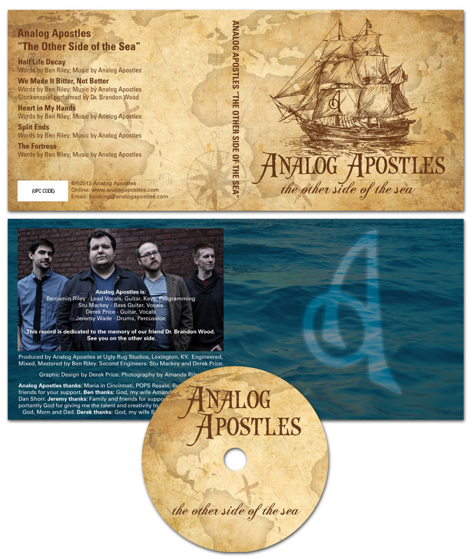
I designed this CD art for Lexington, KY alternative rock band Analog Apostles‘ debut EP “The Other Side of the Sea”. Since I played lead guitar in the band at the time, it was a no brainer for me to do the artwork. I was also very involved in the music production side.

Ben, the main songwriter and rhythm guitarist, thought of the title long before we recorded the first note. The album name and many of the songs made references to water, so we decided together on a nautical theme.

CD art – setting sail for the high seas

The four panel digipak CD art started with an antique style treasure map background. Then, I overlaid a classical pirate ship illustration in brown as the focal point. The “A” monogram mark from the logo I designed was later superimposed onto the ship’s main sail.

After that, I set the band‘s name in an antique “swashbuckling” style font face. The album’s title then materialized in a classic cursive script. I capped off the design with a ghostly image of the band’s “A” icon over the dark blue ocean background in the tray card. Since the record’s theme suggested high seas adventure, a hint of supernatural mystery put it over the top.

From start to finish, this record truly was a DIY project. We performed every aspect of the production, from the recording process to ordering the album duplication. Ben’s wife Amanda did a great job with the posed band photography. Our fan base fully funded the CD’s production online via Indiegogo, which is a great fundraising tool for artists on a budget.

Hire me to design your Album Cover

Are you a band or record label currently hoisting the main sails on a new album? Contact me today for a CD art design that will shiver your fans’ timbers.

Ronald Jenkees shirt design

Ronald Jenkees | Louisville, KY

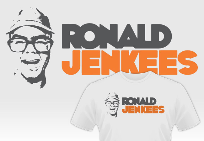
This Ronald Jenkees shirt design is one of my biggest hits! RJ is a friend of my old band from Kentucky. If you’ve never heard of him, he is an electronic music prodigy, as well as a YouTube phenom.

RJ is instantly recognizable, squinting in his Coke bottle glasses while wearing an assortment of fedoras and other hats. In his live performance videos, he always encourages viewers to have fun with their music, no matter what their skill level may be. This makes him a kindred soul to me, so I was happy to work up some apparel art for him.

He commissioned a simple shirt design in 2013, which he would release along with a new album. His only request was that I keep the shirt to a simple two to three colors. Since I have a background in screen printing, simple designs are a specialty of mine. He encouraged me to get creative with shirt colors and depictions of him.

Ronald Jenkees shirt design story

First, I used Boris Black Bloxx for the text, which a thick, wacky font. I decreased the spacing of it in order to add to the fun. Then, I simplified a screen capture from one of Ronald’s Youtube jam videos to create a one color image. Finally, the product displays his vibrant personality while promoting his jaw dropping musical prowess.

This version is the men’s style, which is displayed on an Ice Grey T-shirt with orange and dark grey inks. The design is also available in a grey ladies cut with pink and dark grey ink colors. Order one for yourself here! Then go see him in action on “the YouTubes” here!

Shirt design for musicians and Youtube stars alike

Are you crowdfunding your next album and in need of a shirt design for one of the perks? Do you need merchandise to capitalize on your viral videos that are blowing up on Youtube? Contact me today for the perfect shirt design!

One Inch Button Designs for bands and small businesses

One-Inch Buttons | Various Clients

When I started playing in the independent music scene, every band I knew had one-inch button designs. They are cheap to make for a band who may not have the money saved up to record an album yet.

Fans of independent music love to wear these little collectible pins as fashion accessories. I have collected so many over the years that I couldn’t realistically wear them all. When I came home one day, I found that my wife had pinned them all up on my curtains in my office. It looked really rad!

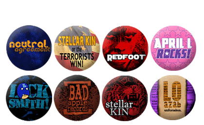
Some of the designs above were made for bands, such as Stellar Kin. I also have designed pins for labels like Bad Apple Records. Other button designs were just for fun to commemorate an inside joke (“The Locksmith”). I made a few as inexpensive, personalized birthday gift idea for my friends (“April L Rocks!”).

I love that this format has both freedoms and limitations. Basically, I can design anything in Photoshop without having to worry about high printing costs due to the size or number of colors used, such as with screen printing. It is also challenging in the sense that I have a small canvas to work with, and if I make the text too small, for instance, it will be hard to read.

Button designs for everyone!

Whenever I take part in a new music venture, I always design buttons to get started with merchandise. As I mentioned, they are easy to afford for both buyers and sellers. My friend Matt has manufactured buttons with his company Think Twice Buttons since 2001. He does great work and has a ton of sizes and options to choose from.

Hire me for your one inch pin artwork

Why not hire me to create some button designs for your band or business? Then get Matt to make them! You can’t go wrong with these tiny accessories when it comes to bang for your buck.