Apparel Design

Contact me for your own apparel design

Scroll down in order to see samples of my apparel design work below. Then contact me to get started. I’m ready to work on your shirt or or other clothing graphic design project!

Bryan Danielson shirt design with teddy bear theme

Bryan Danielson | Aberdeen, WA

This (Daniel Bryan) Bryan Danielson shirt design was one of my favorite projects to work on. I cheered on the legendary AEW and  WWE Superstar since his days wrestling for independent promotions like Ring of Honor and Dragon Gate USA. WWE briefly let him go in 2010 after a controversial incident on television. He was scripted to choke out an announcer with a tie during an on-screen attack with his Nexus cohorts. Sponsors objected to the violent image, and WWE officials decided he went too far.

While he was banished, he resumed wrestling on the independent wrestling scene. Bryan decided to capitalize on the publicity the angle earned him and had a contest for his fans.

Bryan Danielson shirt design story

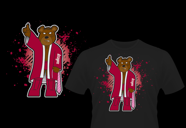
The premise was to design a shirt, four colors or less, depicting Bryan as an angry teddy bear. Preferably, he would clutch the infamous pink tie from the firing incident.

After reading this news, I sprung to action. First, I hand drew the anthropomorphic, scowling fur ball, posing in Bryan’s signature satin ring robe. Next, I scanned in the sketch and cleaned it up using Adobe Photoshop. Then, I transitioned the art to Illustrator, where I redrew it to create a vector file.

I colored in the bear’s ring gear with his signature deep red hues. He is holding up a finger signaling #1, a signature taunt that eventually evolved into his double fingers up YES! gesture.

Before he could declare a winner of the contest, WWE hired Bryan back. He then returned as a surprise partner at that year’s SummerSlam facing his former partners in the Nexus. I believe I would have won, since several fans emailed me wanting to buy their own copy of the shirt.

Shirt design for wrestlers, athletes, and other sports brands

Are you an independent pro wrestler looking for new merch designs? Do you manage a sports team or another entertainment brand? Contact me today for a shirt design that will have your fans shouting “YES! YES! YES!”

Basketball shirt design - team apparel graphic design

Clash City Rockers | N/A

I made this basketball shirt design comp in order to demonstrate my skills to a custom sports apparel company.  The team name is an homage to punk rock legends The Clash. It also commemorates a district tournament win for the fictional high school sports team.

Basketball shirt design story

First, I chose a red and yellow color scheme reminiscent of my high school alma mater, the Muhlenberg South Suns. Also, the main titles are set in black, which contrasts the white shirt. I made the most of a four color screen print to demonstrate my versatility. I blended many of the colors together in percentages, thus creating gradient effects.

My suggested basketball shirt design lays out on a white shirt along with bright red ringers for a vintage sports feel. I framed the requisite basketball shape with a bold red circle filled with bright yellow stars. Additional black and white strokes give weight to the frame. A burst of sun rays in the background completes the shape.

The word “CHAMPIONS” shines in a yellow to orange gradient, which pops off the shirt with a black shadow. It then adorns a stitched red ribbon in the foreground. I chose to set it in the bold serif Memphis font to give it a traditional athletic feel.

“10TH DISTRICT BASKETBALL” at the top features a white to black gradient with a heavy black shadow. “2009” and “CLASH CITY” display in a heavyweight sans serif font, which is similar to Britannic Bold.

Finally, the word “Rockers” splashes across the front of the design in a thick, painterly script. This gives the apparel design an edge.

Your sports team needs to hire a professional graphic designer

When your school needs a slam dunk basketball shirt design, contact me to get started. Together, we would make a great team!

One Inch Button Designs for bands and small businesses

One-Inch Buttons | Various Clients

When I started playing in the independent music scene, every band I knew had one-inch button designs. They are cheap to make for a band who may not have the money saved up to record an album yet.

Fans of independent music love to wear these little collectible pins as fashion accessories. I have collected so many over the years that I couldn’t realistically wear them all. When I came home one day, I found that my wife had pinned them all up on my curtains in my office. It looked really rad!

Some of the designs above were made for bands, such as Stellar Kin. I also have designed pins for labels like Bad Apple Records. Other button designs were made just for fun to commemorate an inside joke (“The Locksmith”). I made a few as inexpensive, personalized birthday gift idea for my friends (“April L Rocks!”).

I love that this format has both freedoms and limitations. Basically, I can design anything in Photoshop without having to worry about high printing costs due to the size or number of colors used, such as with screen printing. The small canvas also presents its own challenges. If I make the text too small, for instance, then it will be hard to read.

Button designs for everyone!

Whenever I take part in a new music venture, I always design buttons to get started with merchandise. As I mentioned, they are easy to afford for both buyers and sellers. My friend Matt has manufactured buttons with his company Think Twice Buttons since 2001. He does great work and has a ton of sizes and options to choose from.

Hire me for your one inch pin artwork

Why not hire me to create some button designs for your band or business? Then get Matt to make them! You can’t go wrong with these tiny accessories when it comes to bang for your buck.

Band merch design - Stellar Kin "heart" shirt

Stellar Kin | Bowling Green, KY

I toured with the band Stellar Kin for six years. In addition to writing and performing, I created all of our band merch design. It is a special feeling to know that there are hundreds of these floating around out there with my former band’s name emblazoned on them.

Band merch design story

This shirt design is one of my favorites. I sought out to use an alternative placement from the beginning. Why not wrap the art around the side? The story of how the artwork came together for this jade green shirt is a unique one.

When I lived in Bowling Green, Kentucky, I came home from work one day to find that a neighbor’s home had burned down. Some of the debris had blown into my yard. I picked up a burnt piece of a page from the Bible. It instantly inspired me to create a unique band merch design. Not only did it contain scriptures about how we are called by God to love one another, it was distinctly shaped like one half of a heart. I scanned both sides of the page and simplified it to a simple high contrast solid black.

After I mirrored the two sides of the page to form the focal heart image, the phrase “Love never fails, even when we do.” came to mind. It sums up the main idea of the scriptures, as well as a personal mantra for myself. I set this text in a distressed typewriter font across a grungy faux papyrus scroll.

I distressed the band name “Stellar Kin” as well, featuring it in a pirate style script. Finally, I colored in the background of the art with some hot pink paint swaths to add extra chaos, while still tying the art together.

Your band needs a graphic artist for your apparel art.

I love working with independent musicians when they need merchandise designs. Bonus points for an unusual concept or a random twist on a conventional idea. Contact me today to get started!

Mascot Shirt Design for Main Street Costumes in Kentucky

Main Street Costumes | Greenville, KY

Main Street Costumes needed a mascot shirt design that captured the essence of their local, year round costume shop. The design features a photo of a six foot tall, one-eyed skull. This gross, yet lovable, creature greeted those who drove by the shop, and was a fixture downtown for years. For the design, I surrounded the skull with a familiar cast of characters who were simultaneously both creepy and festive.

Mascot shirt design story

First, the owners Clint and Lori Cobb provided me with a high resolution photo of their familiar skull mascot. Also, they sent vector images of other famous characters that they had commissioned drawings of. These included Santa Claus, Frankenstein’s monster, Dracula, a wicked witch, Uncle Sam, the Grim Reaper, and the Easter Bunny. I accepted the challenge to feature these colorful images in front of the shop’s “road sign” logo in a simplified four color screen print.

I reduced the surrounding characters to shades of grey, and simplified the skull to a black and white image. However, I recolored the bloodshot white of the eye, and the blue pupil. This is a great solution to the characters, since they originally needed too many solid colors to screen print at a reasonable cost. This also allows these elements to still stand out, framed in turquoise and surrounded by the colorful text, road sign logo, and hypnotic red circles.

I used a vintage style specialty font for the main text “Home of Giant Skull!”, styled with a red to white gradient. “Mainstreetcostumes.com” is set in light green using the familiar font used for TV’s The Simpsons.

Hire a professional graphic designer for your business apparel

Does your business have a unique mascot that is popular both online and with brick and mortar visitors? You should make the most of it and print some merchandise! Contact me today so we can put our heads together!