admin

Book jacket art for Response to Grace - Kentucky Christian book cover design

Troy Napier | Georgetown, KY

Troy C. Napier is an author from neighboring Georgetown, Kentucky. He contacted me to design the book jacket art for his first commentary The Response to Grace. Troy chose me because of my success working with other Christian authors. My reputation as a Christian book cover design artist was growing.

Troy, happily displaying the finished product.

Troy, happily displaying the finished product.

Book Jacket Art For Kentucky Author

Since Troy did not have a specific vision in for this project, I worked with him to come up with the right book jacket art concept. First, he provided me with samples of some book layouts that he liked, in order to outline their positive aspects. I then pitched a few concepts based on different passages of scriptures in the Bible.

For example, I proposed centering the art around a close up photo of an ear (Matthew 11:15). Also, I thought of a runner lacing up his shoes and crouching at the starting line (Hebrews 12:1). Finally, we agreed on the concept of a fisherman. This idea was based on Jesus calling his first disciples in Matthew 4.

I first incorporated a royalty free stock image of a fisherman casting his net out on the water for the focal point of the book jacket art. I softened the edges of the photo and blended it into the grunge texture background. Afterward, I set the cover text in a classic serif font, mixing weights of that same font for variety.

The back cover features a picture of a net. Hundreds of fish fill the net to the brim, almost breaking it. The book’s title text is reversed out of it. A compass image adorns the bottom of the book below the author’s photo and bio. The book is available as a paperback, as well as in Kindle format on Amazon.

Contact me today for your Christian book cover design

Are you an author seeking a graphic designer for your next book? I specialize in making faith based themes come to life. Contact me today.

Kentucky shirt design detail for Louisville Bluegrass band

Misty Mountain String Band | Louisville, KY

I created this Kentucky shirt design for The Misty Mountain String Band, who are both long time clients and friends. They are surely the hardest working bluegrass and roots music quartet in the USA. I may be biased in this assumption, though.

The Louisville foursome showcase traditional Kentucky instrumental and vocal sounds. Four voices create soaring harmonies over banjo, mandolin, stand up bass, and the six stringed acoustic guitar. Their distinct blend of folk and old time music styles creates a crowd pleasing live show.

As with their previous records, the group called upon their fanbase to help crowd fund their 2018 LP “Kentucky Bound”. The Kickstarter online fundraiser service was a perfect platform to do that. Since a new record always calls for new merchandise, they needed a distinctly Kentucky shirt design as a reward for their donors. As the details unfolded, it looked like I was about to become a Kentucky tourism shirt designer!

Kentucky shirt design story – choosing the right images

Kentucky Postcard that inspired the "Kentucky Bound" Shirt Design by Kentucky Tourism Shirt Designer Their stand up bassist contacted me with a concept that was based on a vintage postcard designed to attract tourists to the Bluegrass State. Like the retro postcard, the shirt would feature a variety of Kentucky landmarks and attractions. We worked together to flesh out a variety of examples for their Kentucky shirt design. Finally, we all settled together on an iconic group of eleven notable ones.


First, I started by hunting down the most appropriate royalty free images that I could find for each of the listed attractions. Then, I assembled the lettering for the main title from a tall sans serif font. After outlining the text, I reshaped each letter to make them stand out like those on the original design. Using the Adobe Illustrator application, I stroked the letters with thick black strokes and added a thinner white stroke inside. Then, I manipulated the text. I added both warp and 3D effects in order to mimic the text style featured on the original postcard.

Main title and photo retouching by Kentucky tourism shirt designer

Next, I cropped each of the photos so that they would fit exactly inside of the letters. As with the original design, some of the items also needed to take up the space of two letters. Peabody’s coal shovel was so enormous that it warranted taking up the “B” and “O” to get the full length effect. The patterns on the monarch butterfly’s beautiful wings deserved the extra space provided inside the letters “N” and “D”.

After I laid out and cropped the images, I color corrected each of them. I did this by adjusting their brightness and saturation factors so that each picture would balance the others out. Last of all, I blended some filtered copies together with the original photos in order to give them a painterly feel. I was ready at last to add the finishing touches.

Finishing Touches

In front of the faded and pale sunset background, I then set the band’s name. I employed a mix of italicized tall sans serif and script fonts. A majestic cardinal, which is the Kentucky state bird, rests its sturdy talons on the letter “I”. The red bird looks straight ahead to a bright future for our commonwealth. The goldenrod is the official state flower of Kentucky. The yellow flower also appears floating in the bottom left corner of the postcard. You might even choose to say that it appears as a garnish to balance all of the elements out.

Finally, this Kentucky shirt design features the historic Bill Monroe Homeplace in the bottom right corner of the postcard. This is a call back that is reminiscent of the Kentucky state capitol building, which is featured in the original postcard. As with the main title, I blended the original photograph with a copy of it that I stylized with a painterly dry brush Photoshop filter. I added an inside stroke to the rectangle shape in order to complete the postcard feel. To top off the shirt design composition, I later added a grunge texture overlay. This gives the whole piece a feel that looks both worn and weathered. A few minor revisions later, and we had a finished product.

Fan Reception

This design was roundly praised. When the teaser images were posted on the band’s social media channels, fans remarked that they couldn’t wait to get their hands on the new MMSB swag. That being said, this shirt graphic design turned out to be one of my favorite projects to date. The colorful postcard image really pops off of the mid grey colored shirt. It is always a pleasure to work together with The Misty Mountain String Band.

Contact me for your own Kentucky shirt design

Are you part of a Bluegrass band, a record label, or a small business which is based in Kentucky? Does your group need an original shirt design that pays tribute to your old Kentucky home? You can put full confidence in this Kentucky tourism shirt designer to get the job done. Contact me today!

Star Wars themed wedding DVD art

Zack and Sarah Messick / Georgetown, KY

My longtime friends Zack and Sarah were married in June 2018. Their Star Wars themed ceremony took place in a park located near me in Wilmore, Kentucky. I served as one of the groomsmen. My three year old son was also in the wedding party, filling the role of the ring bearer. My friends did not hire anyone to film the wedding. Therefore, I volunteered to set my Zoom camera up at the altar. Then, I edited the video in iMovie, including adding the requisite “scrolling text” popularized by the film series. All I needed to do after that was to make the wedding DVD art as a Star Wars parody design.

Wedding DVD art front cover design story

Original "Star Wars Episode 1: The Phantom Menace" artwork, which I based the wedding DVD art on.

Original “Star Wars Episode 1: The Phantom Menace” artwork, which I based the wedding DVD art on.

I loosely based the design on the artwork for Star Wars Episode 1: The Phantom Menace. Critics and fans alike agree this is the worst film in the series. However, of all of the DVD layouts I found online, it stood out for this project. From the montage of the characters floating in space to the golden to the embossed title lettering, the design had the space epic feel I wanted to get across for this piece.

Wedding DVD art cover – Star Wars parody design

The logo featured in the top left of the cover is a recreation I made of the one from the couple’s wedding invitations. Since I had already recycled my copy of the printed invitation, I recreated the mark in Adobe Illustrator. The groom’s mother kindly sent me a photo she took of hers.

I set the text in the requisite “Star Jedi” font for the main title image. Afterward, I tilted it using the shear tool, in order to simulate the angle of the original mark they used. Then, I imported it into Adobe Photoshop. This way, I could add the gradient and embossing effects needed to complete the title’s finishing touches.

Photography special effects for wedding DVD cover

Melissa Rossini, the wedding’s photographer, sent me a few stills from the event for me to incorporate. I created a montage of the wedding party that was similar to the original cover. The bride, groom, flower girl, and ring bearer loom over the light saber fight candid shot below. I overlaid some paint filters and added some contrast to each person’s image to simulate the lighting and color effects of the original art.

When I was editing the “fight scene” photo, I added a glow effect to the toy light sabers in order to add authenticity. I then faded each of the figures into the red “explosion” over the outer space background. Said explosion consists of a few powder and light burst stock images. I added blur filters to both of them, then recolored them with a bright red to orange gradient.

Typography for the sci-fi themed video packaging layout

The classic Bank Gothic font spells out the text of the wedding’s tagline “The Saga Continues…”. It also denotes the wedding ceremony date, as well as its location. I spread out the letters‘ tracking in much the same way the top and bottom text of the original is. Finally, the requisite “DVD video” logo adorns the Star Wars parody design cover.

Wedding DVD art back cover design story

For the back cover image, I transcribed the couple’s wedding vows from the video, since this was a surprise. I set the text in the venerable ITC Franklin Gothic. It is the same font which is used in the Star Wars films’ iconic scrolling text introductions. The perfect shot of the minister and the happy couple during the ceremony provides the backdrop behind the fading black text background. Finally, I topped off the vows with the famous Star Wars symbols signifying the Rebel Alliance and the Empire.

This was a pro bono design that I made as a gift for my friends, as well as a parody of a well known film series. Therefore, I saw fit to go all the way with the Star Wars parody design thematic elements. Unlike most wedding DVD art covers, it makes a great conversation piece for visitors who see the media shelf in their humble home. The added personal touch of editing the video with Star Wars graphics and music also makes for more replay value than most couples’ wedding videos. I also included two opening and closing slideshows of wedding photos, which I set to the song used for Sarah’s bridal march.

The happy couple absolutely loved it. All things considered, this project developed into one of my all time favorites.

Mark your special day with custom artwork for your video

Will you and your sweetheart tie the knot soon? I know from my own experience how stressful it can be for a couple to keep up with all of the details as they plan for their big day. There are a variety of important elements that the bride and groom must consider. Everything from the catering to the flowers go into making the perfect wedding ceremony.

It is so important to make sure that you have your ceremony documented by professional photography and video services. Why not complete your wedding DVD with an equally professional cover art? Even if your ceremony features an unconventional theme, I am the perfect choice to design your wedding artwork. Contact me today so we can get started right away!

Christmas event poster design for Muhlenberg County Public Library

Muhlenberg County Public Libraries / Greenville, KY

At the end of each year, I create the Christmas event poster design for my hometown library system in Kentucky. This is always one of my favorite seasonal projects to plan and execute. I love being a Christmas poster artist!

Muhlenberg County’s annual holiday events take place at their Thistle Cottage location. Thistle Cottage is a converted historic home which is located in the county seat of Greenville, KY. Many local businesses sponsor the unique Christmas trees that go on display throughout December at the Jubilee of Trees.

Also, kids of all ages get to take pictures with Santa Claus himself one day during the proceedings. I love coming up with a new, distinct solution for this seasonal project each and every year.

Focal image in Christmas event poster design

Since I had previously a plethora of stock art for their campaigns, I did not want to repeat myself. A holiday theme can be limiting if you don’t put much thought into it. Therefore, I wanted to try something both different and distinct from past projects this year. Something special was in order!

I conceptualized a simple, flat illustration which would make use of a minimal number of colors. Not unlike TV’s South Park, the cut out style gave the promotional material a lighthearted feel.

First, I used the Adobe Illustrator application to create the focal image of the poster. I drew up a pint sized elf playing a medieval style trumpet to announce the events. I actually based the illustration on a picture of my three year old son from his birthday photo shoot. He is wearing an outfit which is modeled after Will Ferrell’s character Buddy from the film Elf. The green and gold uniform is complete with a red feather in his cap. A royal red flag draped over the trumpet, heralding the December event dates. I used a mix of antique style fonts that looked like they could easily adorn a Middle Ages castle.

A tiny, smiling fairy is sitting cross legged atop his trumpet. She holds a sparkling wand in her hand, and plotting holiday mischief. I actually based the pixie’s image on a photo I had taken years ago of my wife. I added wings and recolored her dress green like Disney’s Tinkerbell.

Additional elements in the Christmas event poster design

The snowy background scene in the posters consists of rolling hills and pine trees. I desaturated the trees’ colors to dull hues in order to make it obvious that they were far off in the background. The hill in the distance is also slightly darker to achieve that purpose. In addition to the elf and fairy, the foreground elements announce the ongoing Jubilee of Trees. I continued using the simple logo I created for the event years ago.

Also, a “want ad” style poster provides all of the details for the Pictures with Santa event. I chose a simple, one color “hipster” interpretation of Old Saint Nick. The silhouette image comes complete with ironic horn rimmed glasses. The client asked if the Santa Claus image was me, since my wife and son depicted the fairy and elf, respectively. A bright red waving banner with gold trim displays across the top. I set the poster’s main title in an Old English style font called “PlainBlack”.

Many fonts I considered from my font book were perfect, stylistically. Unfortunately, they were also too hard to read. That is a big no-no for a poster design, especially for the main title text. I made sure to select the perfect font, which was both legible and regal. The white space at the bottom displays a list of event sponsors. The Thistle Cottage logo I designed years ago also displays in a pale shade of blue. Last of all, I sprinkled faint snowflakes throughout the scene.

Christmas poster artist – adjusting image formats for different situations

The simplified Facebook ad featured my Thistle Cottage logo on the elf's flag instead of the dates.

The simplified Facebook ad featured my Thistle Cottage logo on the elf’s flag instead of the dates.

After I finalized the design, the library distributed the final product in a variety of print sizes.

First, they needed it in the largest print format, which was an 11×17″ poster. I then resized the elements and rearranged them to fit in a half page handout. Next, I created two different sizes for two local papers’ print newspaper ads. Both of the publications have their own sizes and specs, so I had to follow them exactly.

MCPL also promoted the event extensively on their social media channels. I modified the design so that it would properly fit on the public library system’s Facebook Event page. Meta’s graphics specs limit the amount of text that advertisers can use. The graphics themselves also need to be formatted so that the feature images are positioned in specific locations. This way, every part of the image will display as it should, regardless of which device users view it on. Thus, I had to get creative, so that I could fit it into that mold. This was no problem for me, of course. I always make sure to stay informed on current social media advertising trends.

Contact me for your Christmas event poster design

The staff at Muhlenberg County Public Libraries always tell me that they love my work. Why not try me, a dedicated Christmas poster artist, for your own event ad campaign? You might just become one of my repeat customers as well! Contact me today to get started!

Band shirt graphic design for The Rough Customers

The Rough Customers | Lexington, KY

My friends in Lexington’s favorite (only) ska band The Rough Customers approached me for a new band shirt graphic design. They requested a parody of the famous Ale-8-One soft drink logo. Ale-8-One (“A Late One”) bottles their ginger based soda near here in Winchester, KY.

Since it is a symbol of Kentucky culture, the band chose it to represent them at both local shows and tour dates. Also, the band had just added a new singer, so new merchandise would be a great way to celebrate the new era of the band.

Band shirt graphic design story

Many of my projects involve brainstorming ideas with clients. However, we did not need much back and forth discussion for this shirt design. The band simply requested a parody logo replacing the product name with their own. The design would go on a kelly green shirt, reminiscent of the brand’s bottles. I suggested replacing the stars in the original design with trumpets, in order to give it a subtle nod to the band’s genre.

Rough Customers band shirt design on display at their merch table.

The shirt makes its debut at the band’s merch table.

I began the design by tracing the outline of the soft drink’s signature red and white badge. The brand name actually uses a hand drawn mark, instead of a conventional font. As such, I studied the original. I wondered what other characters would look like if they were written in this style. Then, I started working in Adobe Illustrator.

Shirt Typography In Adobe Illustrator

I started with the conventional sans serif font Myriad Pro, spelling out each letter. After that, I outlined them, and warped them using envelope filters, as well as the pen tool. I spent the bulk of my time getting the sizes and weights of each new character just right in order to mimic the original logo’s feel.

Finally, I substituted the aforementioned trumpets in place of the original’s stars. The end result? The Rough Customers‘ fans loved donning the bright green, red, and white shirts while skanking at the band’s shows.

Contact me for your band shirt graphic design

Do you play ska, punk, metal, or rock music? Perhaps you perform Mongolian throat singing? I’ve got you covered. I love designing shirts for bands and music artists. Contact me today to get started.

Sempervivi band website design

Sempervivi | Lexington, KY

I made this band website design for my punk rock music trio Sempervivi. We perform in Lexington, KY and the surrounding region. I have been a band web designer for over 20 years, so of course, I felt obliged to design the site for my own group.

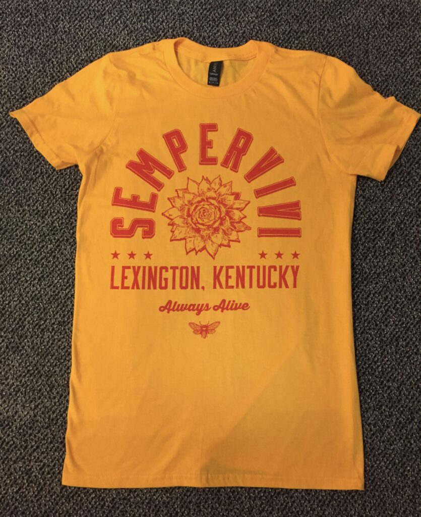
In addition to releasing our second EP “Always Alive”, I had a lot of merchandise and other promotional material to design. I hastily assembled a new website redesign which was themed after the album art. However, I was never happy with how it looked or functioned. The layout did not flow very well on mobile devices and the blog focused home page seemed dated. Thus, I carved out some time to create a new site that retained the color scheme of the EP CD layout, but fostered a much more user friendly experience. Time to put on my band web designer hat!

Band website design story

I have been a website designer for almost as long as I have been a musician who plays in bands. Naturally, my profession and my hobby have intersected many times over the years. I am always evolving, and always reaching out to learn better, more efficient methods. This applies to writing and performing my songs, as well as designing clean, responsive web solutions. My two passions come together and dovetail in this website redesign project.

The main improvements I needed to make included the overall aesthetics. The old site was, frankly, bland and boring. I needed to add some video and bring the overall look of the site up to current tastes. Fonts were to be changed from a conventional sans serif to a more trendy slab. Features wise, I sought to downplay the blog. While still important, I only updated it every few months. As such, I needed to change the focus of the site from the blog entries to the overall story of the band, the music itself, and upcoming events.

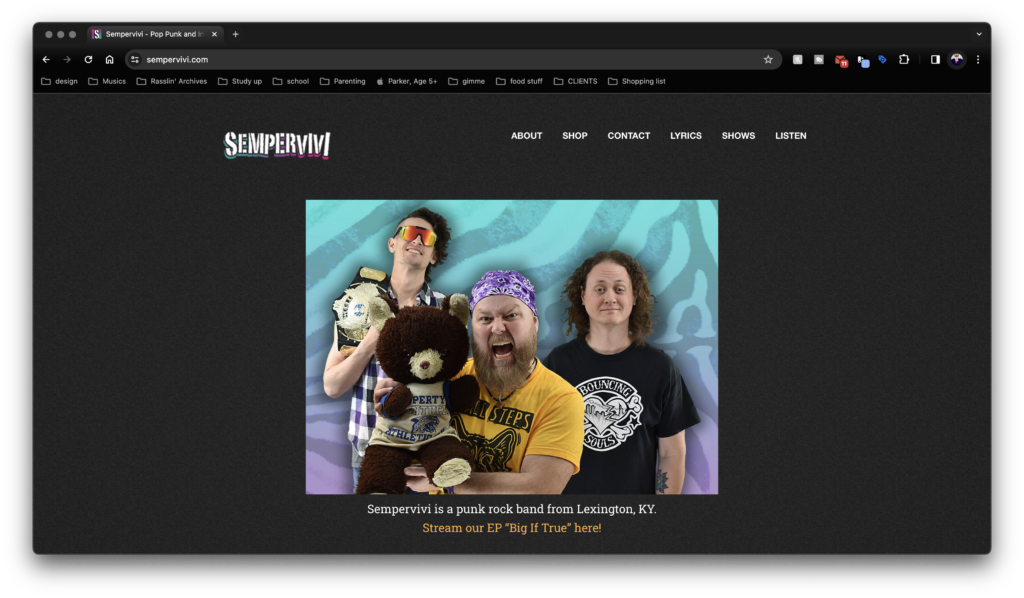
Band web designer – Website homepage overview

Semperivi - the band of this here band web designer

The home page background video loop gives a strong first impression. I stitched together  performance highlights from several venues into a 30-second clip using Apple iMovie. Since Sempervivi could appear as either a solo act or as a band, I featured footage of both formats. The video is overlaid by a muted shade of the green used for the “Always Alive” EP’s cover. In front of the video background, I embedded a compact Bandcamp player containing the newest EP. Below in large type, the site tagline summarizes Sempervivi in two sentences. Last, the call to action “BOOK NOW” button punctuates the introduction.

Visitors can hear our music and get a synopsis of what it’s about, then navigate to my booking form without ever having to scroll down. The most important content all lies squarely above the fold. The next section down reveals a list of upcoming shows on my calendar. A plugin pulls a feed of future performances from the Facebook page. By using this, I avoid having to enter event information twice, as I was before when using an events calendar plugin. If a particular date interests a fan, they can click and go directly to the Facebook event to RSVP. The section’s columns clearly display event dates, titles, venues, and cover images.

The rest of the homepage contains subsections displaying a longer “About” paragraph and an Instagram feed. Thumbnails and snippets from the most recent blog entry also keep fans up to date.

Additional band website design features

The rest of the pages on the site contain all of the information newcomers and longtime fans alike need. Each individual page displays a different featured image in its header. These range from action shots on stage to candid photos to show band members’ personalities.

In particular, I am very happy with how the Song Lyrics page developed. I created an anchored list which comprises of all of the songs in my arsenal. Each section contains the verses, bridges, and choruses for the songs. If a song was featured on an album, I added its individual Bandcamp player above the lyrics. This way, the site’s visitors can listen along to the song while they read the words.

The Biography page provides the details on the band’s history. Then it features clips of glowing album reviews at the bottom.

I update the blog every so often with news to keep everyone in the loop. The blog archive page shows a list of the most recent news entries. Each one displays the featured image above an excerpt, which fans can click in order to read the full entry. Next to the blog, in the sidebar, the booking call to action button reappears above the Upcoming Shows feed. Finally, I set up a store page on the site so that I could sell my merchandise directly. I factored in shipping from my account and created secure buttons so fans who can’t attend a show can still buy our shirts, CDs, stickers, and buttons.

Contact me today for your band website design

Overall, the site condenses down neatly to display on mobile phones and tablets. This responsive design ensures that not one of the visitors will get frustrated trying to navigate through the content. The site can meet its goal of expanding my music’s brand. Does your indie band or record label need to hire a band web designer? You need a solution that is both easy for your fans to use and for you to update. Contact me today and let’s make it happen!
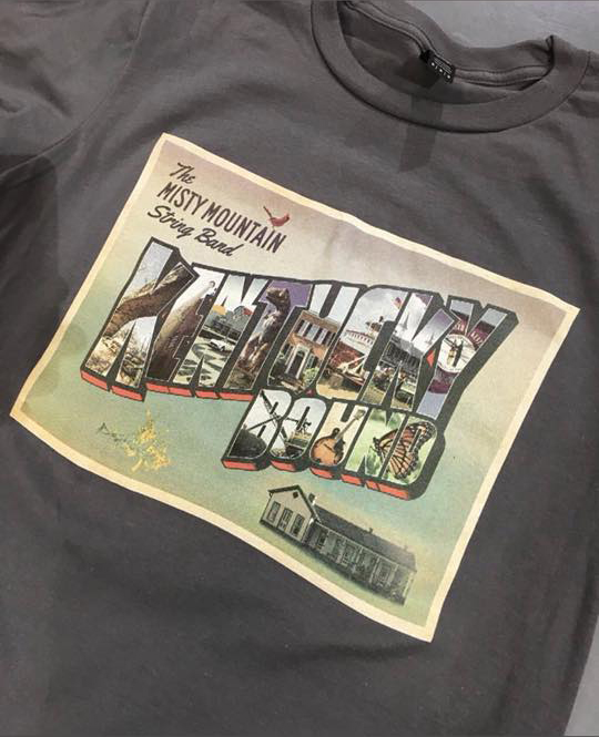
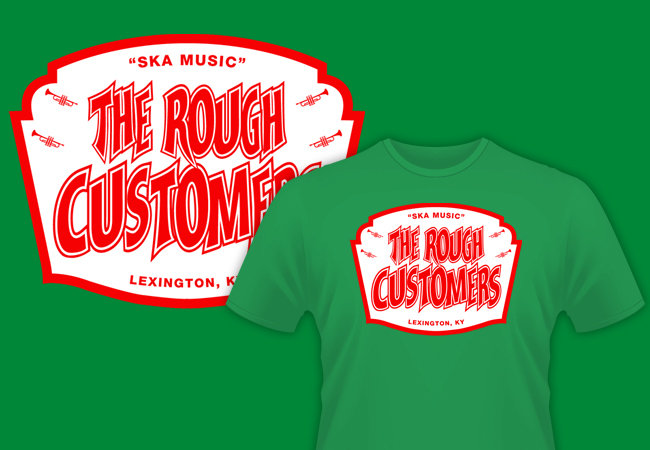
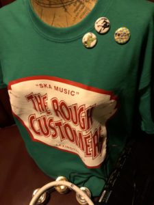
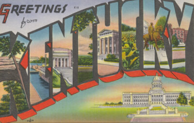
Custom concert poster design for Guided by Voices band

Guided by Voices | Dayton, OH

The legendary indie rock band Guided by Voices scheduled a tour stop in my hometown of Lexington, KY. As such, they were in need of a custom concert poster design for it. Their New York City based management company found me via a Google search. Then, they contacted me to pitch a unique proposition. I was hired on as the official Guided By Voices poster designer for this event!

The group asked me to design, print, and hand number a limited edition of 100 show posters. After approval of the design, I would then mail one copy to management. I also was required to hang a few copies at the concert’s host venue, The Burl. Finally, on the day of the show, I could set up a table next to the band’s merch station and sell the rest. I am always selling my own services. Therefore, I jumped at the chance to take part in this project.

Guided By Voices gave me carte blanche creatively. It was totally up to me to determine the poster’s artistic concept, as well as the subsequent design. The band had only rejected one poster art in their 30 plus year existence. They had developed a keen taste for quality design over their many years in the business. My reputation locally here in Lexington, KY for concert poster design preceded me. It felt great to know that both the iconic rock band and their management had so much confidence in me.

Custom concert poster design story – Guided By Voices Poster Designer

First, I Googled other posters that were designed for the band’s previous tour dates in order to do some research. Most of the other graphic artists sought to emulate screen printed designs. Thus, they only featured three or less colors in their posters. My planned design necessitated more colors. I wanted to create a flat, cartoon style illustration. It had to convey the necessary information while staying both fun and unique.

From the start of the project, I knew I wanted to incorporate an equestrian theme. Also, I intended for the piece’s concept to tip it’s proverbial hat to the culture of my home state of Kentucky.

I felt that it was a bit too cliche to use an image of a horse race as I initially had planned. All of my favorite concert posters incorporate a striking, slightly odd focal image. I had to think outside of the box. I traveled down to the uncanny valley by drawing a rowdy bartender wearing a rubber horse mask. Those who know me are well aware that people wearing realistic animal masks make me very uncomfortable. However, I resolved to face my fears by drawing this poster’s focal image.

Straight (bourbon) from the horse’s mouth on a custom concert poster design

The masked bartender brandishes a bottle of bourbon in one hand and a can of beer in the other. These containers mimic native Kentucky brands Maker’s Mark and West Sixth Brewing respectively. However, they incorporate the band’s icon logo and name instead. The main character stands behind the bar and in front of the The Burl’s signature wood paneling. Also, I framed her popping out of a circular, bright red and blue stained glass design. This is similar to the club’s famous circular window, which has been seen glowing on stage behind many iconic musical acts over the years.

Finally, I topped the main image off with a faux red wax seal. This seal resembles the one that is used by Maker’s Mark for their branding. However, it showcases the GBV icon logo instead of the Maker’s text. I achieved this effect by using an SVG Emboss filter in the Adobe Illustrator application.

Finishing touches – font and color choices

Selling posters at Guided By Voices merch table

Selling posters at Guided By Voices merch table

I splattered the light brown background behind the main elements with various black spots. This gives it an appearance similar to a cork board. I framed the entire poster in with a thick black stroke. This ties all of the elements together and adds just enough weight to it. Last of all, I highlighted the text with a darker shade of the electric blue featured on the stained glass window frame.

I set the main title in a mix of both the Birch Standard tall serif and Thirsty Script Extra Bold fonts. To add depth, as well as emphasize the words “GUIDED BY VOICES”, I added a faint white shadow effect. I also tilted the main title to make it stand out and create the appearance of motion. I wrote both the date and location of the event in an old west style font called Captain Howdy.

To make it resemble the font The Burl uses in their own logo, I modified the original font by closing in the characters’ open spaces. The word “in” repeats the usage of the popular Thirsty Script font, adding some variety to the bottom text.

Guided by Voices concert poster design – Purchase a limited edition print

Being chosen to be the Guided By Voices poster designer was such an honor. Everyone praised my poster design, ranging from the band’s rabid Facebook fan base to the owner of the club. What could be better than creating an effective advertisement that also doubles as a collectible art print? This was a very is fulfilling experience for me overall. As of this writing, I have a very limited stock remaining. Buy one for yourself!

      $20

Contact me for your own event poster art

Are you a concert promoter, or perhaps a touring band with a big date coming up? You need an original art piece that will turn heads and sell tickets. You need me to create your custom concert poster design. I have designed countless print ads to promote events since I started my own graphic design business in 1999. Contact me today to get started.

Dining Out for Life full page ad campaign design

AVOL / Lexington, KY

I created this ad campaign design for AVOL in Lexington, KY. It is a nonprofit which organizes AIDS volunteers. They loved the trade publication ads I made for them previously. Therefore, they contracted me for their biggest annual event campaign. For one day every September, local restaurants donate 25% of their proceeds to fighting AIDS. The organization needed a few different print sizes. These included an 11×17″ poster size and varying newspaper ad sizes, as well as bookmarks.

Ad campaign design story for AIDS benefit

Sandwich board sized poster design for the AIDS charity event

Sandwich board sized poster design for the AIDS charity event

My local chapter of the AIDS charity gave me creative freedom on this project. They only suggested a retro 1950s diner theme. They also sent a few public domain images to inspire me. These included the vintage waitress illustration I finally chose. I also redesigned their existing event logo with a new one which continued the theme.

After my instructions, I poured through old 1950s ad campaign designs for inspiration. Their futuristic floating shapes and pastel color palettes, as well as their kitschy mixed fonts made the cut.

I arranged these elements to suggest motion and give them a fun feeling overall. I did this by tilting text blocks and highlighting objects with different shades. A pink gradient gives shine to the restaurant and sponsor lists.

The ad pieces had many moving parts, from the list of participating restaurants to information about a related art exhibit. I got creative to ensure synergy and legibility from the biggest to smallest versions.

I met the challenge of making the ad art both attractive and easy to read. Also, I crushed the deadline in plenty of time for last minute revisions. My clients raved about the finished product.

Can I design your event’s advertising pieces?

I’ve improved the ad campaign design results of many charity nonprofits and small businesses. Contact me today to join the growing list. Let’s get started with your advertising campaign!

Dining Out for Life retro logo design

AVOL / Lexington, KY

It was an honor to design the ad campaign for the 2017 installment of this AIDS nonprofit’s biggest annual charity event. Every year, dozens of local Lexington restaurants donate 25% of their profits for one day to fight this terrible disease. AVOL’s director wanted to go with a 50s diner theme for this year’s event, so he asked if I could start with a retro logo design. I jumped at the opportunity to give a fun, old school feel to this important happening.

Retro logo design for AIDS benefit story

AVOL provided a few sock hop and vintage diner images for inspiration. However, the director really gave me carte blanche to create something from scratch. I studied a few kitschy, fun 50s advertisements with futuristic themes. There were lots of wacky shapes on display invoking ray guns and flying saucers.

Despite many people’s perception of the 1950s as a culturally repressed era in the USA, graphic design trends were both bold and upbeat. I took these cues to form this concept, and it all came together quickly.

First, for the background, I made a four point arrow shape in pink to form it. Then I created somewhat of a reversed out shadow in front of it from a darker pink stroke. This floating element gives it an authentic vintage feel, as well as depth. I set the main title in a classic tall sans serif font. Black letters spell the words “DINING OUT”, encased in individual seafoam green boxes. Because they are agitated, they seem to be dancing, grabbing your attention right away. The words “FOR LIFE” also pop off of a wide black fork shape pointing up and ahead.

Finally, the simple slogan “Dine Out, Fight AIDS” completes the piece using a lighthearted paintbrush font in the same shade of seafoam green. The end result is a classic mark invoking drive in movies, bowling alleys, and greasy spoons. Everyone who lays eyes on this logo gives me great feedback. It definitely puts smiles on faces and grabs people’s attention.

Contact me for your own retro logo design!

Do you have a vision for a retro logo design? Whether you’re a startup business or a local nonprofit, I’ve got you covered.  Contact me today!

Sempervivi t-shirt design

Sempervivi | Lexington, KY

Just as with the T-shirt design for my previous band Analog Apostles, the first Sempervivi shirt design was a big seller out of the gate. Releasing and promoting an album is a lot of work, but I never slack off when it comes to the accompanying merch. Therefore, I put in some serious time on the minutia of this apparel project. Since I was spending my own money to print these, and I wanted fans to actually buy them, every detail counted.

Lexington, KY Band T-Shirt Design Story

Sempervivi T-Shirt Design, modeled by Jeremiah Duncan of Lexington, Kentucky

My buddy Jeremiah modeling the design.

Shirt art was not originally in the plans or budget after finishing the record. However, my wife liked the idea and encouraged me to splurge, within reason.

I felt like there were enough black and heather grey band shirts in the world. I needed my shirt art to stand out. My music is, generally speaking, positive and upbeat, so bright yellow seemed like a good choice. You can’t go wrong pairing it with red ink.

The primary colors pop sitting on the merch table! Keeping the art at one ink color offset the cost of springing for super soft, vintage tees.

I wanted to go for a sports feel with the layout, similar to designs by Roots of Fight. The arching “SEMPERVIVI”, as well as “LEXINGTON, KENTUCKY” are set in the tall title font Moonshiner. I mixed it with the bold, trendy script Thirsty, which spells “Always Alive”.

Since this is a promotional item tying in with the new record, I reused some hand drawn elements from the CD art. Specifically, I made the succulent the focal point of the art. The much smaller cicada at the bottom punctuates the composition. Finally, I used a grunge brush to create a distressed feel throughout the artwork.

Apparel Design for Bands in Kentucky

If you have a band or other music project, I’ve got your hookup for apparel design. I will work with you on a budget friendly design that will still stand out. Contact me to get started!