admin

Nashville Country Hits - Digital Download Graphic Design

Wellington Beck Music Group | Nashville, TN

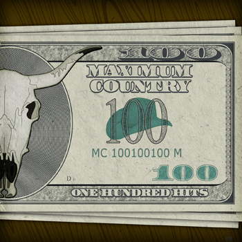
This is a digital download graphic design I made for a compilation of many popular country music singles. This series is much like digital albums such as Kidz Bop and NOW! That’s What I Call Music. The collection of songs is exclusively available online via iTunes, Amazon, and other online music outlets.

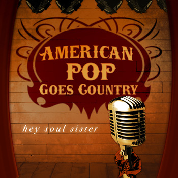
It is a part of the long running series of cover albums produced by Wellington Beck that I designed art for. Quick turnaround was the name of the game for these projects. I excelled at exceeding my client’s expectations on time, each and every time.

Digital download graphic design for country music single

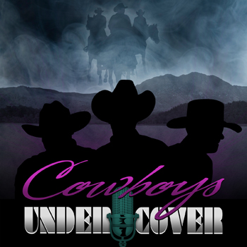
My client requested me to base the album artwork concept on the hit ABC TV series Nashville. I mimicked the show’s mix of serif and condensed sans serif fonts, as well as the bright pink and grey color scheme. The music publisher also made the request that I incorporate an image of a vintage tube television. I started with these ideas, and then decided to expand on them.

Finally, I incorporated a retro television “test pattern” graphic to complete the image’s layout. Many older listeners and fans of the days when television stations signed off for the night with similar images enjoyed this touch. I made an instant hit with both my client and their listeners.

Hire me for your streaming song graphic art

These album art web graphics are among some of my favorite projects. I got a thrill whenever a new assignment would come across my desk.

Are you a music publisher or an artist who needs a quality design created to meet digital retailers’ standards? I am just as passionate about music as I am about top shelf graphic design. Contact me today to get started.

Zombie Walk 2 event promotion design

Main Street Costumes | Greenville, KY

The living dead returned, roaming the streets of Western Kentucky for the sequel to 2011’s Zombie Walk event! The previous year’s undead themed charity walk turned out to be a huge success. Therefore, Main Street Costumes once again called me for their event promotion design. The small town costume shop printed variations of this artwork as eight feet long banners, postcards, and t-shirts.

Since this was the second annual event, I multiplied the featured zombies by two. I felt that the stock image of the purple female zombie was a tad too immodest for a family event, so I photoshopped more clothing to cover her. I also adjusted some proportions of the characters to better fit the space.

Then, I drew the red “2” so that the second event artwork would call back to 1980s slasher film sequels. The brightly colored characters and titles pop off of the stark background. I used the heavyweight Gotham font for the copy. See my work on display in this Youtube commercial for the event:

Screen printed shirt for event promotion design

I rose to the challenge of simplifying the full color poster and card designs to create a three color screen printed shirt. Since my background includes over five years of working in the screen printing industry, it was second nature to me.

My client agreed that we should reduce the art to pink and purple with white highlights. We stuck with the black background for the shirt. Black therefore functions as a de facto fourth color, outlining the words and images, and coloring hair and grunge elements.

Hire a professional graphic designer for your event’s artwork

Are you planning a community event such as a costume party, fundraiser, or fun run 5K race? Contact me today! I will bring your vision to life.

Country music album art for 50: Country by the Numbers - Digital Download CD

Wellington Beck Music Group | Nashville, TN

This country music album art complements a compilation of country singles produced by some longtime regular clients. Wellington Beck produced digital exclusive albums featuring cover versions of songs by popular artists like Luke Bryan, Blake Shelton, and others. As with past projects, they gave me a lot of creative “rope” and very few specific guidelines.

Country music album art story

I felt that sticking with a base of primary colors and a text focused design would help the art stand out. The client asked me to make the number “50” the most prominent part of this country music album art. Therefore, I set it in a bold red tall serif. I stylized it with a faint inner glow effect and an opaque shadow in order to give it just the right depth.

On the top and bottom, I typed “Country by the Numbers” in a deep blue shade. For these words, I used the Trade Gothic font in a light weight. In keeping with the Old West theme, I then added a rope “lassoing” it the number 50, swooping in from the bottom to grab it. The rope envelopes the number in front and back, creating three dimensions.

Finally, I overlaid the bold and bright artwork with a rusty, sputtered grunge pattern. There is also a faint outline of arrows flying up and to the right. The background also contains some bright beams of light. I was happy that this art successfully blended primary hues with grunge elements and Western themes.

Contact me for your next song or album art

Are you an independent country music artist, a record label, or a publisher? Whether you need a print CD art, or a quick turnaround digital art solely for streaming services, I’ve got you covered.  Contact me to get started today.

Zombie poster design for Kentucky costume shop event

Main Street Costumes / Greenville, KY

My longtime friends Clint and Lori Cobb built their successful local costume shop Main Street Costumes (now The Halloween Shirt Company) from the ground up. They bolted onto their successful eBay store with a brick and mortar. It fast became a fixture in my small hometown of Greenville, KY, famous for the giant skull in the window. When they started planning a “Zombie Walk” event to benefit a local charity, Clint and Lori called on me to create a promotional design. They  featured this zombie poster design on 3’x5′ banners, postcards, and t-shirts, as well as other mediums.

Zombie poster design story

I set out to create a feel that was somewhat gory, yet still lighthearted enough for local families. First, I began the zombie poster design with the stock featured image, a white eyed “walker”.

The gruesome figure, complete with green decaying skin, a tattered shirt, and disheveled hair, still needed a little work. I felt that the size of his head was too small. Therefore, I used Adobe Photoshop to adjust it. Additionally, I tweaked a few colors and features before moving on to the rest of the poster.

In order to make the rest of the zombie poster design elements pop against the black background, I used bright colors. The zombie is outlined in a bloody red splatter. His head juts in front of the event logo in order to add depth.

Bright yellow and orange banners zig zag across the front like caution tape, displaying the event details. I used a frenetic, handwritten style font so it would have a comic book feel.

The debut event was a huge success, since it drew over 350 costumed “zombies” to Main Street in the heart of Muhlenberg County.

Hire me for your business’s event promotion art

Are you holding a zombie or horror themed event? Perhaps a Halloween bash for your local community? Contact me today!

Cowboy covers CD art design - "Cowboys Undercover" Digital Music Download Art for Wellington Beck

Wellington Beck Music Group | Nashville, TN

My client was very happy with how this collection of country music covers CD art design turned out. The publisher Wellington Beck gave me only one specific request for the design: incorporate an old school radio microphone in the title.

As always, they trusted me completely to create a professional, quick turnaround graphic. The latest compilation in their country music series became a huge hit, and this single art design was a big part of that.

Country music covers CD art design story

The name of the project suggests mystery, so I sought to create a scene which featured anonymous silhouettes. I also went for an 80’s Western movie poster feel, which is similar to this one. In the image’s background, dusty  horsemen gallop along a ghostly trail set in the smoky sky above a purple and blue mountain range. Perhaps the cowboys in the foreground are searching for some outlaw horse thieves.

Continuing the retro 80’s movie theme, I then spelled “Cowboys” in large, stretched pink script font in the title. In order to give it some shine, I added a gradient effect. Also, I colored the vintage microphone in a deep turquoise so it would complement the main title. It is featured between the words “Under” and “Cover”, which are spelled in a radical, classic block font.

These letters also feature a white to grey gradient and a white shadow to create contrast against the cowboy figures in the foreground. This digital download cover art is like Miami Vice meets Gunsmoke!

Contact me for your covers CD art design

Are you an artist or record label that is planning to release a record of cover songs? There is no need to go undercover for your compilation album art graphic design. Contact me today to get started!

Country cd art designer - Music Digital Download Compilation Artwork

Wellington Beck Music Group | Nashville, TN

I thoroughly enjoyed the time when I worked for Wellington Beck Music Group as a country CD art designer. The Nashville based music publisher sold digital music via Amazon mp3 and iTunes, as well as many other online outlets.

Country CD art designer story

This is another compilation of popular country singles featuring the steer skull mascot from their “American Country Hits” series.

Wellington Beck asked me to recreate a $100 United States dollar bill with the steer skull instead of Benjamin Franklin’s portrait. I desaturated the colors from the original image, then blended it into the oval portrait in the center using Adobe Photoshop.

I was particularly happy with how the texture of the dollar bills turned out. It adds a much needed air of realism. The simulated currency looks like actual crinkled American dollars. The green cowboy hat stamped over the characters spelling out the number “100” also looks great.

A dark brown wood grain patterned table completes the rustic look, which you can expect from a good country CD art designer.

The final result turned out to be a huge seller for the digital music publisher. It is still is in streaming rotation today. We did not leave any cold, hard cash on the table when it came to this project!

I’ll design your Country Music Album Cover

Do you work with a music publisher? Perhaps you own your own independent record label. You may offer digital music, along with traditional physical CDs. You know better than anyone else that the image is just as important as the music that accompanies it. Instead of trying to do it yourself, or relying on a cut rate, fly by night firm, you should hire a pro with years of experience. Contact me today and put your money where your mouth is!

Country music art design for "Hey Soul Sister" cover song single

Wellington Beck Music Group | Nashville, TN

This was a new series of country music covers from regular clients Wellington Beck. The “American Pop Goes Country” series included both compilation albums and popular country singles. This country music art design covers the ubiquitous Train hit song “Hey Soul Sister”.

Country music art design story

I stayed with the basic theme of my client’s previous “American Country Hits” series. The same Western fonts and tribal elements of the original’s main title are still present here. However, for this “pop idol” themed series, I modified the original series logo. I “painted” it on the grungy stage wall with a rounded circle incorporated. This gives the piece’s logo mark an overall smooth feel. I basically merged the original ACH logo with the famous American Idol mark.

I based all of the country music art design elements, other than the logo, on actual stock photographs. Out front, the vintage Shure “Fat Boy” microphone stands out against the weathered stage. Wrapped in a red bandanna, it beckons the viewer to take the stage and sing along.

The lighting rig overhead and the opened red curtains frame the warm orange tinted scene in. I used a few high contrast, glow, and shadow effects to give the digital album art a crisp, high end feel.

The “American Pop Goes Country” cover song series became a big hit. These singles and compilations are still available online today. The label exclusively offers them as digital downloads. Outlets such as iTunes and Amazon Music carry it for streaming and purchase.

Let me design your country album artwork

Are you a musician or perhaps an country music record label? Do you need album artwork created? I have years of experience designing one of a kind CD and digital download artContact me today to get started!

Bryan Danielson shirt design with teddy bear theme

Bryan Danielson | Aberdeen, WA

This (Daniel Bryan) Bryan Danielson shirt design was one of my favorite projects to work on. I cheered on the legendary AEW and  WWE Superstar since his days wrestling for independent promotions like Ring of Honor and Dragon Gate USA. WWE briefly let him go in 2010 after a controversial incident on television. He was scripted to choke out an announcer with a tie during an on-screen attack with his Nexus cohorts. Sponsors objected to the violent image, and WWE officials decided he went too far.

While he was banished, he resumed wrestling on the independent wrestling scene. Bryan decided to capitalize on the publicity the angle earned him and had a contest for his fans.

Bryan Danielson shirt design story

The premise was to design a shirt, four colors or less, depicting Bryan as an angry teddy bear. Preferably, he would clutch the infamous pink tie from the firing incident.

After reading this news, I sprung to action. First, I hand drew the anthropomorphic, scowling fur ball, posing in Bryan’s signature satin ring robe. Next, I scanned in the sketch and cleaned it up using Adobe Photoshop. Then, I transitioned the art to Illustrator, where I redrew it to create a vector file.

I colored in the bear’s ring gear with his signature deep red hues. He is holding up a finger signaling #1, a signature taunt that eventually evolved into his double fingers up YES! gesture.

Before he could declare a winner of the contest, WWE hired Bryan back. He then returned as a surprise partner at that year’s SummerSlam facing his former partners in the Nexus. I believe I would have won, since several fans emailed me wanting to buy their own copy of the shirt.

Shirt design for wrestlers, athletes, and other sports brands

Are you an independent pro wrestler looking for new merch designs? Do you manage a sports team or another entertainment brand? Contact me today for a shirt design that will have your fans shouting “YES! YES! YES!”

Youth camp logo design for Marked events

Marked Youth Camp / Southern Illinois

I made this youth camp logo design for a United Methodist Church sponsored camp based in Illinois.  It was an update of their existing logo, which made use of block lettering and a grunge “splatter” element. The Youth Pastor called me to reimagine it with a more modern look and feel.

Youth Camp Logo Design Story

First, I chose the weighty Rockwell Bold font, which was very popular at this time. A font that strong is impossible to ignore, especially with a high contrast design such as this. Then, I filled the letter “A” in red.  This represents how Christians are set apart (“marked”) for the Lord’s service. Many of my favorite logo designs leave out the bridge in the capital letter “A”. I feel that this also helps this design stand out in addition to the color variant.

The client encouraged me to use some swirling vine elements, but to make sure they were “not too feminine”. This gives the design some flair, but is not too over the top. I added a thick black stroke outline around the elements to give it plenty of weight and contrast.

Finishing Up

Tilting the logo upward also helps to catch the eye. Gradient and embossing effects on the letter “A”, as well as the black background, help give it a high end feel.

I included some subtle grunge cracks around the edges of the text. A splatter in the background gives it an additional edge.

Finally, I drafted several variations of the concept for different purposes, such as those in which the grunge elements were not appropriate. This kind of versatility is important to clients who may need to appeal to different audiences for funding, for instance.

Contact Me For Your Own Design

Does your church or youth camp need a fresh look? Rebranding could be the key to attract new parishioners or campers. I have extensive experience with religious content, as well as decades in the field of high end logo design. Contact me today to get started.

Big Blue Customs Hot Rod Logo Design in Lexington, KY

Big Blue Customs / Lexington, KY

Regular client Chris Curtis, owner of the Chip Magician body shop, started taking on more custom work in 2010. Because of this, he decided to launch a new brand around it. I created this hot rod logo design for him based on a pencil sketch he had drawn up by a third party. Chris needed a masculine, powerful image to represent his brand. The end result needed to retain the attitude of the original sketch, while pumping it up with extreme shine.

Hot rod logo design story

First, I started by tackling the color scheme. Here in Lexington, Kentucky everyone bleeds UK Wildcats blue, so I Pantone matched that particular shade for this design’s background. The warped varsity style block lettering in white makes that theme obvious enough. It pairs perfectly with the word “Customs”, appropriately set in a custom font below it. The words are stroked multiple times and shadowed, as is the background. This adds just the right amount of over the top boldness.

Behind the words and background, I added an image of a custom chrome wheel. There is no doubt when you see this that the business caters to an audience who is passionate about customizing their cars. I then framed the wheel at the bottom using two tribal ornaments that subtly suggest flames. Throughout the design, I embellished with chrome effects, gradients, shadows, as well as inner and outer strokes to grab the viewer’s attention.

Finally, I added in some extra bling to the corners of the word “CUSTOMS” for maximum shine. There you have it – one high end, hot rod logo design!

Start your engines! Hire me for your hot rod logo design

If you’re looking for a bold, chromed out logo for your business, then I am your man. Contact me today to get started!