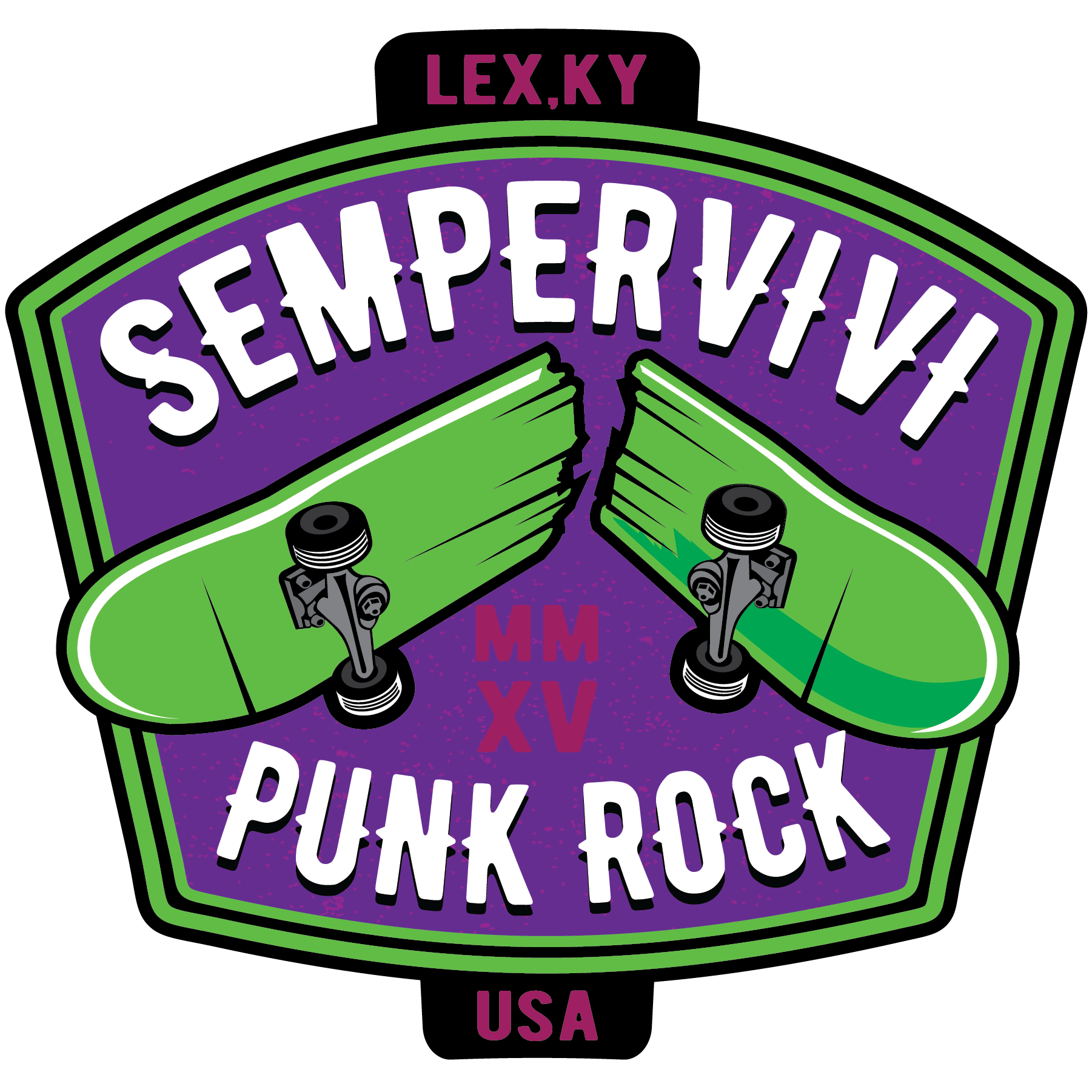
admin

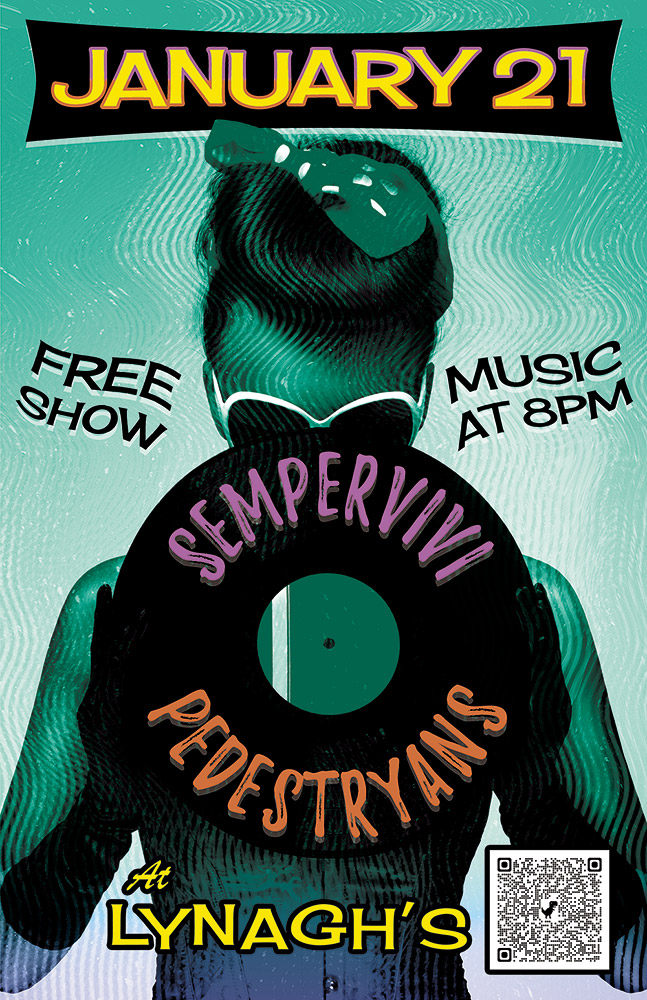
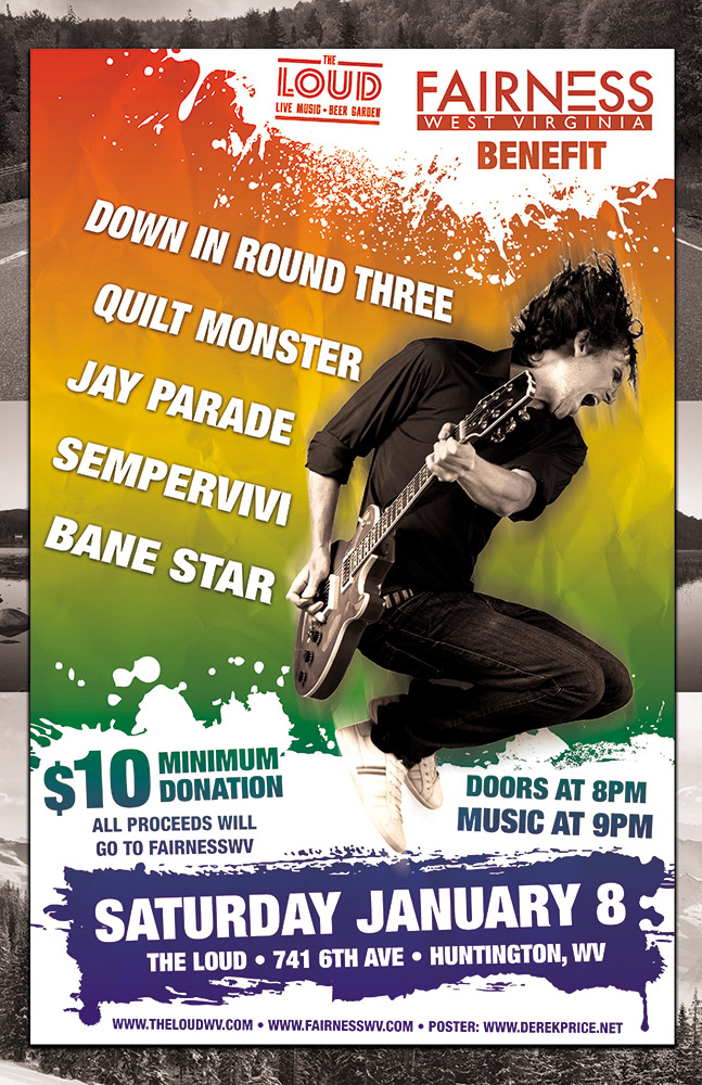
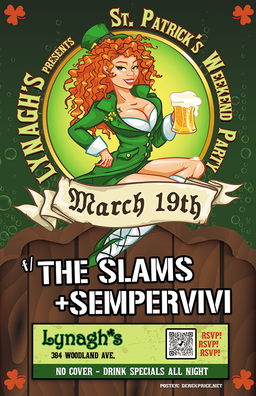
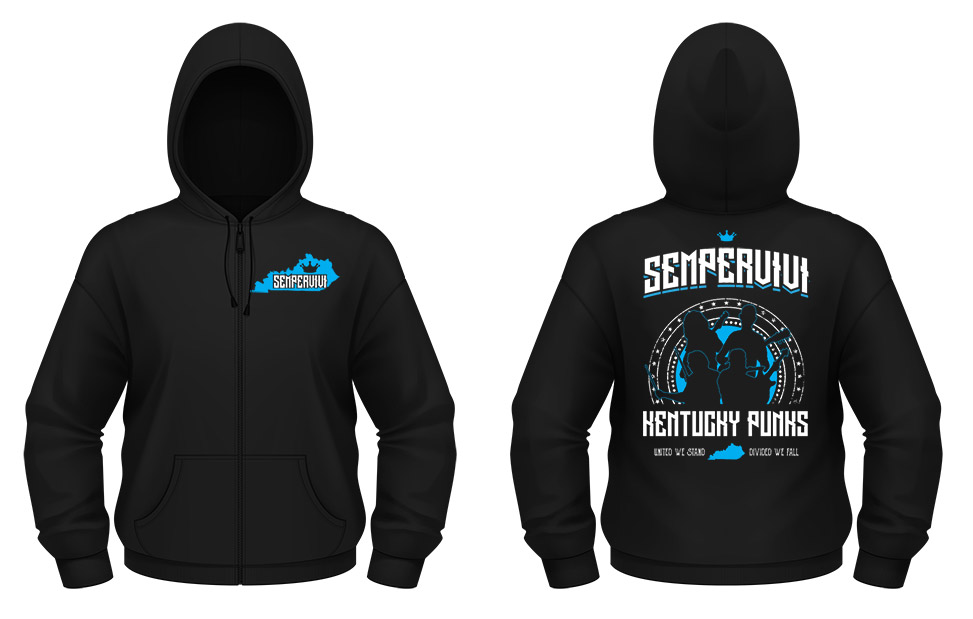
I’m a big time band merch nerd. Especially stickers. If I don’t have the money budgeted to buy a shirt or hoodie from a band at their show, I will at least purchase some stickers. They end up either on my truck, toolbox, or the filing cabinet in my office. I always make sure my band Sempervivi’s merchandise table is fully stocked with items ranging from inexpensive to higher priced items. In 2022, we were running low on previous sticker design concepts, so I took advantage of a Sticker Mule sale and stocked up. I worked up four different sticker design ideas and had all of them printed in order to offer some variety to our fans.

Sticker Design Story

Using the "Skate" sticker design on my favorite coffee cup.

The “Skate” sticker design on my favorite coffee cup.

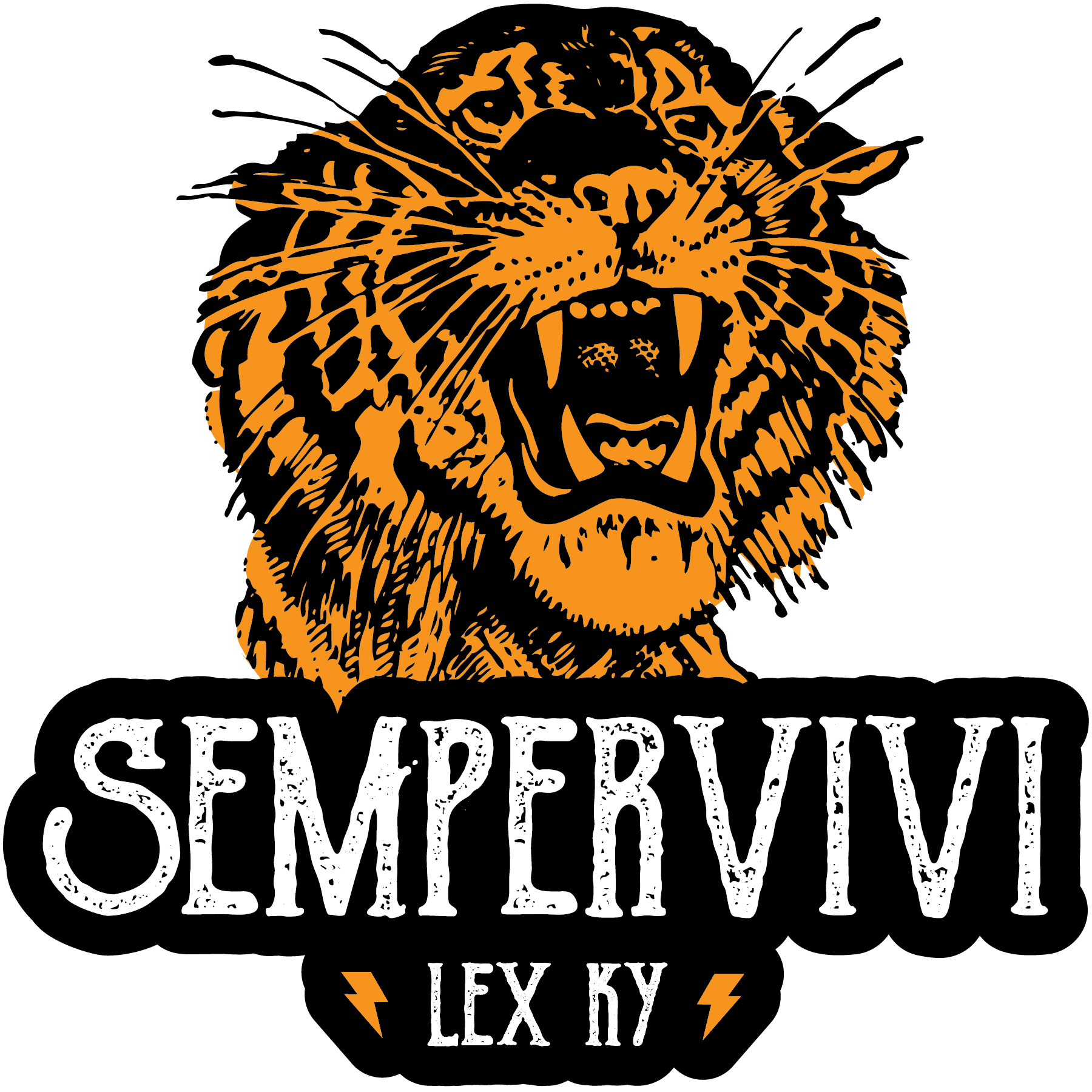
First, I thumbed through some old line art books and picked out a nice roaring tiger. I colored in the tiger’s fur with a golden yellow hue. Then, I combined this expertly detailed illustration with our name uppercase in a vintage font. Our hometown “LEX KY” nestles between two simple lightning bolt icons in yellow, completing the first sticker design.

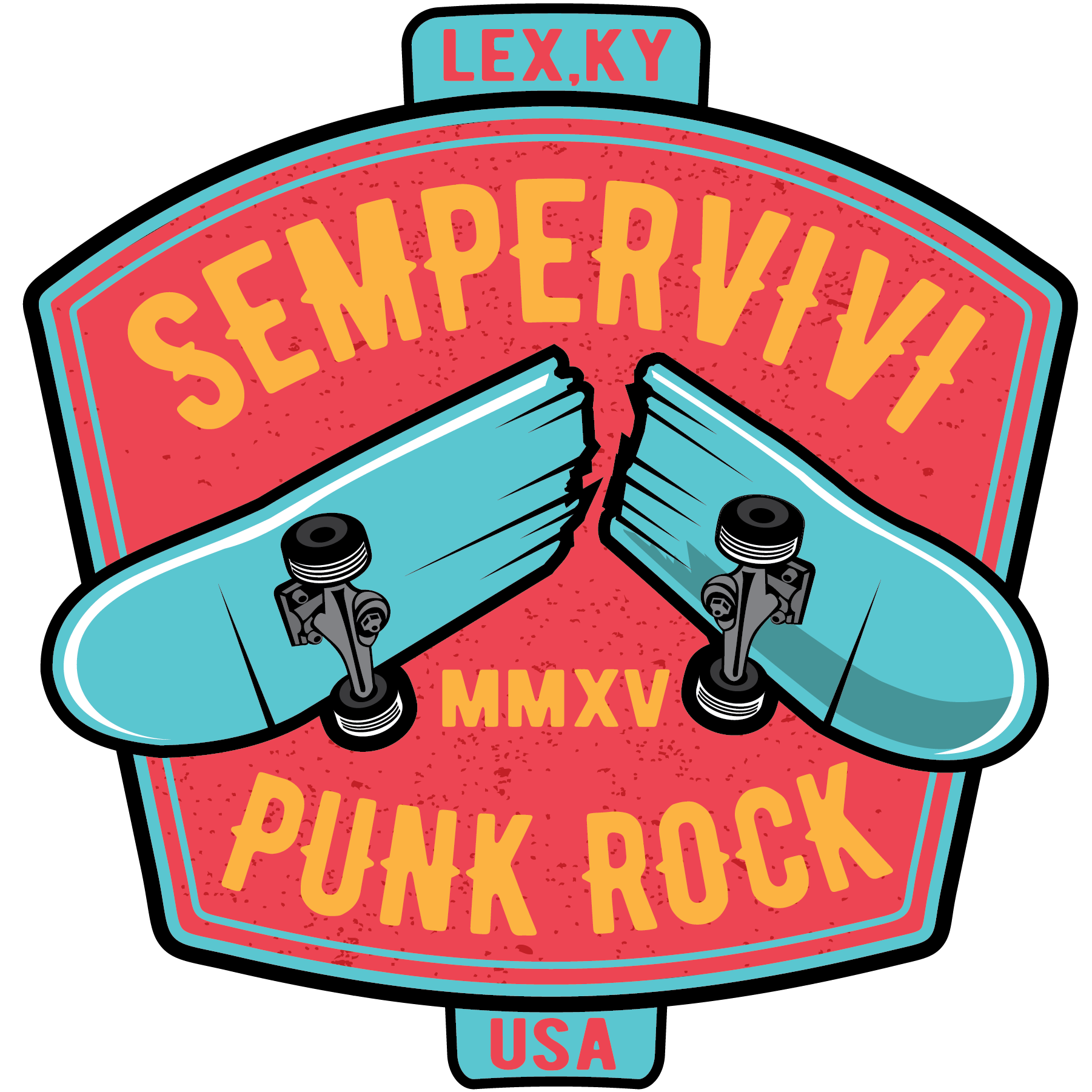
Since many would call our band’s genre “skate punk”, I incorporated a broken skateboard image into an old school signage layout. The bold image of the broken deck jumps out in front of the marquee font spelling our band name. Then, I added our hometown and Roman numerals for the year 2015 to the sticker design, commemorating the year when our band began.

I played with a few different different color schemes. The band members couldn’t choose between the two palettes I pared it down to, so we had both printed. I love the alternative “Joker” combination of mostly purple and lime green. The melon red and Carolina blue scheme is lighter, cleaner, and more fun.

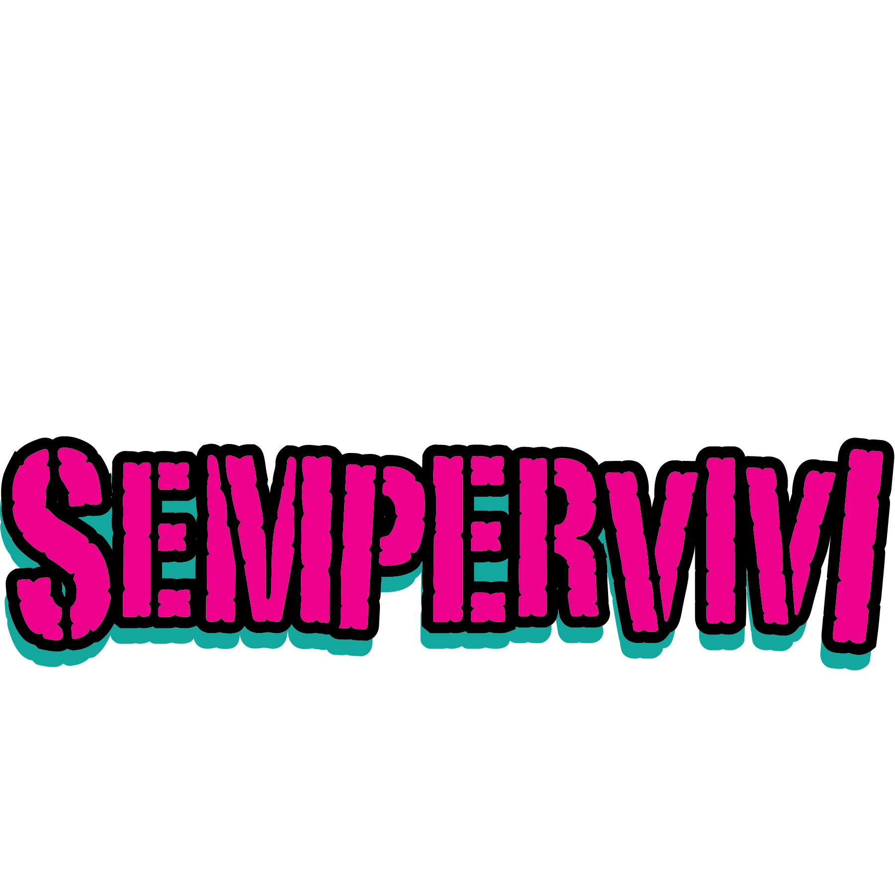
Finally, I had been toying around with a rugged “stamp” style logo for the band. I jumbled the sizes of the letters and tilted them, creating a chaotic style to match our fast, loud punk sound. The final touches came together as I filled in the characters in neon pink and turquoise. Then, I outlined the letters in black and added a solid black shadow to the art to make it pop.

Stick with me, your trusty merch artist.

Every musician needs merch. If you are a live performer, your fans want to buy merch to support you. An inexpensive way to get started?  Contact me today to bring your sticker design to life.

Pedestrians Kentucky Blues Concert Poster

Pedestryans | Lexington, KY

Here’s a retro concert poster that I designed for a 2022 show at Lynagh’s Irish Pub in Lexington. My friend Destry is a classy lady who sings and plays bass guitar in the blues based alternative rock band Pedestryans. Her selfie game is on point, and she often rocks a variety of vintage styles. Featuring a classic 1950s style pin up girl would fit perfectly.

Retro Concert Poster Story

When I chose the vintage style pin up girl photo from my extensive stock image collection, I knew that I wanted to bathe it in an aqua blue tint. I overlaid the whole image with a wavy “static” pattern, so as to imitate vintage TV interference. Also, I envisioned wrapping the band names around the black vinyl record that she is holding. The bright pink and orange hues of the names help them stand out over the wax circle.

For the date at the top, I manually jumbled the letters in order to give it a retro, playful feel. I also jumbled the letters at the bottom of the page that spell out the venue name. The bright yellow date is encased in a typical 50’s “futuristic” style black curved shape. I then added a subtle gradient that fades the aqua blue to purple at the bottom in order to highlight “At Lynagh’s”. Other event information floats to the left and right of the pin up girl in black. Every retro concert poster needs a wave warp effect. I added this element in order to give it some movement and also to increase the kitsch factor.

I’m the poster designer you’ve been looking for!

Are you holding an event that would benefit from a retro concert poster design? I love incorporating vintage 1950s elements into promotional ads! Contact me today to get started.

LGBTQ Fairness Benefit Poster Design

Fairness WV | Huntington, WV

West Virginia based band Jay Parade offered my band Sempervivi a spot on this benefit show they were holding for Fairness WV. The guys liked my poster design for another show we did together, so they asked if I would donate my time for this cause. I happily agreed to provide this LGBTQ fairness poster design.

LGBTQ Fairness Poster Design Story

Josh from Jay Parade gave me all of the information about the equality event, such as the bands performing and the starting time. I contacted the venue, as well as Fairness WV, to obtain their logos. Since the organization had confidence in my skills, they did not insist on any specific design elements for the layout. Although I knew I wanted to include a rainbow in some way, I didn’t want to stoop to cliches or pandering. When working on a project such as this, it is easy to make it too cute. I needed to create an eye catching, bright poster that clearly announced what the event was, as well as its goal.

Using negative space for some of the typography was another goal. White “paint” splatters create that negative space in front of the rainbow color gradient background. I reversed out both the logos at the top, as well as the date and other information at the bottom. Then I added a rad rocker jumping with his guitar as the focal image. I reduced the image down to black and white, so it would stand out in front of the rainbow background. Once I added a motion blur filter, the guitarist was complete. Each of the band names features a perspective warp to give it some motion as it wraps around the guitarist.

When I put all of those elements together, I thought it was good, but not quite complete yet. In order to complete the LGBTQ Fairness Poster Design, I shrunk everything down and centered it. Then, I created an homage to the Appalachian mountains shared by West Virginia and my home state of Kentucky. I added some black and white mountain photos to make the new background. Now, the rainbow scheme really pops!

Contact Me For Your Benefit Fundraiser Art

Will your fairness campaign hold a fundraiser soon? You need a professional graphic designer to help draw attention to your benefit event.  Contact me today.

St. Patrick's Day Poster Design for Lexington, KY Irish Bar

Lynagh’s Irish Pub | Lexington, KY

I experienced some of my favorite memories of performing original music live on the stage at Lynagh’s. Lexington’s finest Irish Pub was always good to me and my bandmates in Sempervivi. Since they are an Irish themed bar and grill, St Patricks Day was a hugely successful time of year for them. The Slams are a local favorite Celtic Punk style band. Therefore, booking them to play with us at the pub on this occasion was a no brainer. Of course, I took on the task of drawing up the St Patricks Day poster design, so let’s dive in, shall we?

St Patricks Day Poster Design Story

I knew right away that the central image would need to feature a buxom Irish lass. Therefore, the perfect illustrated stock image portrays a luscious redhead in green leprechaun garb holding aloft a mug of foamy beer. After adding her to the composition, I wrapped the event name around the circular frame behind her. “March 19th” displays in a scrolling banner using an old English style font, while each of the band names is “stenciled” on the wooden fence our lucky lady sits on.

Additional event information also displays in a lime and dark green box at the bottom. In order to add a little flair to the dark green background, I inserted some fizzy bubbles, mimicking those founding in the beer mug. Finally, I added a solid orange shamrock shape in each corner to contrast the green and tie everything together.

 Contact Me For Your Irish Pub Party Artwork

Are you planning a big concert event or party at your venue for St Patrick’s Day? Do NOT press your luck! Hire a professional graphic artist with over 20 years of experience to design your poster. Contact me today!

Sempervivi Hoodie Graphic Design - Front and Back

Sempervivi / Lexington, KY

Since 2015, I’ve designed several shirts for my pop punk project Sempervivi. As the band has grown, so have our merchandise offerings. We decided to take the next logical step by putting out some hoodies. I have done hoodie graphic design before, but this was special, since it was for my own music project.

Hoodie Graphic Design Story

Printing hoodies can be expensive. I wasn’t sure if there would be a big enough demand for Sempervivi hoodies, so setting up a preorder on our website for a limited run made sense. Maybe my friend who prints our shirts (Jeremiah at Flesh and Blood Printshop) might have a few extra blanks lying around. I asked him, and it turned out he had a lucky number of 13 surplus hoodies, both pullovers and full zip ups. There was also a mix of black, dark green, and heather grey garments, in a wide variety of sizes, so it helped create a sense of scarcity.

Once I got our plan in place, I started working on a design, which is backward from my usual order of doing things. Our bassist suggested that I create the design around silhouettes of us rocking out. I’ve done this theme several times over the years, both for artists and businesses. I used Adobe Illustrator to outline a few screen captures of live video footage, as well as some professional photos our friend Carmen had taken.

After I arranged the silhouettes, I framed them in a grungy circle of stars, adding the phrase “Kentucky Punks” underneath. To punctuate that phrase, I added our state’s motto “United We Stand, Divided We Fall”. Then, I arched the band name at the top using a tall retro title font. I adjusted the “M” for legibility, and added a small crown at the top to finish the back art.

Finally, I added the front design to the left chest. The silhouette of Kentucky contains the new logo font without the arch, along with the crown.

Hoodie Graphic Design Color Variants

Since we were printing on three different colored garments, I asked our printer to use three different ink color combinations. In addition to this being our first hoodie design, it was our first apparel to feature more than one ink color. For the black hoodies, we used a combination of cyan blue and white. The forest green garments featured orange and white. Lastly, the heather grey hoodie graphic design was printed using black and pink ink.

When I finally nailed down the design and the color schemes, we set up the online preorder for our fans. Once we had sold enough hoodies in advance to break even, I sent the files to press. Suffice to say that everyone loved them!

Contact Me For Your Hoodie Graphic Design

Inspired to offer hoodies for your fans? Contact me today to create a hoodie graphic design for your own band or business.

To be honest, I could take or leave Cable TV, as well as most streaming services. I am, however, a Youtube junkie. I’m always adding videos to my “Watch Later” list. I consume hours of content about retro gaming, pro wrestling, and other topics. During the pandemic, my band could not rehearse in person for over a year, so I decided to focus on creating content for our channel. I went all in, studying how Youtube algorithms worked. One of the crucial elements in building a successful channel is to make sure  your Youtube thumbnail design is on point. I observed techniques many creators used in their thumbnail creation and put them to work for both my band and my regular clients.

Youtube Thumbnail Design Story

During the 2020 quarantine, I laser focused on some of my favorite creators. I noticed that channels such as Punk Rock MBA and Top Hat Gaming Man employed an effective thumbnail design style. Since thumbnails often display at very small sizes, it is important to maximize the space you are given. The most impactful art in this format tends to employ a bright colored background. A big, bold headline occupies approximately one half of the space, usually in white and outlined in black. Most importantly, the other half of the thumbnail usually features someone’s face, with a clear, often exaggerated expression. A face with an obvious expression, when paired with a compelling headline, can spark curiosity and generate clicks.

After study time, I put all of this knowledge to work. I sharpened my thumbnail skills while editing original music videos for Sempervivi and clips of Zoom classes by my clients You Net Results and Sara Drury. One such video for the band enabled me to partner with my favorite female pro wrestler Thunder Rosa, using footage from her career before she signed with AEW.

Do You Need A Youtube Thumbnail Design Created? Contact Me Today!

From the beginning, I have loved creating quick turnaround web graphics. Moving from one concept to the next on a tight deadline keeps my creative skills sharp. Do you need an experienced graphic designer to make your Youtube thumbnail design shine? Perhaps you even might need some video editing for your productions. Contact me today to see if we are a good fit!

Anniversary shirt design - Lynagh's Irish Pub - Lexington, KY

Lynagh’s Irish Pub / Lexington, KY

The staff at Lynagh’s Irish Pub were great to me for the few years we worked together. They hired me for some of my favorite apparel and concert poster projects. Despite the COVID-19 pandemic reducing all of our local gathering places to carry-out only in 2020, the owner Jeb was still looking ahead to the next year. He contracted me for an anniversary shirt design to commemorate Lynagh’s 40th year of service.

Anniversary shirt design diary

As usual, Jeb gave me one bullet point and let me run with it. He requested that I recreate the Lynagh’s storefront from a few photos he sent. Other than that, he gave me complete creative freedom. I rubbed my hands together and started sketching out the perfect apparel design for this special occasion.

Initially, I intended on featuring the storefront front and center. I would situate all of the other elements behind it on the anniversary shirt design. However, the building is not exactly very distinct, apart from the signs on top of the roof. I decided it would be more effective it were “contained” within a shield shaped frame.

I made a very detailed drawing of the store, including the West Sixth Brewing neon sign in the window. The glass door opens to invite everyone in the friendly confines of the pub. I took some liberties with the illustration for artistic effect. Specifically, I enlarged the signs on the roof so they would stand out more within the shield. I needed to maximize the space on the art board. I also added a black “night sky” with stylized stars to help the sign pop more.

Finally, I laid out the shield and the heraldry. Outside the frame, I added a civic crown wrapping around either side in order to add a touch of class. I typed “40th Anniversary” in the Copperplate font, and then placed it into a double stacked banner in the center. To balance all of the elements out, I added a three leafed shamrock at the bottom, as well as a regal crown on top. The years 1981 and 2021 proudly display on either side of the crown, completing the anniversary shirt design.

Contact me today for your own commemorative apparel artwork

Does your business have an important milestone coming up? Let’s celebrate! Contact me today.

Comedian website design for stand-up comic Rich Jones

Rich Jones | Dayton, OH

It seems like everyone is a comedian on the internet these days. My friend Rich is real life standup comic, though, and a funny one, too! There just aren’t enough of those around, especially Christian comics who don’t use foul language. When Rich contacted me to make his comedian website design, I jumped at the chance.

Comedian website design story

Rich already had an existing website incorporating his wrestling inspired nickname (“The Whole Sh’Bang”) and logo (similar to that of our mutual favorite Bret “Hitman” Hart). It was, however, very limited. Many “drag and drop” template editor sites are. Because of this, I helped Rich add a hosting package to his domain name.  This way, I could redesign it using WordPress, which is my preferred web design platform.

I included the requisite brick wall background many comedians and comedy clubs employ on their sites. However, I made it a more subtle and shadowy dark blue, so the pink and white elements really pop off of the page.

He had a wide selection of photos of himself with famous friends, as well as Youtube performance videos of his clean comedy routine. I sprinkled these throughout the site in order to give visitors an idea of Rich’s personality.

As far as features go, I added a podcast player to a sticky section at the bottom of the site. It features the most recent episode of his show automatically. He also needed a page dedicated to the podcast, which encouraged visitors to subscribe and check out past episodes.

Finally, I added a Paypal store, so Rich can sell his shirts and other merchandise directly. Perhaps most importantly, I also set up an events calendar in order for fans to keep up with Rich’s appearances. Clubs can also book Rich via his secure form.

Check out Rich’s website here!

Think you’re so funny? Let me design your website!

Are you a comedian seeking more bookings and more merch sales? Let me create a new site for you and connect with your fans better than ever before – no joke!  Contact me today!

Resolute Repairs home repair contractor logo

Resolute Repairs / Lexington, KY

My neighbor Drew was starting up his own home repair business. It just so happened that I needed some repair work done on my home. As luck would have it, he also needed a contractor logo design for his company. We struck up a barter deal for each of our respective services, then we both got to work!

Contractor logo design story

Drew and his partner Daniel wanted to represent their brand with a simple, classic mark. Specifically, they wanted art that was text based, with subtle image elements. They needed big, bold mark that got right to the point, but did not have any specific font or element in mind. Rather, they desired a specific turquoise shade. I used this information to draw up a series of comps.

Out of all of my sketches, Drew chose the version with a simple italicized, bold serif font. Inside the line separating the two words, I reversed out “LLC” in the ubiquitous Helvetica Bold font.

On either side of that, I placed circular Phillips head screw shapes. These subtle elements reinforce the home repair business category. The right screw shape also implies a dot on top of the lowercase “i” in the word “Repairs”.

Finally, the capital “R”‘s in each of the words connect. The company could use this separate mark in alternate branding applications, from uniform embroidery to vehicle wraps. I was happy with the drywall work performed by my new client. Drew and Daniel were thrilled with their new contractor logo design. Win/win!

Contact me today for your contractor logo design

The word “resolute” is a synonym for “determined”. Whether it comes to your print or web image, I am resolute to help you to look your best. Does your company need a contractor logo design? Send me a message today.

Vanessa Davis Songwriter streaming music cover art for Digital Download EP

Vanessa Davis | Lexington, KY

Vanessa Davis Kentucky based singer songwriter. She asked me to design the streaming music cover art for a new EP composed during the 2020 Coronavirus quarantine. She provided a few elements to get me started on the art, and then she put me to work.

Streaming music cover art story

Print poster variant of the streaming music art

Print poster variant of the streaming music art

Vanessa sent me a rough sketch of her incorporated into the foreground of a painting by her grandmother. She also provided sheet music for songs on the album, and requested that I add those in if they  fit.

First, I removed the background from her photograph, smoothing out the edges of her curly hair. I then set out to blend her seamlessly into the painting. In Photoshop, I combined an “oil painting” filter with an embossed second copy of her photo, thus mimicking the painting’s texture. Next, I modified the colors in both her picture and the painting in order to create consistency.

I then incorporated the sheet music into the image. A variety of eraser brushes gave the composition a weathered, ethereal feel, as if they were a dream by author, floating amongst the sky and landscape.

Finally, I chose a classic serif font to represent the album title. Based on our discussions revolving around her rootsy, folk based musical style, I typed out Vanessa’s name in an elegant script font. After completing the painterly art, I opted to keep the text minimal and not add any effects. I simply added a faint black feathered box under it to help its legibility.

Vanessa also requested that I design a print quality poster to complement the album art. She would send these posters out for publicity purposes. I first blurred copies of the painting together to create a new background. Then, I extended the music notes above and below the streaming EP art. Regarding the finished poster and CD, my client declared, “I LOVE THIS! I am thrilled with the work you’ve done on this.”

Check out Vanessa’s music on Youtube and follow her on Instagram.

Let me design your streaming music cover art

Since I am a musician myself, I take a keen interest in helping other artists. I understand how important it is for great music to be paired with complementary artwork. Contact me today, and I’ll make bring your artistic vision to life.