admin

CD Artwork for Sempervivi "Always Alive" by Kentucky CD cover artist

Sempervivi | Lexington, KY

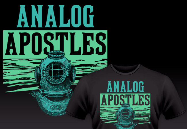
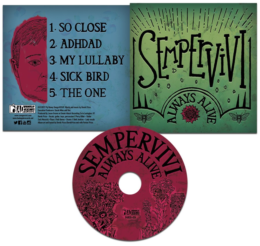
Since I began my career working as a freelance graphic designer, I’ve enjoyed being a CD cover artist. The CD artwork for my own band Sempervivi proves that I am very hands on with personal projects. I departed my previous band Analog Apostles in 2014 in order to start my own solo project. After self producing an acoustic EP, I wrote new songs for this record, which necessitated a full band. I designed my own layout for “Always Alive” in 2017. This album was, in every sense of the words, both a labor of love and a family affair.

CD artwork process for Kentucky rock music

Initially, I only knew that I wanted to use a bright green color for the album’s cover. This is because the record’s concept is evergreen life. I took my time on this project in between other work and music related tasks, since my goal was to hand draw as much of the CD art as possible. At first, I even hand wrote the credits, but I was not happy with how those turned out. However, I drew or traced each and every other element in the CD and jacket composition.

CD artwork incorporating natural elements

Many of these songs’ themes center around family, growing up, and the idea of continuing one’s lineage to future generations. I wanted to incorporate many elements that were found in nature. Therefore, I researched which animals represented immortality in different world cultures. In the end, I settled on the cicada. It is a winged insect which is common here in Kentucky that can be heard chirping loudly on humid summer evenings. I incorporated a pair of these bugs as part of the front cover heraldry.

The sempervivum plant is also known as a succulent or houseleek. I featured it in red, located front and center on the cover. It is a reference to the name of the band as well. “Sempervivum” is a Latin phrase that literally translates to “ever living” or “always alive”.

Album Cover Artist – Fonts and typography

I did not initially set out to draw the word “SEMPERVIVI” with a particular font in mind. Instead, I decided to emulate something I would have doodled on one of my old high school notebooks. I drew, scanned, tilted, and resized the letters a few different times to get the feel just right. The varying sizes and placements of the tall serif characters make it stand out in a way that a conventional font would not.

I set the arched title “ALWAYS ALIVE”, as well as the track listing, in the “Triforce” specialty font. However, I filled in the signature openings of the letters when I traced it. This is in order to give the characters more weight. I then completed the front cover layout with some doodles of light beams and bubbles. I also created a frame to go around all of the elements using the Adobe Illustrator program. Then, I retraced it by hand in order to continue the sketch art theme. The text, frame, and drawings all have a faint white shadow that adds depth, as well as creating a subtle embossing effect.

Jacket CD artwork finishing touches

I sketched a drawing of my young son’s face on the back cover as the focal point. This made sense, since two of the songs center around becoming a father and spending time with him. The drawing offsets the album’s track listing. I used the Paint tool in Photoshop so I could highlight his face and make it pop off of the cool blue background. I also redrew the Bad Apple Records logo, which I designed for the record label in 2002. Finally, many paint splatters blend into the background. My son actually painted them at the tender age of just one and a half years old. Thus, I made sure that he was listed prominently in the album credits at the bottom of the jacket!

Finishing the compact disc layout

Last of all, I painted the compact disc itself with a deep magenta hue. It was complementary to both the green and blue backgrounds on the jacket itself. Next, I blended in a few more paint splatters from my son’s art into the background. Then, I arched the artist name and album title, once again using my altered version of the Triforce font. I traced sempervivum stalks from some photographs I found online by using a fine Sharpie marker. The traced Bad Apple Records logo is again featured, centered between the drawings. One more time, I highlighted these elements in a lighter shade of Magenta by using the Paint tool in Adobe Photoshop. After I had put in many a long hour working on it, the album art was finally ready for the press.

CD artwork that screams “YOU!”

All of the elements of this sophomore record, ranging from the songs themselves to the art detailed above, encapsulate the story of who I am. I identify with many roles. Christian, husband, father, Kentuckian, musician, friend, and graphic artist are all labels which describe me.

Do you have a distinct vision of what CD packaging should accompany your next recording project? Let me be your CD cover artist! I have years of experience designing merchandise for bands and musicians in many genres. This includes artists performing everything from country to bluegrass to alternative rock. Whether you have photography and other elements ready or not, I can get the results you need. Contact me today so we can get started on your own CD artwork!

Analog Apostles "Diver" Band Shirt Design by Kentucky Band Merch Artist

Analog Apostles | Lexington, KY

Ahoy, scurvy sea dogs! This band shirt design made for the alternative rock band Analog Apostles is one of my favorites. I created this two color screen printed art before we loaded up our van and left for our Summer 2014 tour of the USA. These eery shirts were instantly hot sellers. Several years after they were pressed, I still see them around town here in Lexington on occasion. I love being a band merch artist and creating musician shirt art! We’re going to plunge 20,000 leagues into the sea and talk about the thought and work that went into this band apparel design.

Band Shirt Design – limited inks for apparel printing on a budget

Everybody loves to wear a good black band shirt. I know I do, at least. Seriously, I have probably filled half of my t-shirt drawer with black apparel featuring musician shirt art. Mostly for my clients’ budgetary reasons, my shirt designs usually feature only one or two screen printed ink colors. Also, black is the most popular shirt color. Many shirt printing businesses offer special discounts on them. I can still make a big impact, even though I am not drawing from a large color palette.

This design definitely provided a lot of bang for our indie band’s very limited bucks! I chose a color combination that consisted of cool turquoise blue and a light green shade. They come together to create an aura that is both mysterious and soothing. This makes the two distinctly bright ink colors really stand out against the stark black background of the shirt itself.

Deep sea themed band shirt design for a Kentucky indie rock group

The chilling deep sea diver bust is up front wearing a vintage style diving helmet. I feel that this element adds to the mystery of the overall design. Who or what could be lurking behind the mask? The unknown figure in the foreground makes for an unsettling and potentially dangerous focal point. How spooky is that?

It turns out that the uncanny valley has a body of water running through it. A pattern of waves comes together in order to create the green background behind the diver. I actually took the cool water shapes from a photograph of the ocean. I simplified the aquatic image down to just two colors using Adobe Photoshop. This way, it would work on the screen printed art. Then, I finished cleaning it up for the vector art application using the Adobe Illustrator application. This way, I removed the shadows so that it would only display the highlights in green.

Band merch artist details fonts and styles

Finally, I added the band’s name at the top of the design in a tall serif style type. Because of the deep sea theme, I used a vintage font that I felt could easily be found on a pirate ship flag. Perhaps one might even find it emblazoned on a buried treasure map. In fact, it is the very same font that has been used by Major League Baseball team the Pittsburgh Pirates in the past, MLB Tuscan.

I began by first setting the word “ANALOG” at the top in the turquoise hue. Then, I continued by reversing out the word “APOSTLES” so that it would read in black over the green water background. Therefore, it makes the best use possible of the negative space of the shirt itself. It creates the illusion of a three color design. This way, it still remains legible as part of the name of the band, while adding some depth to the overall design. Do you get the dad joke that I was making there? Depth? Water? I am a father who has a young son, so silly puns are my forte’.

Analog Apostle musician shirt art modeled by a cool guy in Kentucky.

Not sure what the world’s coolest guy Fred is doing here, but the shirt looks good on him.

You need a professional band shirt design of your own

Way back in 1999, I was a student at Murray State University studying Art, with an emphasis on Graphic Design. During that time, I started up my own freelance graphic design business right from my dorm room. I have been playing the guitar and singing in independent bands all around Kentucky since 1997. Over the years, I have combined my two passions many times.

I have made designing music merchandise for bands one of my specialties. In fact, it’s one of my favorite things to do. Networking with other musicians has taught me a lot about this print graphic design genre. This art was a callback to our most recent independent EP “The Other Side of the Sea”, which I also designed the layout for. Some players prefer more literal, music based interpretations in their merch designs instead.

Every band or artist should sell some physical merchandise at their shows. If you want to successfully grow your fanbase, it helps to have some quality merch items on your table. Buttons, stickers, CDs, refrigerator magnets, and can koozies are great ideas.

One of the most effective ways for music fans to support their favorite local artists is wearing their shirts wherever they go. An eye catching apparel design can start up conversations with both friends and strangers alike. Subsequently, this investment would make a great way to help spread the word about your own brand.

Contact me for your own musician shirt art

Do you need a band merch artist? Let’s work together to find your perfect fit. Contact me today if your indie band or record label needs a rad shirt design of your very own!

Hiram Grooming Company 3rd Degree Beard Balm Can Label Design Detail

Hiram Grooming Co. / Lexington, KY

I created this beard balm label design for my friend Jeremiah’s “3rd Degree” beard balm. He needed both a logo design and packaging design for his new business venture Hiram Grooming Co. Each of his products is all natural, vegan, organic, fair trade, and handmade “to make good men look better”. His can labels required a clean, simple black and white layout with a short turnaround, so naturally he gave me a call.

Beard balm label design story

Hiram Grooming Company Beard Balm Can Labels printed

The finished product!

Jeremiah had initially sketched up a layout for me in Microsoft Publisher. I redesigned it in Adobe Illustrator with cleaner imagery and upgraded fonts as he had requested.

Just as he did with his logo, Jeremiah provided some vintage masonic art to recreate. The coffin imagery was from an old drawing featured in The Freemason’s Manual. It of course represents mortality. The hammer and shovel tools also appear, representing craftsmanship. I cleaned up the image and then redrew it as a vector graphic in Illustrator.

I also recreated another low resolution banner graphic that is often found in traditional masonic imagery. The three tenets of “Strength, Wisdom, Beauty” are a perfect fit for a men’s hair care product. The milgrain border ties all of the elements together with a touch of class.

Usually for packaging design work, I tend to stick with just one or two fonts. However, in this case, I used a variety of vintage fonts throughout the can label design. I then laid them out in the same style as many Victorian era products and ads. The result is a classic design indicative of a salve that a true renaissance man can appreciate.

Can I be your product’s packaging designer?

Do you manufacture your own grooming or healthcare products? Do they come in cans or tubes? You need the perfect packaging design to appeal to your customer base. Contact me to get the ball rolling!

Parody shirt design for Lexington, KY Country Music Singer Christopher Sprankle

Christopher Sprankle | Franklin, TN

Sprankle also used the design on a drink koozie.

Sprankle also used the design on a drink koozie.

I made this parody shirt design for the Tennessee based country music singer Christopher Sprankle. When Chris moved here to Lexington, KY, his manager contacted me for a two color shirt art.

She sent me a favorite photo of Chris’s dog Grizzly, since he is popular with Chris’s rabid Instagram followers. Then she sent a photo of a rusty can of Grizzly brand smokeless tobacco to incorporate.

First of all, I mocked up the word “Sprankle” in place of the Grizzly logo. Since the logo is a hand drawn design, rather than a commercial font, I had to draw up the grunge text manually.

After that, I simplified the photo of Grizzly in Photoshop into a black and white image, then I further contrasted it in Adobe Illustrator to finish the effect.

Topping off the parody shirt design

Photo of Grizzly the dog used for the parody shirt design.

Photo of Grizzly the dog used for the parody shirt design.

Because I had a few more elements left to work with, I made a few suggestions. The client loved every one of my ideas, so we ran with them. First, I reworded “Long Cut Wintergreen” to Sprankle’s hometown Franklin, TN. I also improvised “American Country Music” instead of “American Snuff Co”.

Finally, I wanted to use “Est. 1903” from the original oval text, so I decided to change it to to Sprankle’s birth year of 1994. I added in some grunge around the edges since the design needed a weathered feel. In the end, Sprankle’s fans loved it, so I guess you could call it a smash hit.

See the photo I started with on the right, then follow Chris’s music on Instagram here.

Contact me for your brand’s shirt artwork

Whether you are a country musician or a Christian bookstore, parody shirt designs can be big sellers. Contact me today for the right fit.

"Lessons on Gifts and Giving" Book Cover Art

George Thompson | Greenville, KY

I loved working on this book cover art, which was another in a series of Christian book cover design. I created it for Western Kentucky pastor and author George E. Thompson. George is one of the first humans I remember knowing. My parents often took me to his home as a youth, and I attended preschool with his daughter in my small Kentucky hometown. Being his book cover designer really brought our relationship full circle.

Lessons on Gifts and Giving compiles a series of brief thoughts about the gifts of the Holy Spirit. The New Testament books of the Holy Bible describe these gifts in great detail. At the time George commissioned me, I was not doing as much print work as I would have liked. Plus, my family are voracious readers, enjoying a variety of topics. Because of these particular reasons, it was truly a privilege for me to create this religious guide’s artwork.

Book cover art – front cover fonts and colors

George gave me a lot of creative freedom for this project. I took a few steps back to ponder how I could properly depict such awe inspiring subject matter. First, I used one of my favorite color combinations, which is blue, orange, and yellow. The bright colors set against the dark background creates a stark contrast. This specific contrast brings the weight and power to the design, which the book’s theme called for.

Also, I jumped at the chance to use one of the many “ribbon style” fonts that were in vogue at the time. This was an appropriate setting, considering that the focal images centered around gift packages. I also made use of the equally trendy Museo Slab font. It spells out the rest of the text content featured in the book’s layout. I set the main titles on the cover over parallel orange ribbon shapes, which rise upward at an angle. This effect makes the ribbons stand out even more. They have a positive, uplifting feel of forward motion.

Focal image and filter effects for Christian book cover design

Completing the front design, a dark and mysterious figure appears in the cover’s background. This mystery man represents the Holy Spirit. The Bible characterizes the Spirit as a comforter, as well as a guide to believers in Christ. The image of Him holding the glowing golden gift package really sums up the main idea of this book’s topic.

I began by selecting the perfect royalty free stock photo for the focal image. In its initial form, it depicted a businessman who is holding a shiny gold gift package. By using the Adobe Photoshop app, I then desaturated it. I followed up by cut the package out from the photo. Next, I separated it into its own layer, situated in the cover’s foreground. I recolored and darkened the background figure blue. After that, I faded him into the black background in order to cement its intriguing appeal.

Graphic design effects and filters

Wrapping up the design for this tome’s front cover, I should discuss the effects used in the focal image. I should  clarify that I do not typically use many Photoshop filters in my work. It is easy to overdo effects. Sometimes graphic artists make the mistake of throwing them in haphazardly. Because of this, their work can suffer. This is easy to do, even for seasoned pros. However, I felt that the halftone and glow effects were the appropriate finishing touches. They completed the design in order to convey the spiritual theme of this book.

The ethereal Photoshop filters come together in order to make the glowing golden package pop out. I drove home the spiritual theme on the book’s cover, while still retaining a clean and modern feel.

Book cover art – back cover story

The quaint wrapped gift boxes on the back cover also reflect the book’s warm and inviting feel. Humble plaid and butcher paper patterns cover the presents. Each of them is wrapped with a tasteful blue ribbon. I faded them into the pale yellow solid background so they would not compete with the text.

The synopsis, as well as the paragraph describing the author’s credentials, are also featured on the back cover. These passages invite both believers and nonbelievers alike to learn about God’s many great gifts to us.

In conclusion, this Christian book cover design was a great opportunity to use my gifts. Specifically, I am referring to creating the perfect graphic design solutions for my clients. I am happy any chance that I get to both honor God with that gift and help a friend with their own passion project at the same time.

Head over to Amazon and pick up your paperback copy of “Lessons on Gifts and Giving”.

Need a cover design? Let me design yours

You have finished the long and arduous process of writing the perfect manuscript. After that, you went through the steps of painstakingly editing that content. Finally, your literary labor of love has been completed. Every chapter and every page is now finished. Hold up, you can’t take your book to press just yet! Now you need the right cover design, and it needs to be done precisely to spec by a professional book cover designer. You have completed the hard part, so why not let me make your book cover art easy? I possess the education and experience, as well as the eye for detail to get the job done.

What are you waiting for? Go ahead and contact me today.

Girls Who Code Shirt Design for Kentucky College Group for Women Programmers

Girls Who Code | Murray, KY

I created this retro shirt design for a Murray State University based programming club. Since the organizer loved my shirt design for her previous group “Women in Computing”, she reached out to me once again. Since she asked for housewives from vintage ads on pink shirts, that design was decidedly more “girly”. This time around, she wanted something less feminine, since there were also male students helping with her new group “Girls Who Code”.

She still wanted to continue our previous kitsch art theme, while keeping the “nerd” vibe going. Her only other requirements were for the design to use just two ink colors screen printed on navy shirts. I was more than happy to comply. I excel at this format because many of my apparel clients stick with only one or two ink colors. My specs were now on paper, so I got to work right away.

Retro shirt design empowers females in technology fields

First, I searched through my vast stock photography catalog. I quickly found a retro photograph of a wind-up robot that would obviously be a perfect fit. The robot’s colors were then simplified down to only cyan blue.

Next, I overlaid it partially on both the white strips and the negative space. Thus, I added just the right amount of contrast.

I then laid out the text in mixed “Chicago” and “MT Script” fonts to add to the fun. I tilted both the robot and text section at opposite angles, so I could give the art a little more movement. Therefore, it really jumps out at the viewer instead of a more conventional design.

Finally, no coding related design would be complete without incorporating some ones and zeros. Thus, I had to top it off with a few.

Your club or organization needs to hire a professional graphic designer

Are you in a programming club in need of a shirt design that stands out? Then contact me today!

Wolfe County Public library Logo design by Derek Price

Wolfe County Public Library / Campton, KY

This Eastern Kentucky reference center commissioned me for their library logo design and a website package. My hometown clients working at the Muhlenberg County Public Libraries recommended me. I previously had also provided a logo and website for them.

Traditional style green library logo design

The library board did not request very many specifics at first. They needed a strong, traditional mark which incorporated shades of green. Therefore, Wolfe County’s staff chose the tried and true “donut” ring format from my initial mock up sketches. If it’s good enough for Starbucks, then it’s good enough for my clients.

I selected the classic and strong Clarendon font to use throughout the library logo design. A serif font such as Clarendon is always a winner in applications like these. After that, I then wrapped the text “Wolfe County Public Library” around around the ring frame. Outline strokes of varying thicknesses in the ring helped give the mark a subtle uptown feel.

The arched ribbon that reads “WCPL” is the focus element, and also suggests a bookmark. The opened book in front of the ribbon creates depth and perspective. A simple “Est’d 1967” in front of the book reminds viewers of the library’s staying power in the community.

Finally, I topped the design off with the green and white mountains that sprawl in the background. These elements are a nod to the beautiful mountains and hollers throughout Eastern Kentucky. WCPL ordered several tweaks and revisions as the process went along. In the end, however, the library board were very happy with the finished product. It was then time to move on to their website design.

“Book” me to design your library logo design

Are you a public library coordinator? Do you run a small business or nonprofit? You need a strong, traditional mark that represents your library’s connection to the community. Contact me today.

"Lessons on Strengthening the Church" book cover graphic design

George Thompson | Greenville, KY

Here is another book cover graphic design for my old friend George. The author has also been a pastor here in Kentucky for many years. This is a short guide he wrote for growing and strengthening church congregations. As such, I chose to go the literal route with this cover design. Come along with me to the next stop in my journey as a Christian book cover artist.

Christian book cover artist – graphic design story

George liked my idea of juxtaposing a weightlifter along with a shining stained glass window overhead. I simplified the stock photo of the athlete lifting weights to a sepia tone. This makes it a subtle image without completely losing it in the black background, since the stained glass window and the title itself are the main elements. I faded the image of the bench press behind the description on the back of the jacket so the text in front of it is legible.

The title on the front cover has a red grunge frame similar to a rubber stamp. I used the LHF Pilsner Script for the words “Lessons On” for a weighty, vintage feel. “Strengthening the Church” is fittingly set in a strong serif block font. The red and white title pop on the stark black background.

His publisher has very exact standards for formatting. Since that is not his forte, the author requested my help. George entrusted me with the finished format of his original manuscript. I also arranged its indexes to the publisher’s specifications. Buy the book in paperback on Amazon. See also my design for George’s “Lessons on the Lord’s Prayer” cover design.

Hire me for your own book cover graphic design

I truly enjoyed working on this art since physical fitness and spiritual fitness are important to me. I also enjoy visualizing concepts that I am not as familiar with. In some cases you actually can judge a book by its cover!

No matter what your subject matter, I can help you make your work look its best for potential readers. Contact me today.

Iron Will Fitness Studio Logo - Lexington, KY

Iron Will Fitness Studio / Lexington, KY

I designed this fitness logo for a new workout studio startup based here on the South side of Lexington, KY. The owner was up against a tight deadline to open his first location. Luckily for him, tight deadlines are my specialty! I was up for the challenge and we worked closely together to bring his original sketch to life. His mark was ready with time to spare, gracing the signage at his independent gym’s grand opening.

Iron Will Fitness Logo displayed at the Lexington, KY storefront

Iron Will Fitness Studio’s logo displayed on their Lexington, KY storefront

Fitness Logo Design for Kentucky Gym Brand

The client provided me with a rough sketch of the Greek mythological figure Sisyphus pushing his fabled boulder up a hill. I thought that was a great representation of building strength through repetition.

The original drawing suggested a simplified shadowy figure, so I made the hill a simple “swoosh”, and shaded the boulder with straight black lines.

I chose a modern sans serif and varsity combination to suggest a simple, quick to the point philosophy, while nodding to the athletic clientele. Then I colored the high contrast logo in a black, white, and red combination. You just do not get more clean or powerful than that.

Finally, the simple kettlebell weight silhouette as the negative space in the “O” puts a nice finishing touch on the mark. There is no mistaking that this fitness center is where you go to build strength and become your personal best.

The client wanted to keep his options open, so I also provided him with a few other color combinations. As with all of my logos, I Pantone color matched each version. This ensures that the colors display the same, no matter what the application. Find out more about Iron Will Fitness Studio at their website.

Contact me for your own fitness logo design

Are you opening up a new gym? Perhaps you need to rebrand your existing fitness center. Contact me so we can get started.

Thistle Cottage Spring 2015 Victorian Tea Poster Design

Muhlenberg County Public Libraries / Greenville, KY

For the second year running, MCPL once again hired me to make their annual Victorian Tea poster design. I started by laying this design out in the large kiosk size. Then, I resized the art into several smaller formats. Half page newspaper ads were the smallest size.

Thistle Cottage holds their annual Victorian Tea in downtown Greenville, Kentucky. The party is a Victorian themed event where both mothers and daughters dress up and enjoy a traditional tea party. It is a popular event where local families can go back to experience a simpler time in history that their ancestors once knew. The air of nostalgia brings little girls’ tea parties to life. Servers and staff also dress in period attire. An elegant event such as this called for an equally classy poster design.

Victorian Tea Poster Design in Kentucky

I really enjoy sifting through vintage Victorian ads. Obviously, I patterned this poster design after them. I started with the featured black and white illustration of the mother and daughter characters. The poster’s background is dressed in a “shabby chic wallpaper” pattern with the drab colors that were fashionable in that era.

My favorite feature of any good Victorian ad is the variety of fonts and dingbats in use. Artists seem to always use a dozen fonts in any given piece. It looks like the advertiser aimed to use as many fonts as possible in one space. These warped font styles often remind me of the circus. It’s as if the carnival barker pulled double duty and was also hired to design the poster layout. Both the teapot and pointing finger ornaments give the composition an old time “over the top” feel. Step right up!

Contact Me For Your Ladies Event Promotional Art

Are you hosting a retro event? Hire me today for your own Victorian Tea poster design!