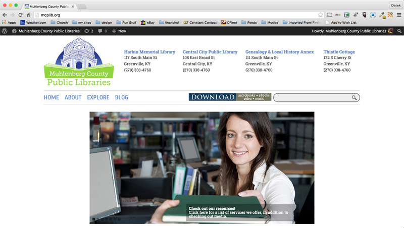
Muhlenberg County Public Libraries / Greenville and Central City, KY
Way back in 2013, my home county’s library system contacted me for a huge rebranding project. They called on me to create a new public library logo design and website for them. When I was growing up in Muhlenberg County, Kentucky, I fondly remember participating in their annual summer reading program each year. I also would often stop in to check out books while I walked home on my way from my school, Greenville Elementary. Because of this, I considered the library logo art project to be a very special honor.
Public library logo design in Kentucky – fonts and Image
First, I created a line drawing, which was based on the iconic county courthouse tower using the Adobe Illustrator application. This building happens to be the largest open belfry anywhere in the United States. The courthouse tower resides right across the street from the Greenville (Harbin Memorial) branch of the public library. MCPL also has a branch situated in Central City, KY.
After I drew up the focal vector image, I spelled out the words in the main title “Muhlenberg County Public Libraries”. I chose the Museo Slab serif style font. I love this font, since it creates an identity that looks both classic and modern at the same time. A simplified book shape opens up in the foreground in order to provide a tasteful contrast to the architecture portrayed behind it. It avoids the pitfall of potentially making the design too complicated by still not being too obvious or complex.
All of the elements’ weights are distributed evenly. The book’s shape gives the correct emphasis on the text. To give the piece some more variety, I set the words “Public Libraries” in a larger size at the bottom. The words “Muhlenberg County” reverse out of the book shape in white.
Public library logo color scheme and finishing touches
The dark blue and lime green color scheme is strong and eye catching, while still keeping things simple. Depending on the application, I set the background color in either a solid blue, or the gradient fade you see displayed here. As with all of my logo designs, I created a separate, simplified version in black and white. I have always maintained the belief that the best logos can be reduced down to a one color format. I love going “back home” to Western Kentucky and seeing my work displayed on signage and billboards. The library was such an important part of my childhood growing up in Muhlenberg County. Therefore, it is a good feeling to know that my work represents it to kids growing up there today.
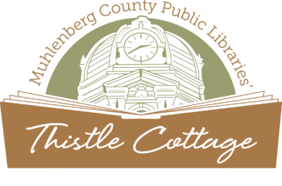
Muhlenberg County Public Libraries Thistle Cottage Logo
Thistle Cottage history and public library logo design colors
Later on in that very same year, MCPL returned to me for a new task. They requested a new variation of my original public library logo design. The new spin on the brand first involved a change in the color scheme. For this particular version, I decided we should incorporate a rustic copper brown and army green combination.
Both of these muted colors combine and hearken back to the heritage of the building represented by the mark. Thistle Cottage is a historic early 20th Century home on 122 South Cherry Street in downtown Greenville, KY. It was built in the year 1912, back when the Western Kentucky coal mining industry was still booming. The Cottage is located just around the corner from the Harbin Memorial library branch.
Thistle Cottage was formerly a cultural center that would host touring art exhibits. The city gave it to the public library system in 2013. They then converted it into a museum and art gallery space. MCPL also holds their annual community events there. These events include their Mother’s Day Victorian Tea party in May, along with their Pictures with Santa holiday series.
Thistle Cottage library logo art – fonts and finishing touches
A fun handwriting script font comes together in order to spell out the main title phrase “Thistle Cottage”. Once again, I reversed the title out of the large open book shape in white. Then, I made the book shape a bit taller. This way, it would frame in all of the main title text. I kept the “Muhlenberg County Public Libraries” text intact from the original logo design in this particular variation. Then, I arched it around the courthouse image from the original logo in the copper brown shade. Finally, I recolored the county courthouse in the olive shade of green.
The finished product I provided made the staff at MCPL very happy in the end. While it is obviously associated with the Kentucky public library system, the muted color scheme and classic script give the logo a vintage feel of its own.
Thistle Cottage logo signage gallery
Check out the finished product in real life below! The library features it prominently on the sign in front of the Thistle Cottage building.

My then-young son and I in front of the Thistle Cottage sign at my gallery exhibit in 2019.
“Book” me for your public library logo design!
Are you a library director who will soon launch a new library system or branch in your community? Perhaps your own library system has been using the same outdated library logo art for many years. You may very well be in need of an image rebrand! Whatever your situation may be, you should contact me! Everyone in your town will be checking you out! Sorry, for better or worse, I just can’t help myself when it comes to a good pun.