Guided by Voices | Dayton, OH
The legendary indie rock band Guided by Voices scheduled a tour stop in my hometown of Lexington, KY. As such, they were in need of a custom concert poster design for it. Their New York City based management company found me via a Google search. Then, they contacted me to pitch a unique proposition. I was the official Guided By Voices poster designer for this event!
The group asked me to design, print, and hand number a limited edition of 100 show posters. After approval of the design, I would then mail one copy to management. I also was required to hang a few copies at the concert’s host venue, The Burl. Finally, on the day of the show, I could set up a table next to the band’s merch station and sell the rest. I am always selling my own services. Therefore, I jumped at the chance to take part in this project.
Guided By Voices gave me creative carte blanche. It was totally up to me to determine the poster’s artistic concept, as well as the subsequent design. The band had only rejected one poster art in their 30 plus year existence. They had developed a keen taste for quality design over their many years in the business. My reputation locally here in Lexington, KY for concert poster design preceded me. It felt great to know that both the iconic rock band and their management had so much confidence in me.
Custom concert poster design story – Guided By Voices Poster Designer
First, I Googled other posters that were designed for the band’s previous tour dates in order to do some research. Most of the other graphic artists sought to emulate screen printed designs. Thus, they only featured three or less colors in their posters. My planned design necessitated more colors. I wanted to create a flat, cartoon style illustration. It had to convey the necessary information while staying both fun and unique.
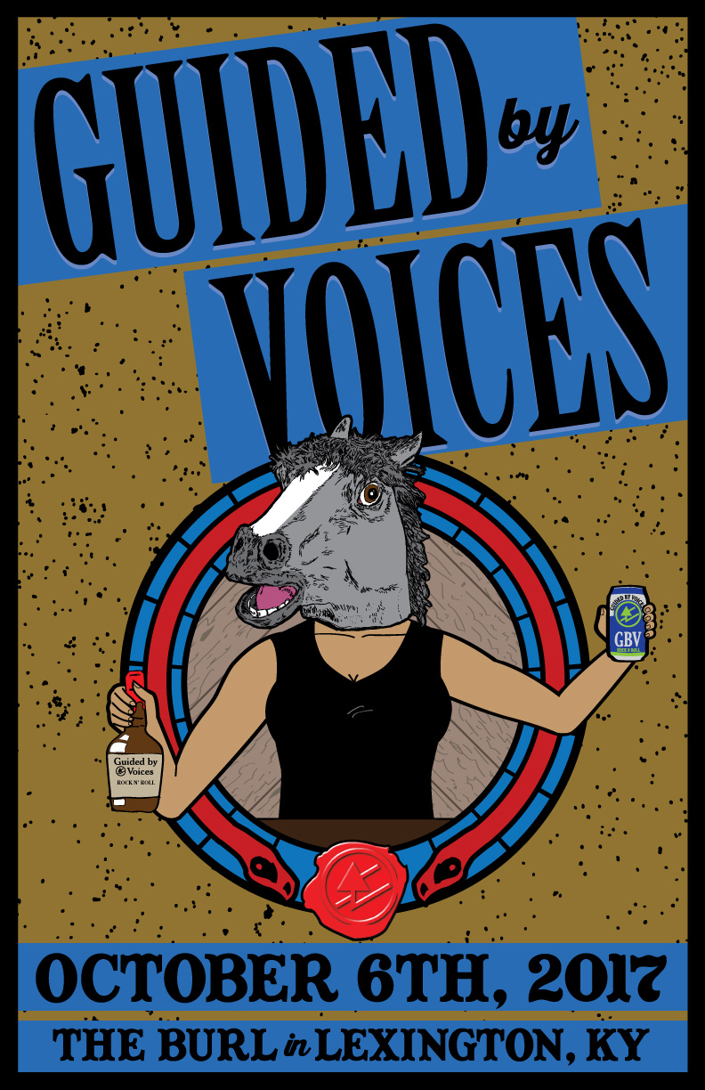
From the start of the project, I knew I wanted to incorporate an equestrian theme. Also, I intended for the piece’s concept to tip it’s proverbial hat to the culture of my home state of Kentucky.
I felt that it was a bit too cliche to use an image of a horse race as I initially had planned. All of my favorite concert posters incorporate a striking, slightly odd focal image. I had to think outside of the box. I traveled down to the uncanny valley by drawing a rowdy bartender wearing a rubber horse mask. Those who know me are well aware that people wearing realistic animal masks make me very uncomfortable. However, I resolved to face my fears by drawing this poster’s focal image.
Straight (bourbon) from the horse’s mouth on a custom concert poster design
The masked bartender brandishes a bottle of bourbon in one hand and a can of beer in the other. These containers mimic native Kentucky brands Maker’s Mark and West Sixth Brewing respectively. However, they incorporate the band’s icon logo and name instead. The main character stands behind the bar and in front of the The Burl’s signature wood paneling. Also, I framed her popping out of a circular, bright red and blue stained glass design. This is similar to the club’s famous circular window, which has been seen glowing on stage behind many iconic musical acts over the years.
Finally, I topped the main image off with a faux red wax seal. This seal resembles the one that is used by Maker’s Mark for their branding. However, it showcases the GBV icon logo instead of the Maker’s text. I achieved this effect by using an SVG Emboss filter in the Adobe Illustrator application.
Finishing touches – font and color choices
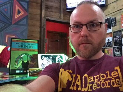
Selling posters at Guided By Voices merch table
I splattered the light brown background behind the main elements with various black spots. This gives it an appearance similar to a cork board. I framed the entire poster in with a thick black stroke. This ties all of the elements together and adds just enough weight to it. Last of all, I highlighted the text with a darker shade of the electric blue featured on the stained glass window frame.
I set the main title in a mix of both the Birch Standard tall serif and Thirsty Script Extra Bold fonts. To add depth, as well as emphasize the words “GUIDED BY VOICES”, I added a faint white shadow effect. I also tilted the main title to make it stand out and create the appearance of motion. I wrote both the date and location of the event in an old west style font called Captain Howdy.
To make it resemble the font The Burl uses in their own logo, I modified the original font by closing in the characters’ open spaces. The word “in” repeats the usage of the popular Thirsty Script font, adding some variety to the bottom text.
Guided by Voices concert poster design – Purchase a limited edition print
Being chosen to be the Guided By Voices poster designer was such an honor. Everyone praised my poster design, ranging from the band’s rabid Facebook fan base to the owner of the club. What could be better than creating an effective advertisement that also doubles as a collectible art print? This was a very is fulfilling experience for me overall. As of this writing, I have a very limited stock remaining. Buy one for yourself!
Contact me for your own event poster art
Are you a concert promoter, or perhaps a touring band with a big date coming up? You need an original art piece that will turn heads and sell tickets. You need me to create your custom concert poster design. I have designed countless print ads to promote events since I started my own graphic design business in 1999. Contact me today to get started.