 Hardin County Water District No. 1 | Elizabethtown, KY
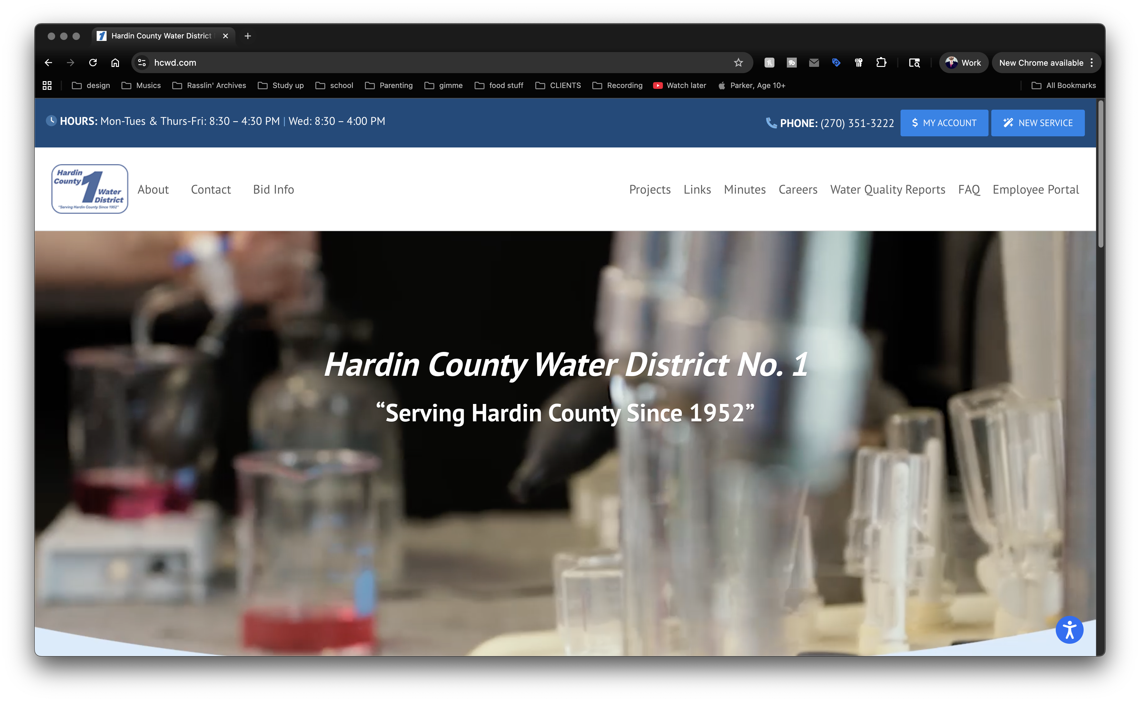
Years ago, while living in Elizabethtown, Kentucky, I struck up a friendship with a coworker named Robert. We kept in contact after I moved to Lexington and went to work for myself full time. Robert also got a new job, working for the local water company. He hired me to design their online customer portal a few years later. Others changed up the site as the years went by, and it was in dire need of a facelift. Customers’ needs were changing, as were web accessibility standards. Robert brought me back on board for Hardin County Water District Number 1’s website redesign.
Website Redesign For Kentucky Utility Company
Once Robert supplied the list of needed features, I got to work on the new test site. I recommended my old friends at Sublime Media Group in Bowling Green, KY to shoot new footage for the homepage. Once I had the raw footage in hand, I edited it down to a 15-second clip, optimized down to 5mb for web streaming. Robert requested a few changes and the video was ready for prime time.
After completing the video, I focused on cleaning up the site’s layout. I made sure the site stayed clean and inviting, sticking to white and shades of blue. I unified the fonts to help the new site’s cohesion. Then, I made sure customers could easily access the most important elements of the site. I positioned the District’s hours and phone number, along with the buttons to add new service and access customer accounts, at the top.
Under the main site video, I positioned two family focused stock images, highlighting links to pay the customer’s bill and connect new service. Finally, the news section rounds out the homepage layout. Thumbnails and excerpts from the four most recent news items automatically populate this area. Users can click the “Read More” links in each excerpt to read the full articles, or click the “News Archives” link to read all of the posts.
Wrapping Up The Website Redesign
After my client approved the homepage, we worked together to shape up the rest of the site. Robert and I worked together to update, clean up, and organize each page. I added a stock photo to each page with a water theme. Each of them also centered around smiling families and kids.
Last, but definitely not least, I worked with the water utility company on securing their forms. They deal with sensitive, personal information tied to each customer, so it had to be encrypted. I also edited existing forms, adding new features to help prospective new account holders and potential employees.
Does Your Company Need Need A Fresh Website Redesign?
Function is important. When it comes to your online presence, style is, too. If you have a stale site, you can trust me for your website redesign. Contact me today.